

You Can Ring My Bell


John P. Hussman, Ph.D.
President, Hussman Investment Trust
June 2024
With the market nearly 20% off its highs, it is rather easy to say that stocks are in a ‘bear market.’ However, this type of label is simply a snapshot and says nothing about future prospects for the market. The stock market is now fairly valued. We expect that many investors, particularly short sellers, will realize several months from now that they sold at wholesale. Reestablish a 100%, fully invested position.
-John P. Hussman, Monthly Market Letter, October 12, 1990
Over the following 25-year period, the annual total return of the S&P 500 averaged 10.1%
So yes, we believe that the crash risk of the market is extremely high. The short term, however, is unclear. Nothing in the market is certain, but we don’t know any other way to approach the market than to ask “What are the conditions now?” and “How have those conditions historically been resolved?” In this case, we have only one answer.
– John P. Hussman, Monthly Market Letter, March 7, 2000
Last week, we noted in our weekly market comment that the market has recruited enough ‘trend uniformity’ to shift the Market Climate to a favorable condition. As usual, we don’t forecast, we identify. Our view is not that stocks must advance, nor that the economy must expand. Rather, current conditions match those that have historically generated favorable market returns, on average.
– John P. Hussman, Monthly Market Letter, May 12, 2003
Given my general avoidance of forecasts, there are very few situations when I would state my views about the market as a “warning.” Unfortunately, in contrast to more general Market Climates that we observe from week to week, the current set of conditions provides no historical examples when stocks have followed with decent returns. Every single instance has been a disaster.
– John P. Hussman, Examine All Risk Exposures, October 15, 2007
Probably the best way to begin this comment is to reiterate that U.S. stocks are now undervalued. Last week, we also observed early indications of an improvement in the quality of market action, and an easing of the upward pressure on risk premiums. In 2000, we could confidently assert that stocks would most probably deliver negative total returns over the following 10-year period. Today, we can comfortably expect 8-10% total returns even without assuming any material increase in price-to-normalized-earnings multiples. Given a modest expansion in multiples, a passive investment in the S&P 500 can be expected to achieve total returns well in excess of 10% annually.
– John P. Hussman, Why Warren Buffett is Right (and why Nobody Cares), October 20, 2008
I may as well just say it. Based on the present combination of extreme valuations, unfavorable and deteriorating market internals, and a rare preponderance of warning syndromes in weekly and now daily data, my impression is that the speculative market advance since 2009 ended last week. Barring a wholesale shift in the quality of market internals, which are quickly going the wrong way, any further highs from these levels are likely to be minimal. In contrast, current valuation extremes imply potential downside risk for the S&P 500 on the order of 50-70% over the completion of this cycle.
Emphatically, nothing in our investment discipline relies on a market peak, and every element of our discipline remains open to a change in market conditions that would encourage a more constructive outlook. We just don’t see those conditions at present.
As our long-term readers know, I try to avoid statements that sound like forecasts. Our investment discipline is not to forecast, but to identify – to align our outlook with prevailing, observable, measurable conditions. Given that the S&P 500 just set a record intra-day high of 5505.53 on Thursday of last week, suggesting that the bubble has peaked is extreme, even for me. Still, as I observed at the 2000 and 2007 peaks, we don’t know any other way to approach the market than to ask “What are the conditions now?” and “How have those conditions historically been resolved?” Then, as now, we had only one answer.
Taken as a whole – extreme valuations, divergent market internals, overextended market action, euphoric sentiment, tepid participation, deteriorating leadership, and other warning signs – the current set of market conditions provides no historical examples when stocks have followed with decent returns. Instead, the “nearest neighbors” are either major market peaks or extremes that preceded steep corrections.
The reason my language is so pointed is that, as Jeremy Grantham observed on the approach to the January 2022 peak, “Seriousness is flagged by the language that you use. I’ve always tried to make a big difference, but the difference is often wasted because people don’t remember what you sounded like when you were serious. The difference I’m trying to make is just the routine ‘the market is expensive,’ and the significant. The significant is three bubbles. This is serious.
Should you change your investment position here? We haven’t. Whether or not we’re at a market peak, we were already defensive based on extreme valuations, unfavorable internals, and overextended conditions. If you’re a passive investor, my intent is not to encourage you to abandon your discipline. What I do believe, however, is that this is an extraordinarily good moment to examine your risk exposures and to take them seriously. If your notion of passive investing doesn’t allow for a realistic possibility of a market loss well in excess of 50%, or a decade or more in which the S&P 500 lags Treasury bills, you’ve not only decided to be a passive investor, you’ve decided to ignore history. So, whatever your discipline, examine your risk exposures.
It’s helpful to keep in mind that anytime you change part of your investment position, there will be regret. If you sell part of your holdings, and the market continues to advance, you’ll regret having sold anything. If you sell part of your holdings and the market declines, you’ll regret not having sold more. The same is true for purchases. There will always be regret. The key is to realize this up front, and choose an acceptable level of regret. You do that by examining your exposure to risk, considering both potential returns and potential losses. That’s my main hope in writing this comment.
“Why listen to a permabear?”
Before we review present market conditions, I think it’s important to describe how – after admirably navigating decades of market cycles, bubbles, and crashes – I dropped the ball in the speculative half-cycle since the 2008-2009 global financial crisis (GFC). No explanation gives us a time machine or do-over, but if you’re inclined to follow our work yet struggling to understand that stumble, my hope is that this brief discussion will offer some confidence as we go forward – at a moment where confidence in our work may serve you or your clients particularly well.
The reason I discuss this period is simple. If investors are to have confidence in our work, it helps not only to understand our process and our successes in prior cycles, but also exactly what the specific wrench was in this bubble, and how we got rid of that wrench. As an investor, I would want to be able to reconcile our decades of effective, flexible discipline with our persistent defensiveness during this bubble. I would want to know how our broader flexibility has been restored, even if record valuations and unfavorable internals reasonably suggest a defensive outlook here. To do that, it will help to add some specifics about the ensemble methods we adopted after the global financial crisis.
As I’ve detailed before, prior to the GFC, our investment methods were informed mainly by U.S. financial and economic cycles since 1940. Like many advisors, I viewed Depression-era data as obsolete. While we had moved to a constructive outlook in late-October 2008 after a market plunge of more than 40%, the subsequent employment losses and banking strains were unlike anything observed in post-war data. For better or worse, I decided I had a fiduciary duty to stress-test our methods against Depression-era outcomes. The effort to resolve what I called our “two data sets problem” ultimately led us to adopt a set of ensemble methods to classify market conditions.
The ensemble approach did beautifully across history and in validation data. It also captured a reliable feature of market history. Regardless of which random sample of history one might choose, “overvalued, overbought, overbullish” syndromes were nearly always the first branch of the decision tree separating favorable and unfavorable market outcomes. The air-pockets, panics, and crashes that regularly followed these extremes convinced me that a bearish response was reasonable. Because of their historical reliability, overextended features of market action took priority in the ensembles, ahead of the uniformity or divergence of market internals.
Unfortunately, Fed-driven yield-seeking speculation and the novelty of zero interest rate policies encouraged investors to speculate long after even extreme “overvalued, overbought, overbullish” syndromes emerged. In the light of a century of market cycles, ignoring those extremes seemed equal to swinging a baseball bat at a hornet’s nest and expecting it to scatter candy like a piñata. But amid zero interest rates, as long as our measures of market internals were also favorable, it was candy. Nothing but candy.
After multiple attempts to adapt the ensemble methods using various overlays, we finally abandoned that implementation in 2021. As I observed in September of that year, we explicitly prioritized the status of market internals in our discipline, adopted more tractable position limits and safety nets to navigate extremes like 1929-1932 and 2008-2009, ended our reliance on overextended “limits,” and expanded the range of valuations in which we can expect to be constructive.
An important feature of these adaptations is that they prioritize factors that are mathematically related to the definition of total returns. These include not only valuations, but also pressures on the change in valuations (for more, see The Structural Drivers of Investment Returns). Applied across historical data, the result is a similar, but more constructive and flexible version of the discipline that served us so well in market cycles prior to 2009. As always, the most favorable expected market return/risk profiles will typically emerge when a material retreat in valuations is joined by an improvement in market internals.
Our present defensiveness is intentional. The main reason I have not advocated a constructive stance since 2021 is that market internals have remained divergent throughout this period, valuations remain beyond 1929 and 2000 extremes, and my view remains that the period since 2021 comprises the extended top formation of one of the three great speculative bubbles in U.S. history.
Meanwhile, it’s worth noting that the average S&P 500 component has lagged T-bills since 2021, and the capitalization-weighted S&P 500 has been ahead of T-bill returns only since late-April. I suspect even this recent lead will be brief, but in any case, we’ll respond to market conditions as they change.
Valuations, internals, and overextension
Our investment discipline is to align our market outlook with prevailing, observable, measurable conditions, and to change our outlook as those conditions change. No forecasts are required. Nothing in our discipline relies on valuations or profit margins to approach their historical norms in the future, nor do we rule out endless future episodes of Fed intervention. The issue at present is the extreme nature of market conditions.
To understand why our views about current market conditions are so pointed, it will help to review the core elements of our investment discipline, and the horizons over which they matter – from long-term to short-term.
The chart below shows our most reliable gauge of market valuations, based on correlation with actual subsequent S&P 500 total returns in market cycles across history. The chart shows the ratio of nonfinancial market capitalization to gross value-added, including estimated foreign revenues. The present level exceeds both the 1929 and 2000 extremes, and is higher than every point in history except 5 weeks surrounding the January 2022 market peak.
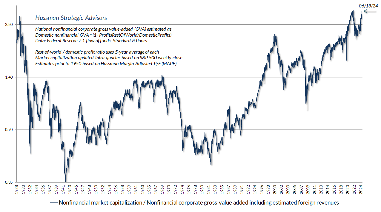
Of course, extreme valuations alone don’t necessarily imply near-term market losses. If overvaluation was enough to drive the market lower, it would be impossible to reach valuations like 1929, 2000, 2022, and today. The only way the market can get to levels like today is by blowing through lesser valuation extremes without consequence.
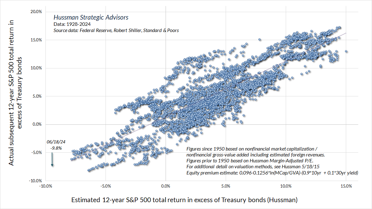
To put the current valuation extreme in perspective, the chart below shows our estimate of 12-year S&P 500 total returns over and above Treasury yields. This is the most reliable estimate of the “equity risk premium” that we have examined or developed, and is better correlated with actual subsequent outcomes than the “Fed Model” (S&P 500 operating earnings yield – 10 year Treasury yield), the “Excess CAPE Yield” of Shiller, Black, and Jirav, and annual estimates produced by Aswath Damodaran, all whose work I admire even when I might disagree.
The chart below offers a broad picture with regard to valuations. The blue line is the S&P 500 Index. The green line is the estimated level of valuations that we associate with historically run-of-the-mill expected long-term returns averaging 10% annually. We don’t require the market to revisit that green line ever again, but that’s the level we would associate with expected returns of 10% annually. The reason we benchmark valuations like this is simple: when analysts say that stocks are “fairly valued” relative to this or that interest rate, what they’re really doing is quietly changing their assumptions about the future stock market returns that will be acceptable to investors. In my view, it’s cleaner to benchmark valuations based on a fixed (even arbitrary) level of expected return, and then show how different levels of expected returns would change that benchmark.
So in the chart below, the orange dotted line is the estimated level of the S&P 500 that would be consistent with expected total returns equal to the prevailing yield of 10-year Treasury bonds (a 0% risk premium). The blue dashed line shows the estimated level of the S&P 500 that would be consistent with a historically-normal 5% risk premium above Treasury yields. The yellow bubbles show points when our estimate of 10-year S&P 500 total returns fell below Treasury yields. Not surprisingly, these were typically followed by “long trips to nowhere,” during which the S&P 500 lagged Treasury returns for a decade or more.
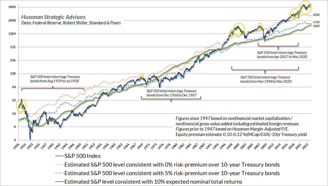
Again, valuations are not equivalent to forecasts, particularly over the near term. Still, current levels, along with historical experience over complete cycles, may help to explain why we estimate that potential full-cycle downside risk may be on the order of 50-70%. As Don Hays used to say, “Valuation doesn’t tell you when, but it does tell you how far.” (h/t Paul Kostyak)
A note on profit margins
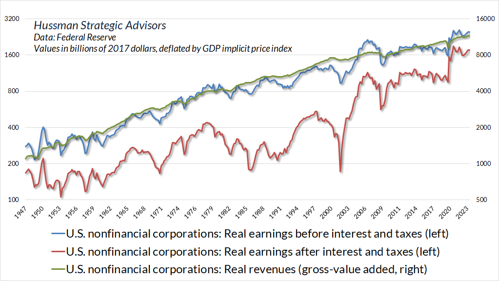
I realize that many investors are inclined to dispense with price/revenue multiples, and even valuations altogether, in the belief that economic dynamics have changed and that profit margins will maintain a permanently high plateau. On that argument, as I detailed in the March comment, Universal Capitulation and No Margin of Safety, the fact is that profit margins of U.S. nonfinancial corporations, before interest and taxes, haven’t changed materially in 75 years.
The blue line in the chart below shows the real earnings of U.S. nonfinancial corporations before interest and taxes (left scale). The green line shows the real revenues (gross value-added) of U.S. nonfinancial corporations (right scale). The two scales are proportional. Notice that the blue and green lines have grown in tandem over time, with very little relative variation. That’s another way of saying that corporate profit margins – before interest and taxes – have fluctuated very little over time.
In contrast, the red line shows the real earnings of U.S. nonfinancial corporations after interest and taxes. The only difference between the blue line and the red line, by definition, is interest and taxes. Those are the factors that have created the impression of inexorably rising U.S. profit margins.
The impact of tax reductions on corporate profit margins was nearly complete by the early 1980’s. Yes, statutory tax rates have declined further since then, but tax payments as a share of corporate revenues haven’t changed much in 40 years.
That leaves declining interest costs from 1980 to the present as the clear driver of profit margin expansion in recent decades. It should not be a surprise, then, that S&P 500 operating margins since the 1980’s have been well-correlated with the corporate bond yields. Indeed, that correlation has gradually increased because the ratio of corporate debt to corporate revenues has approached 1-to-1.
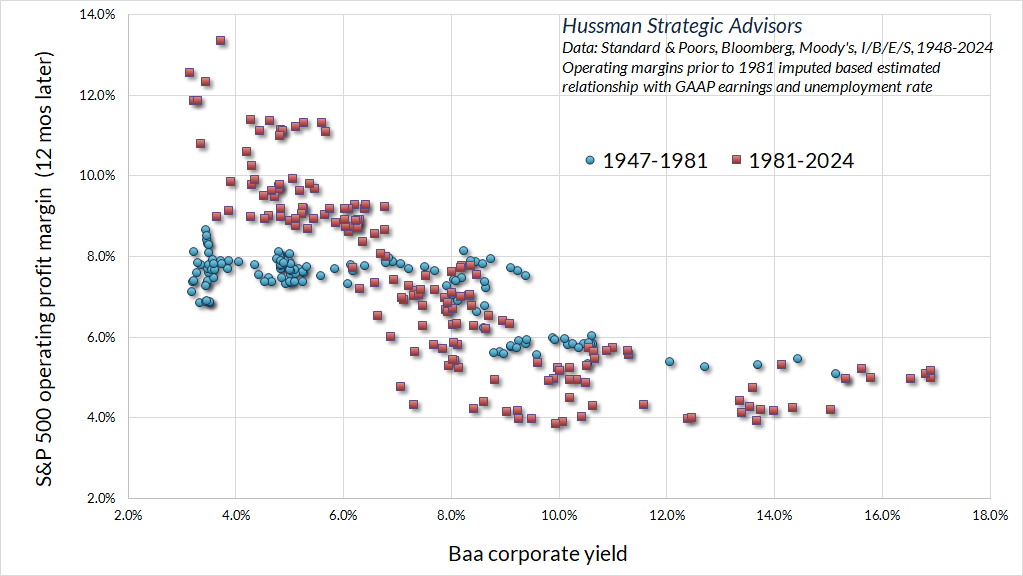
Because U.S. corporations completed a massive wave of debt refinancing in 2020 and 2021, corporate interest costs do not yet reflect the higher rates of recent years. That impact will become more apparent as we hit a wall of refinancing between now and 2027. The March comment contains much broader discussion on margins and market composition.
Market internals
From the standpoint of long-term returns and full cycle risk, valuations are extremely informative. Over shorter segments of the market cycle, we believe that investor psychology toward speculation or risk-aversion is the main driver of returns. When investors are inclined to speculate, they tend to be indiscriminate about it, so we gauge investor psychology based on the uniformity or divergence of market action across thousands of individual stocks, industries, sectors, and security-types, including debt securities of varying creditworthiness.
The chart below presents the cumulative total return of the S&P 500 in periods where our main gauge of market internals has been favorable, accruing Treasury bill interest otherwise. The chart is historical, does not represent any investment portfolio, does not reflect valuations or other features of our investment approach, and is not an assurance of future outcomes.
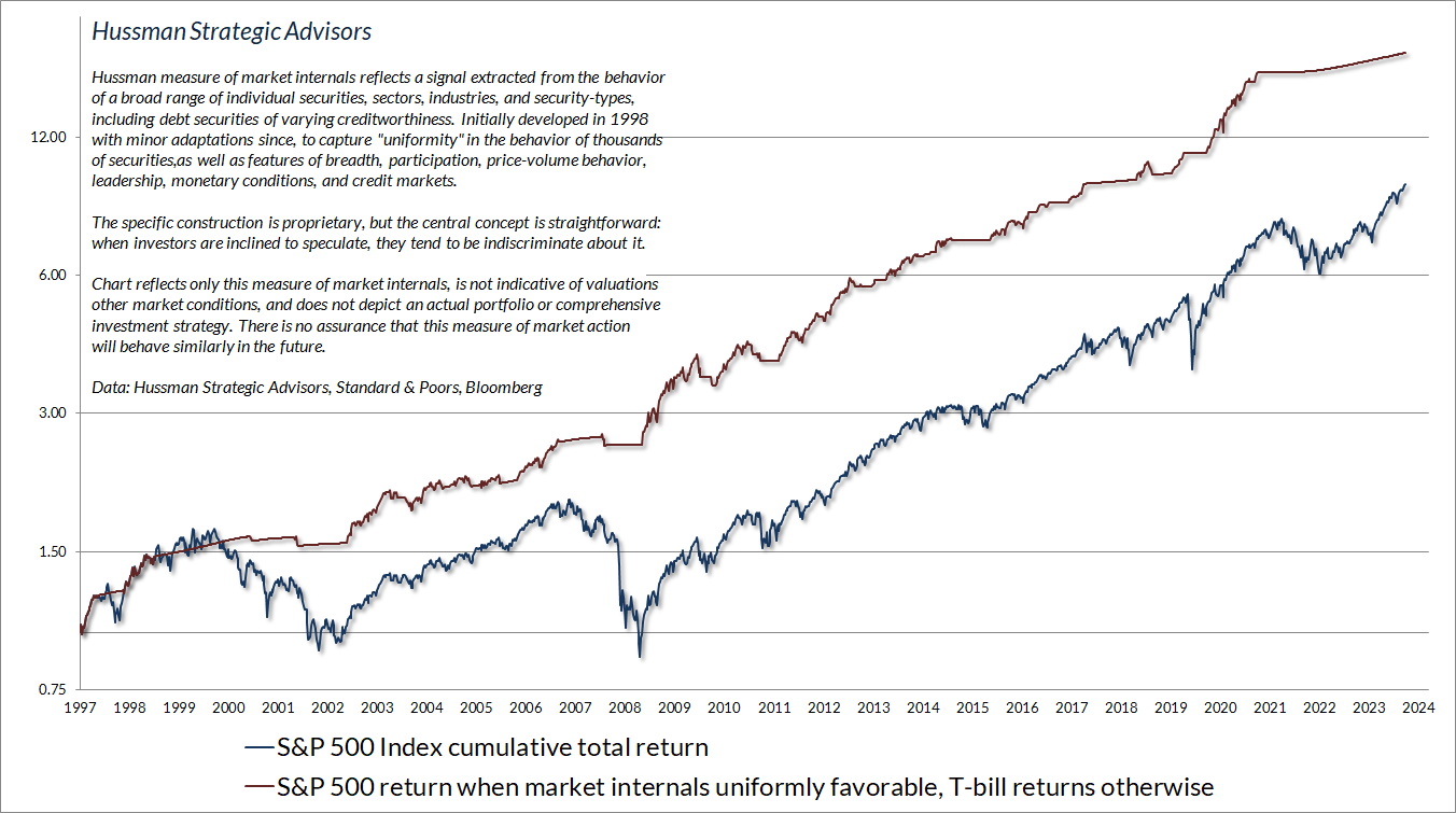
Since the January 2022 market peak, the average S&P 500 component has done no better than Treasury bills, and even the capitalization-weighted index has been ahead of T-bills only since April. Even so, it’s understandably frustrating that internals have remained unfavorable amid what seems like an “obvious” uptrend in recent months. To a large extent, the unfavorable condition of internals reflects a combination of increasingly narrow speculation and economic conditions that continue to hover near the threshold of recession (though we would still need more evidence to expect a recession with confidence).
It’s not particularly unusual for market internals to disagree with popular trend-following measures. Fortunately, when market internals have been unfavorable, yet the “trend” of the S&P 500 has been favorable based on popular trend-following measures (for example, the S&P 500 above its 40-week moving average), internals have typically dominated. On average, stocks have lost value under these conditions, though not always immediately. As I’ve noted in previous comments, we see the same outcome when internals are unfavorable and the Fed is easing, or earnings are rising, or a host of other seemingly attractive conditions are in place. Suffice it to say, I don’t believe that internals are “missing” anything here.
We certainly see speculation in glamour tech stocks, but amid unfavorable internals, even that condition typically ends badly. The main headwind for our hedged-equity discipline in the short run is that narrow speculation can boost the capitalization weighted indices we use to hedge, without much benefit for a broadly diversified portfolio of stocks. We saw the same thing during the approach to 2000, 2007, and 2020 market peaks. There’s no assurance that these headwinds are behind us, but they do tend to be short-lived.
Overextension, compression, reversal, and phase transition
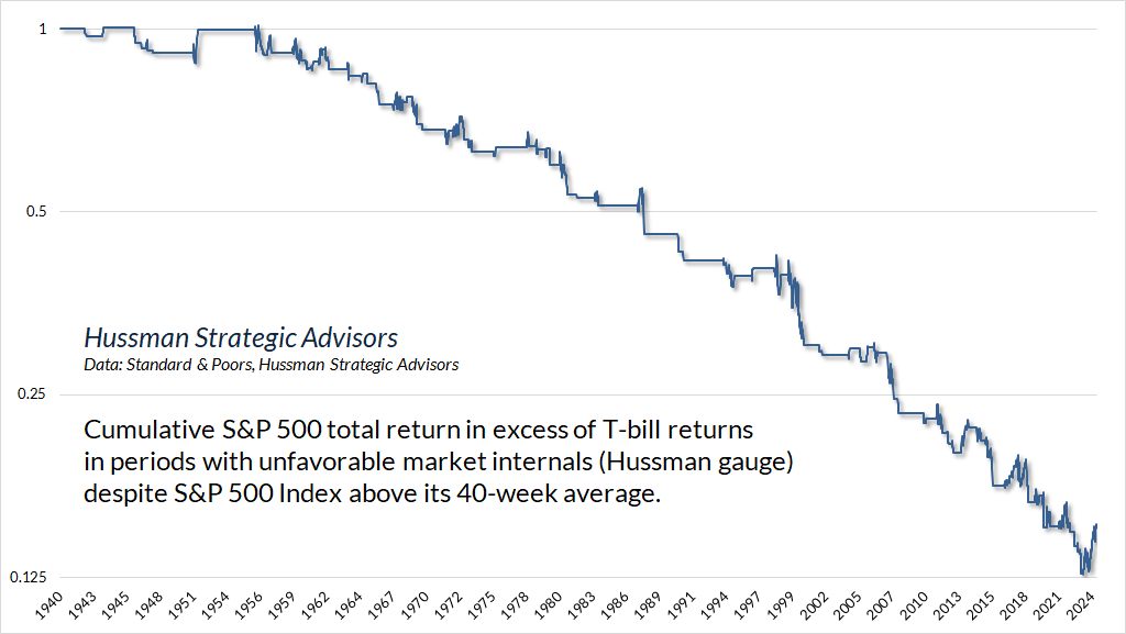
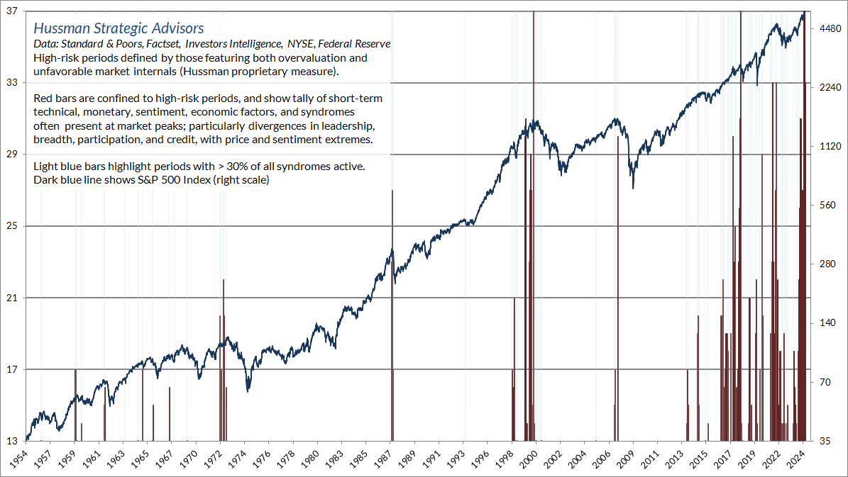
I often describe the combination of elevated valuations and unfavorable market internals as a “trap door” situation, because steep losses tend to emerge from that combination, including 1987, 2000, 2007, late-2018, early-2020, and 2022 among others. Yet as we’ve seen in recent months, even unfavorable internals don’t label extremes or identify the points of most extreme risk.
Once that “trap door” opens, our attention moves to overextended conditions and related syndromes. Over the past four decades, I’ve developed and collected scores of interesting syndromes and relationships that tend to occur at market extremes. I often discuss using terms like “overextension,” “dispersion,” and “reversal.” Having grown up as the son of two medical doctors, I use “syndrome” to describe a combination of observable features that can be associated with a specific outcome. There are certain features of valuation, investor psychology, and price behavior that emerge, to one degree or another, when the fear of missing out becomes particularly extreme and the focus of speculation becomes particularly narrow.
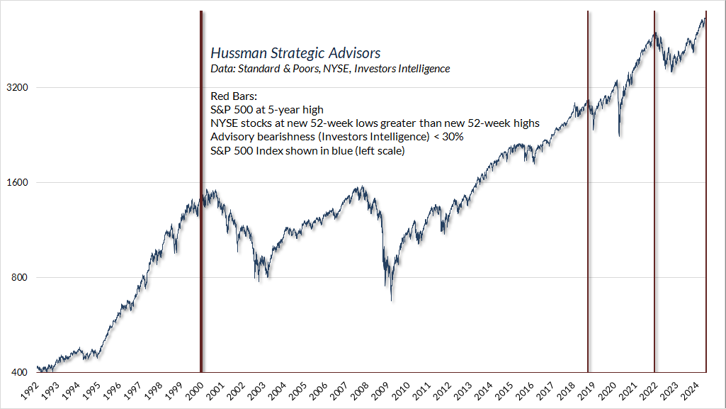
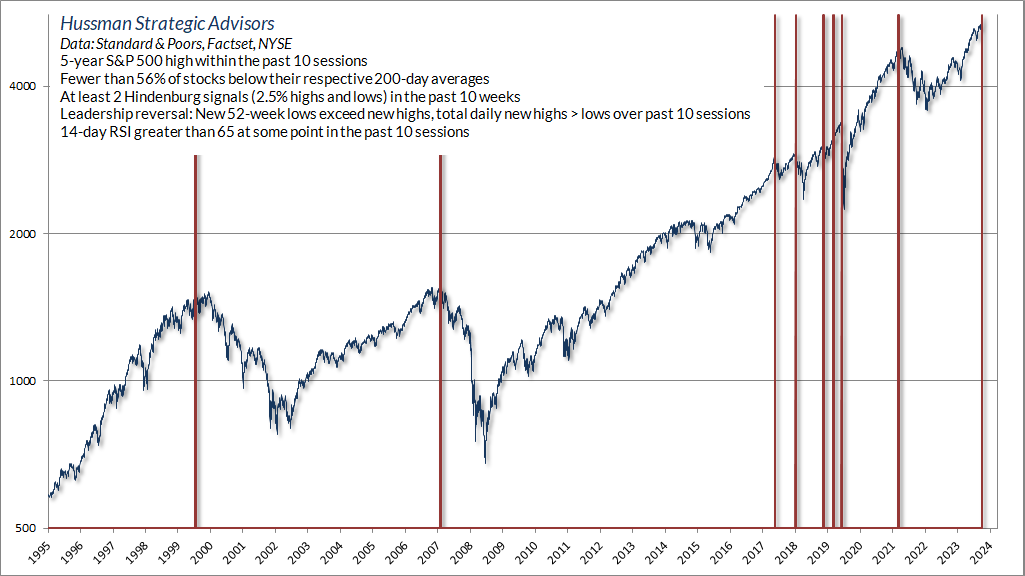
As a very simple example, here’s something you don’t see very often: a 5-year high in the S&P 500 with negative leadership (more stocks at new 52-week lows than new highs), particularly coupled with very little bearish sentiment. That combination, as simple as it seems, is an indication of trouble under the surface. We saw this one on Monday, June 17.
We don’t consider any individual syndrome as highly informative in and of itself. Instead, we look for points that feature a preponderance of them. The reason that we follow boatloads of these syndromes is the same reason we base our gauge of market internals on thousands of securities – uniformity conveys information. I discussed these in our late-November 2021 special interim update titled Motherlode, a few weeks and 2% shy of the January 2022 market peak.
We’ve seen a fresh preponderance of these warning syndromes in the past two weeks. In weekly data, the tally exceeds the number at the 1972, 1987, 2007, 2020, and 2021 peaks, and is rivaled only by the 2000 peak, and the less memorable September 2018 peak (which was followed by a quick plunge of nearly 20% in the S&P 500).
In a special comment earlier this month (Skating by the Trap Door) I observed that the ‘last straw’ of market action in daily data would be dispersion and reversal in “leadership.” The reason is the same one I noted approaching the 2007 market peak:
One of the best indications of the speculative willingness of investors is the ‘uniformity’ of positive market action across a broad range of internals… I’ve noted over the years that substantial market declines are often preceded by a combination of internal dispersion, where the market simultaneously registers a relatively large number of new highs and new lows among individual stocks, and a leadership reversal, where the statistics shift from a majority of new highs to a majority of new lows within a small number of trading sessions.
“This is much like what happens when a substance goes through a ‘phase transition,’ for example, from a gas to a liquid or vice versa. Portions of the material begin to act distinctly, as if the particles are choosing between the two phases, and as the transition approaches its ‘critical point,’ you start to observe larger clusters as one phase takes precedence and the particles that have ‘made a choice’ affect their neighbors. You also observe fast oscillations between order and disorder in the remaining particles. So a phase transition features internal dispersion followed by a leadership reversal. My impression is that this analogy also extends to the market’s tendency to experience increasing volatility at 5-10 minute intervals prior to major declines.”
– John P. Hussman, Ph.D., Market Internals Go Negative, July 30, 2007
Here’s one of scores of syndromes we monitor that captures the basic elements of a “phase transition.” Alone, I view it as a useful but insufficient gauge of market conditions. In combination with much broader speculative warnings, however, it’s one of the “last straws” I described a few weeks ago. We saw this one kick in last Friday.
On Friday June 21st, our tally of warning syndromes in daily data soared beyond 2000, 2007, late-2018, and early-2020 levels, matched only by the spike we observed in November 2021, when I published Motherlode. There’s nothing magical about these syndromes, but when dozens of them kick in at the same time, we do pay attention.
In sum, a simplified way to understand our market outlook is that valuations inform our long-term and full-cycle views, market internals inform our intermediate term views, and a boatload of weekly and daily syndromes relating to overextension, compression, phase transition, and reversal inform our near-term views. I don’t think it’s generally possible to identify market peaks and troughs in real-time, but there are unusual points in history when one observes a sudden deluge of conditions that suggest a speculative climax or risk-averse capitulation. Our investment discipline is to align our outlook with observable, identifiable, quantifiable measures, and no forecasts are required. It’s just that every now and then, those observable measures arrive by the bucketful.
Even a speculative peak would not necessarily imply immediate market losses. Both the closing and intraday peaks of the tech bubble occurred on March 24, 2000, followed by a steep initial decline. But the S&P 500 clawed its way to nearly the same level by September 1, 2000, and slightly exceeded the March 24, 2000 high on a total return basis. Likewise, the “motherlode” of warning flags we observed in November 2021 was followed by an initial decline, but the closing high of the S&P 500 occurred several weeks later, on January 3, 2022, at a level about 1.1% above the late-November intra-day high.
As always, our outlook will change as observable market conditions change.
Glamour growth, new eras, and creative destruction (“… but AI”)
A portion of this discussion is drawn from the June 2021 comment, Alice’s Adventures in Equilibrium
The whole concept of glamour stocks is a perfect reproduction of 1929, and to an extraordinary extent, the industries are the same. In 1929, the glamour stock was an electronic concern – RCA – although the word electronics had not been invented. Investors felt there must be magic in any industrial process they did not understand, and they still feel that way.”
John Kenneth Galbraith, New York Times, May 3, 1970
Economic growth always emerges at the cutting edge. New companies with new innovations provide a fresh addition to previous economic activity, and their growth in the early years is almost always spectacular. As companies become progressively larger, they gradually experience slower growth and lower profitability, both because they progressively saturate their market opportunities, and also because competition gradually emerges. New glamour companies take their place at the top. While investors rediscover the idea of a “new era” at every speculative peak, the reality is that economic growth is nothing but the constant introduction of new eras.
Put simply, long-term expansion in the standard of living does not simply reflect the continuous increase in the production of some single “representative good,” but instead by the progressive introduction of new inventions, technologies, and products that satisfy previous unmet needs.
While investors rediscover the idea of a ‘new era’ at every speculative peak, the reality is that economic growth is nothing but the constant introduction of new eras.
Nearly a century ago, Joseph Schumpeter offered what I still consider the best description of how economic growth emerges in a free enterprise economy, providing a framework that is essential for investors to understand about the “glamour” growth companies that emerge from one economic cycle to the next. In his work on economic development, Schumpeter recognized the critical role of entrepreneurs in advancing economic growth through the introduction of new products.
When Schumpeter described “creative destruction,” and Adam Smith described the “invisible hand,” they envisioned an economic system where potential opportunities for profit would create an incentive for innovation by those who were best capable of filling unmet needs. But they also saw profits as inherently self-destructive, because profit opportunities would encourage a “swarm-like” activity of other entrepreneurs. That competition would expand production, and simultaneously produce economic growth while eroding excessive profits.
As the rise and decay of industrial fortunes is the essential fact about the social structure of capitalist society, both the emergence of what is, in any single instance, an essentially temporary gain, and the elimination of it through the working of the competitive mechanism, obviously are more than ‘frictional’ phenomena, as is the process of underselling by which industrial progress comes about in a capitalist society and by which its achievements result in higher incomes all around.
– Joseph Schumpeter, The Instability of Capitalism (1928)
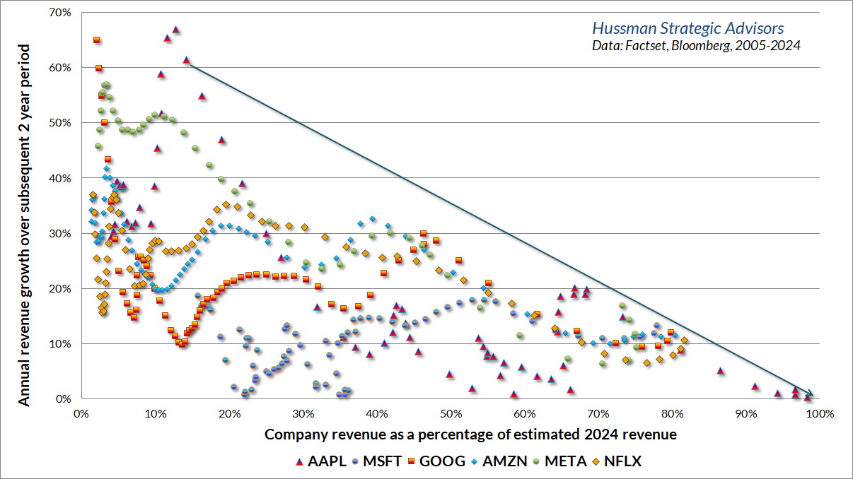
The fact is that the most dynamic layer of the economy is always renewing itself. Previous leaders typically don’t go away, but they do mature. The chart below shows the growth trajectory of several glamour companies discussed in prior comments. The horizontal axis shows the revenue of a given company as a fraction of its estimated 2024 revenue. The vertical axis shows the subsequent 2-year growth in revenue. The upshot here is that growth rates can be extraordinarily high when companies are small relative to their mature size, but those growth rates gradually decay as the companies saturate their markets. Apple, for example, has had negative revenue growth over the past 2 years, despite an 8.6% increase in the consumer price index. Investors often underestimate the risks they are taking when they place premium valuation multiples on companies that have already matured.
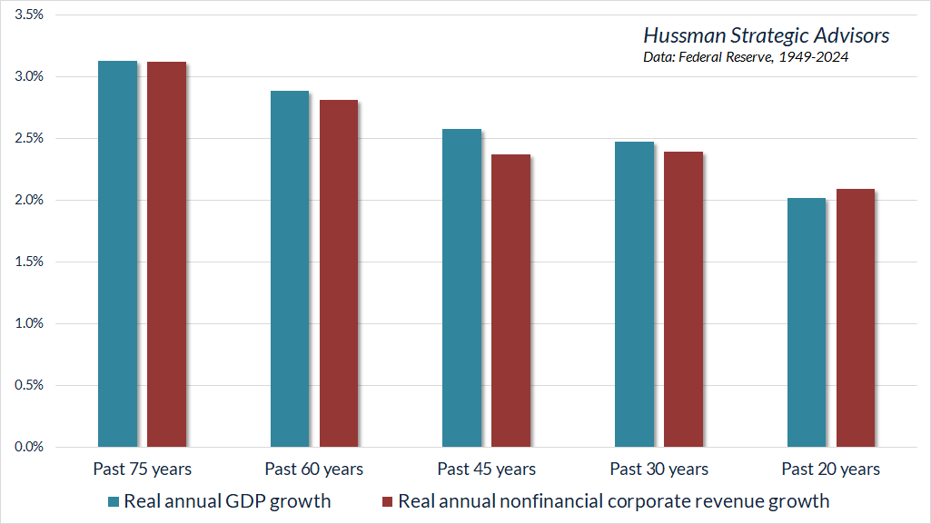
Every speculative episode convinces investors that the economy has entered a “new era,” defined by some novel, exciting innovation that captures the imagination. Yet investors somehow overlook the fact that that despite repeated cycles of technological innovation, real U.S. GDP growth and corporate revenue growth has been fairly consistent over time. In fact, real growth has been slower in the past two decades than it has been across most of U.S. history.
There’s no question that the emergence of the internet, wireless communications, smart phones, social media, data centers, and other technologies have introduced widespread changes in people’s lives. Then again, so did automobiles, and commercial aviation, and telephones, and electricity.
Despite the current conviction that “this time is different,” my sense is that many investors are mistaking concentration for prosperity. The most striking feature of glamour growth companies in recent years isn’t that they’ve produced more economic growth, but rather, that they’ve produced more economic concentration and greater wealth disparity. That outcome is largely the result of “network effects” – as certain companies gain customers, users, or vendors, the likelihood of new customers, users, or vendors choosing the same company increases. Leading companies become larger in size, because a handful of companies substitute for what would otherwise be many more. This concentration is often amplified through acquisition of competitors to obtain more customers or to incorporate or suppress competing technologies.
Aggregate growth isn’t higher as a result. It’s just that industries and wealth have become more concentrated, while the middle class and Main Street businesses can get hollowed out. The industry composition of the S&P 500 changes, but overall revenue growth doesn’t, nor does the arithmetic that links cash flows, prices, valuations, and long-term total returns.
Many of today’s largest companies have features of a “monopoly,” but not in the traditional economic sense. In the typical analysis of monopoly, excess profits are preserved by the ability of the monopolist to limit output and by doing so, to maintain prices at higher levels than would exist in a competitive economy. This sort of monopolist has an incentive to hold output at a sufficiently limited level to ensure a wide gap between revenue and cost. So, monopolists are traditionally thought of as producers that charge high prices and limit supply.
However, in any situation where the additional (“marginal”) cost of producing an extra unit declines or even approaches zero as the company expands output, simply obtaining more customers is sufficient to enhance profits, without any need to raise prices or limit supply. In this case, the largest companies become like “black holes” – drawing in more and more customers and eventually dominating the entire industry. These companies enjoy the status of a “natural monopoly.”
This sort of outcome may be “efficient,” but the level of profits can ultimately have little relationship to the contribution of the entrepreneurs that created these businesses. There’s no question that innovation should be rewarded enough to preserve incentives, but the skew of the wealth distribution has become increasingly bizarre. My impression is that corporate profits and extreme wealth, particularly among mega-cap companies, have become a sort of “capture” or “rent” that reflects network effects, social dynamics, and general technological efficiencies that were no part of that entrepreneur’s invention, and might be better characterized as public goods.
Growth rates and profit margins are trajectories
From an investment perspective, the danger for investors emerges when they imagine that the growth rates and profit margins of mega-cap glamour companies are fixed numbers, rather than trajectories. The fact is that even though the growth is paced by the newest companies, each economic cycle has its own cohort of those companies.
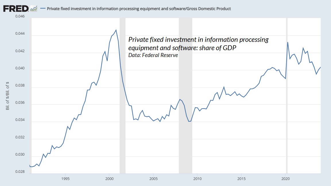
Consider the tech bubble. During the 1990’s investment in information technology and software exploded, and looked nearly parabolic by the 2000 peak. Investors and much of Wall Street extrapolated this parabolic growth. Instead, the breathtaking growth fizzled over the next few years, and despite all of the innovation since, information technology and software investment remains a smaller share of the economy than at the peak of the tech bubble. There’s little doubt that investors are doing the same kind of extrapolation with a new batch of glamour companies today.
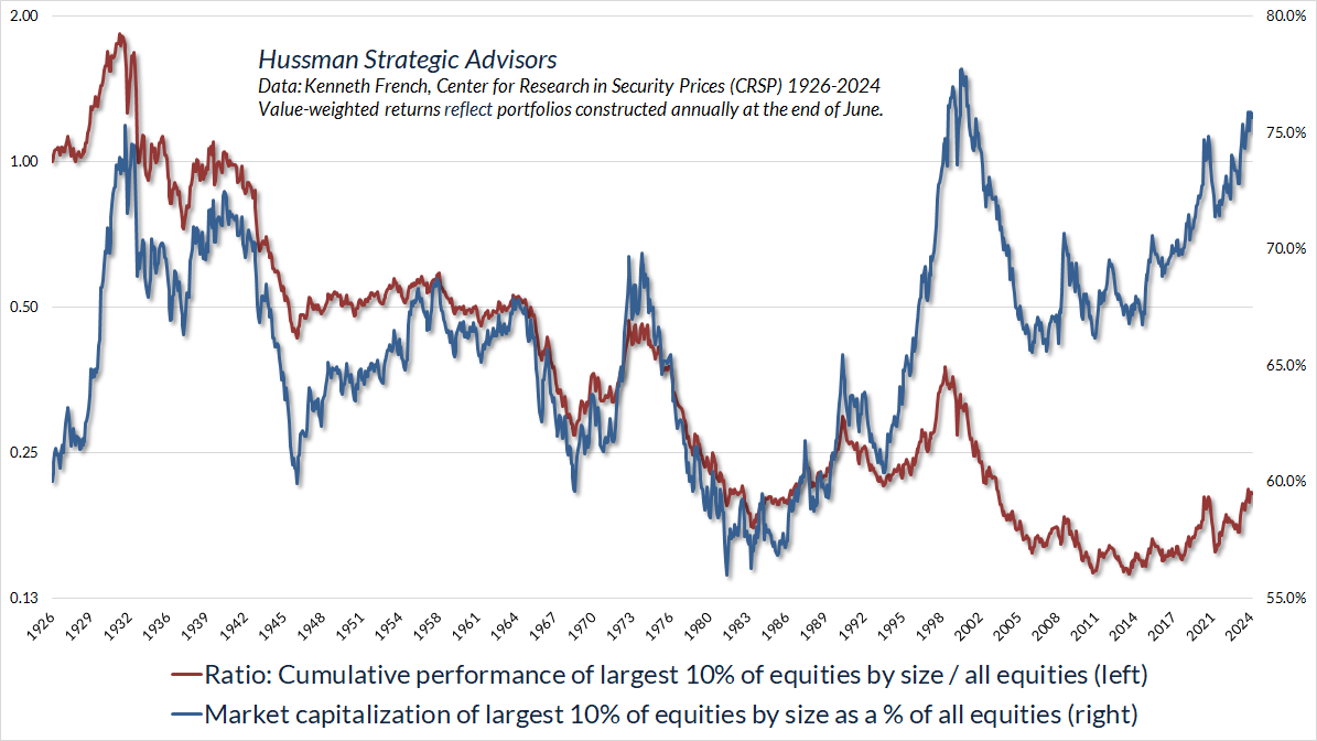
The fact is that the largest companies tend to be lagging long-term investments. There are certainly periods when large companies outpace the general market, and in these periods, their share of total market capitalization can become enormous, as it did in 1929, and 2000, and today. But once the largest companies comprise a lopsided share of total market capitalization, it’s a sign that investors are operating on hopes and dreams, and the subsequent returns tend to be disappointing.
The red line in the chart below shows the performance of the largest 10% of U.S. equities, relative to all U.S. equities. The blue line (right scale) shows the share of total market capitalization that these stocks represent. The current extreme is beyond that of 1929, and less than 2 percentage points short of the 2000 level.
The chart below shows the median price revenue multiple of the largest 10%, smallest 10%, and median component of the S&P 500, sorted by market capitalization. The current level now exceeds the 2000 peak.
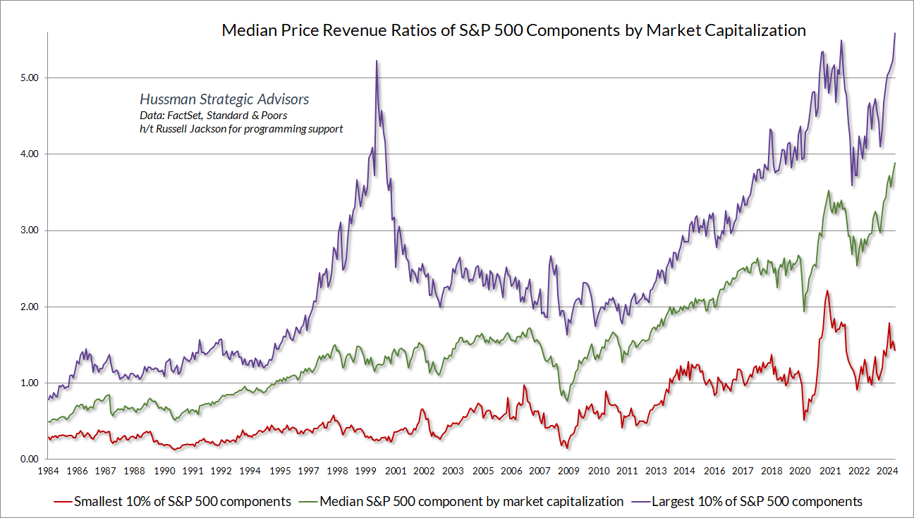
It’s worth noting that while profit margins are indeed higher today than they were in 2000, the profit margins of the largest S&P 500 components, relative to the median S&P 500 component, have remained range-bound for decades. There’s a lot of cyclical volatility, where the profit margins of the largest companies tend to temporarily widen at economic peaks, and subsequently retreat, but there’s no trend. It’s just not true that the dynamics of profit margins have changed because industry composition is different.
‘Onics, ‘tronics, and the investment cost of extrapolation
This is the longest period of practically uninterrupted rise in security prices in our history… The psychological illusion upon which it is based, though not essentially new, has been stronger and more widespread than has ever been the case in this country in the past. This illusion is summed up in the phrase ‘the new era.’ The phrase itself is not new. Every period of speculation rediscovers it… During every preceding period of stock speculation and subsequent collapse business conditions have been discussed in the same unrealistic fashion as in recent years. There has been the same widespread idea that in some miraculous way, endlessly elaborated but never actually defined, the fundamental conditions and requirements of progress and prosperity have changed, that old economic principles have been abrogated… that business profits are destined to grow faster and without limit, and that the expansion of credit can have no end.
– The Business Week, November 2, 1929
Why is this market so unshakable? It must be because 1) so many people have so much surplus money to invest; 2) that hundreds of thousands of newcomers have watched others make money in the market, and are determined to do likewise; 3) stocks are scarce in relation to total demand; 4) the specter of inflation makes common stocks widely sought; 5) corporate earnings are rising. This roaring market shows no signs of slackening its pace.
– Ira Cobleigh, Happiness is a Stock that Doubles in a Year,1968
Just before the collapse of the late-1960’s ‘onics / ‘tronics boom (the “Go Go” bubble)
From the September 1929 peak to the nadir of the Great Depression in the summer of 1932, the Dow industrial average dropped from 381 to 36, or just over 90 percent. From the December 1968 peak to the May 1970 bottom, the same index dropped from 985 to 631, or about 36 percent. But, as we have had occasion to note before, that standard really will not do. As a rough modern counterpart to what Dow represented in the old days, [Dun’s Review] made a list of thirty leading glamour stocks of the nineteen sixties – ten leading conglomerates, ten computer stocks, and ten technology stocks. The average 1969-1970 decline of the ten conglomerates had been 86 percent; of the computer stocks, 80 percent; of the technology stocks, 77 percent. Such were the bitter fruits of the go-go years.
– John Brooks, 1973, The Go-Go Years
From its peak on March 24, 2000 to its trough on October 8, 2002, the technology-heavy Nasdaq 100 (NDX) posted a total return of -83%. Meanwhile, the S&P 500 (SPX) lost -46%, and the Russell 2000 (RUT) lost -39%. From a relative performance perspective, $1 invested in the NDX lost -68% of its value compared with a $1 investment in the SPX, and -72% compared with a $1 investment in the RUT.
A decade following the 2000 market peak, the total return of the NDX stood at -57%, while the SPX was down -8% and the RUT was up 35%. From a relative performance perspective, $1 invested in the NDX at the 2000 bubble peak was down -53% versus the SPX, and -68% versus the RTY.
Even glamour companies of the tech bubble that prospered from a growth perspective lost value from an investment perspective. From their 1999-2000 speculative highs to their 2007 bull market peaks (entirely excluding the global financial crisis that followed), Amazon enjoyed compound annual revenue growth approaching 40%, Microsoft enjoyed revenue growth averaging 14% annually, and Cisco Systems enjoyed revenue growth averaging 22% annually. During that same period, all of these stocks posted negative cumulative total returns, with Amazon losing -5.5%, Microsoft losing -20.3%, and Cisco losing -57.4%. Be careful about extrapolation once extrapolation has already produced extraordinary valuations.
As for the still rapidly-growing NVIDIA, it’s not yet clear whether the explosive growth in data center revenues will persist year after year (which would be similar to the experience of Amazon following the tech bubble), or whether they instead reflect a short-term burst of activity from companies rushing to ensure they aren’t left behind on AI (which would be similar to the tech bubble when, by some software industry estimates, as much as 40% of purchased software was never installed). Either way, with the company trading at a price/revenue ratio of 40, it’s worth remembering that even high and sustained rates of growth don’t automatically result in positive investment returns.
Over the past 5 years, the revenues of S&P 500 technology companies have grown at a compound annual rate of 12%, while the corresponding stock prices have soared by 56% annually. Over time, price/revenue ratios come back in line. Currently, that would require an 83% plunge in tech stocks (recall the 1969-70 tech massacre). The plunge may be muted to about 65% given several years of revenue growth. If you understand values and market history, you know we’re not joking.
– John P. Hussman, Ph.D., March 7, 2000
Just before, well, an 83% plunge in the tech-heavy Nasdaq 100 Index
Keep Me Informed
Please enter your email address to be notified of new content, including market commentary and special updates.
Thank you for your interest in the Hussman Funds.
100% Spam-free. No list sharing. No solicitations. Opt-out anytime with one click.
By submitting this form, you consent to receive news and commentary, at no cost, from Hussman Strategic Advisors, News & Commentary, Cincinnati OH, 45246. https://www.hussmanfunds.com. You can revoke your consent to receive emails at any time by clicking the unsubscribe link at the bottom of every email. Emails are serviced by Constant Contact.
The foregoing comments represent the general investment analysis and economic views of the Advisor, and are provided solely for the purpose of information, instruction and discourse.
Prospectuses for the Hussman Strategic Growth Fund, the Hussman Strategic Total Return Fund, and the Hussman Strategic Allocation Fund, as well as Fund reports and other information, are available by clicking “The Funds” menu button from any page of this website.
Estimates of prospective return and risk for equities, bonds, and other financial markets are forward-looking statements based the analysis and reasonable beliefs of Hussman Strategic Advisors. They are not a guarantee of future performance, and are not indicative of the prospective returns of any of the Hussman Funds. Actual returns may differ substantially from the estimates provided. Estimates of prospective long-term returns for the S&P 500 reflect our standard valuation methodology, focusing on the relationship between current market prices and earnings, dividends and other fundamentals, adjusted for variability over the economic cycle. Further details relating to MarketCap/GVA (the ratio of nonfinancial market capitalization to gross-value added, including estimated foreign revenues) and our Margin-Adjusted P/E (MAPE) can be found in the Market Comment Archive under the Knowledge Center tab of this website. MarketCap/GVA: Hussman 05/18/15. MAPE: Hussman 05/05/14, Hussman 09/04/17.