

Fed Pivots and Baby Aspirin


John P. Hussman, Ph.D.
President, Hussman Investment Trust
August 2024
On Tuesday, July 16, our most reliable gauge of U.S. stock market valuations hit the steepest extreme in U.S. financial history. We cannot, and do not, assert that this places a ‘limit’ on speculation – even the previous January 2022 peak slightly exceeded the high of 1929. In our investment discipline, valuations are not enough. The uniformity or divergence of market internals is critically important (particularly following our 2021 adaptations), and we also attend to syndromes of extremely overextended market conditions. Our discipline does not rely on forecasts, scenarios, or projections of market action. Instead, we try to align our investment stance with observable, measurable market conditions as they change over the market cycle. Still, there’s a very rare set of market conditions extreme enough to deserve a ‘warning.’ As Madge said in the old Palmolive dish soap commercials, ‘you’re soaking in it.’
– John P. Hussman, Ph.D., You’re Soaking in It, July 21, 2024
From the standpoint of full-cycle investment prospects and risks, little has changed since July. Valuations remain near record extremes. Certain elements of market internals have improved somewhat despite a slight decline in the S&P 500 from its peak, but our key gauge remains in an unfavorable condition. While recent economic data have been comfortable, many reliable leading gauges remain just at the border that distinguishes expansion from recession (though we would need more evidence to expect a recession with confidence). Meanwhile, we see numerous stocks being taken behind the shed and clobbered by 10%-30% on earnings reports that are quite good but notch down guidance even slightly. When you see that behavior at extreme valuations, it tends to be a sign of underlying skittishness and risk aversion. When valuations are setting record extremes because the news can’t get any better, even a slightly less optimistic outlook becomes a risk.
As Jeremy Grantham observed a few months ago: “We have totally full employment, totally wonderful profit margins. All the things you would not want to start a bull market from. This is where you start bear markets from. Great bull markets start with exactly the opposite. You’ve got the peak P/E, so you feel wonderful, the stock market has gone up and up and up and up. So everyone feels great, and that’s how you get to a market peak. You feel great about everything. Of course, almost by definition. When do you start going down? You still feel great. You just don’t feel quite as great as you felt the day before.”
While the current level of the Federal funds rate remains consistent with systematic benchmarks that consider inflation, unemployment, real sales, economic slack, and other conditions, we do expect the Federal Reserve to cut interest rates beginning in September. Still, as I noted last month (see the section titled “Unfavorable internals dominate monetary easing, favorable internals amplify it”), even if one knew for certain that the Federal Reserve would cut interest rates over the coming 6-month period, that knowledge would not have historically justified taking a pre-emptive bullish position in the face of unfavorable internals.
As always, our investment discipline is to align our market outlook with measurable, observable market conditions. In 2021, with investors drowning in zero-interest Fed liquidity amounting to 36% of GDP, we abandoned the “ensemble methods” that embraced historically-reliable “limits” to speculation, and shifted greater emphasis to the uniformity and divergence of market internals, which since 1998 have proved to be our most reliable gauge of broad speculation versus risk-aversion.
Presently, I don’t expect a constructive shift in market internals, but as is always true, we can’t rule one out. Given current valuation extremes, any constructive shift would demand position limits and safety nets. A favorable shift in internals would not amount to a bullish “buy signal,” but it would increase our exposure to local market fluctuations without removing our defense against major downside risk. In any event, we’ll respond to market conditions as they shift. No forecasts or scenarios are required.
The chart below shows our most reliable gauge of market valuation, based on its correlation with actual subsequent 10-12 year S&P 500 total returns in market cycles across history. MarketCap/GVA is the ratio of market capitalization of U.S. nonfinancial companies to their gross-valued added, including our estimate of foreign revenues. The current level exceeds both the 1929 and 2000 market extremes.
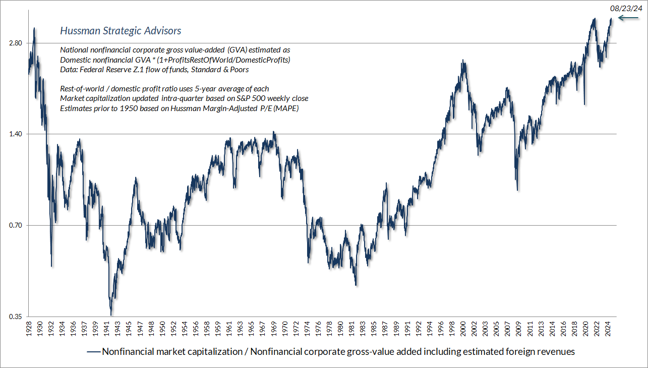
I realize that any reference to 1929 is immediately dismissed as preposterous. On that point, I certainly don’t expect a market loss anywhere near what stocks experienced between 1929 and 1932. Rather, I think it’s useful to think of that 89% market loss as having two parts. The first initial loss of two-thirds of the market’s value restored historically run-of-the-mill valuations. Policy errors and bank failures then resulted in a loss of two-thirds of what remained. That’s how the market lost 89% of its value (1/3 x 1/3 – 1 = -89%). Presently, I view the first bit as more likely than the second.
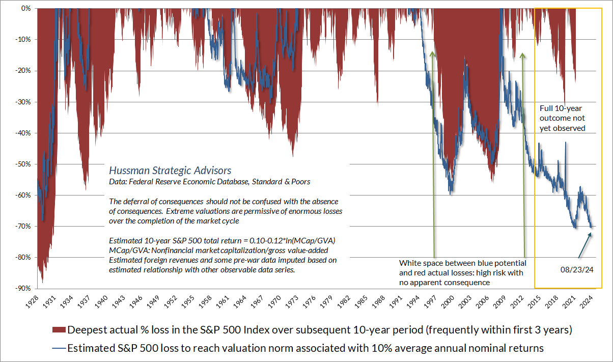
The chart below shows a variant of a chart I’ve periodically shared. Here, the blue line is the estimated loss in the S&P 500 that would be needed for MarketCap/GVA to reach run-of-the-mill valuation norms historically associated with subsequent total returns averaging 10% annually. At present, that potential loss (not a forecast) is about -70%. The red shading shows the deepest actual percentage loss in the S&P 500 index over the subsequent 10-year period.
In practice, these losses often emerged in the first three years following a valuation extreme, but it’s essential to understand that valuations are not timing tools and can remain elevated for extended periods of time (which is why market internals are important as well). There’s often a good deal of “white space” between the blue potential and red actual market losses. This white space represents risk with no apparent consequence.
Clearly, more than a decade of zero-interest monetary policy, coupled with the recent exuberance surrounding mega-cap technology stocks, has deferred the full-cycle consequences of extreme valuations. Still, the deferral of consequences is not the same as the absence of consequences. Notice also that there’s a yellow block in the chart below. For points in this block, the full 10-year outcome has not yet been observed.
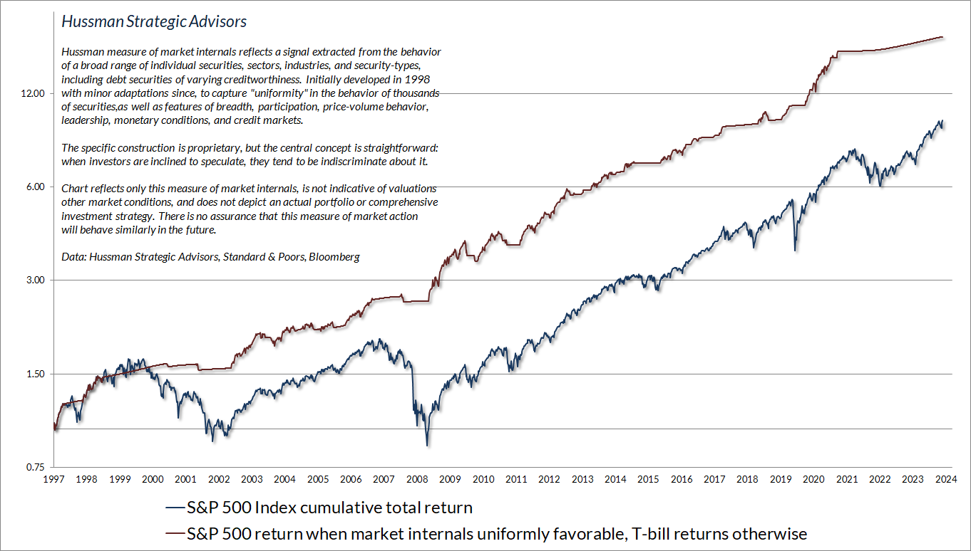
While valuations are extremely informative about likely 10-12 year S&P 500 total returns and potential losses over the complete market cycle, outcomes over shorter segments of the cycle are driven primarily by investor psychology – particularly their inclination toward speculation versus risk-aversion. Our most reliable gauge of that psychology is the uniformity or divergence of market action across thousands of individual stocks, industries, sectors, and security-types, including debt securities of varying creditworthiness.
The chart below presents the cumulative total return of the S&P 500 in periods where our main gauge of market internals has been favorable, accruing Treasury bill interest otherwise. The chart is historical, does not represent any investment portfolio, does not reflect valuations or other features of our investment approach, and is not an assurance of future outcomes.
Treasury bonds, precious metals, and diversifying with a value-conscious, historically-informed, full-cycle discipline
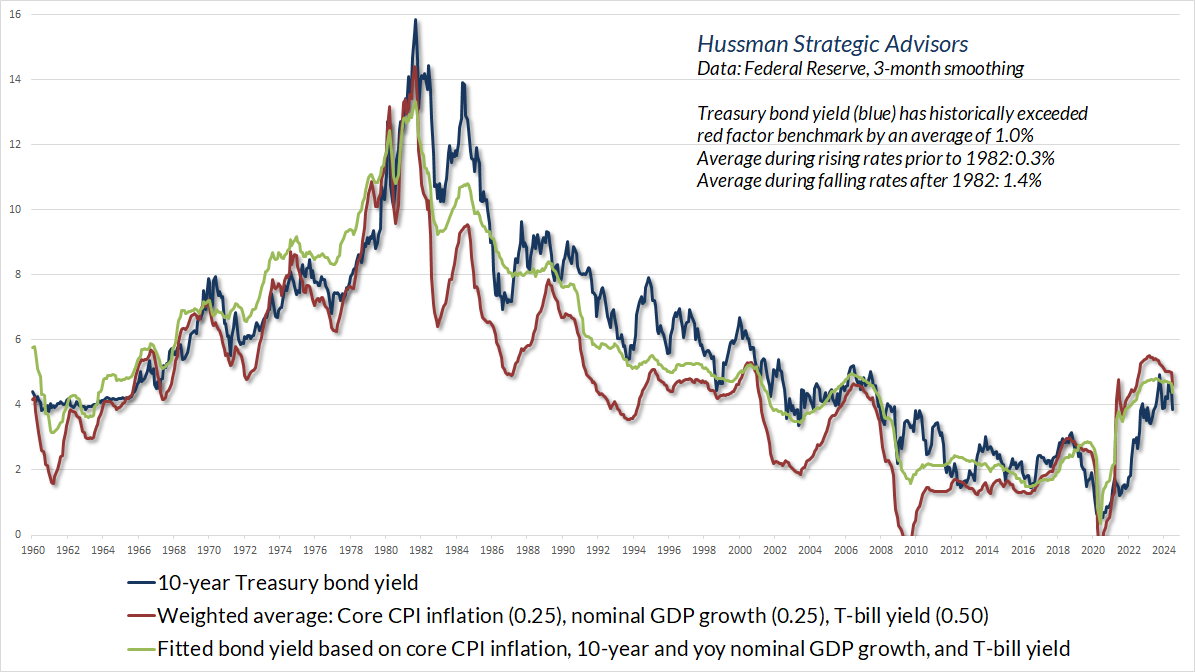
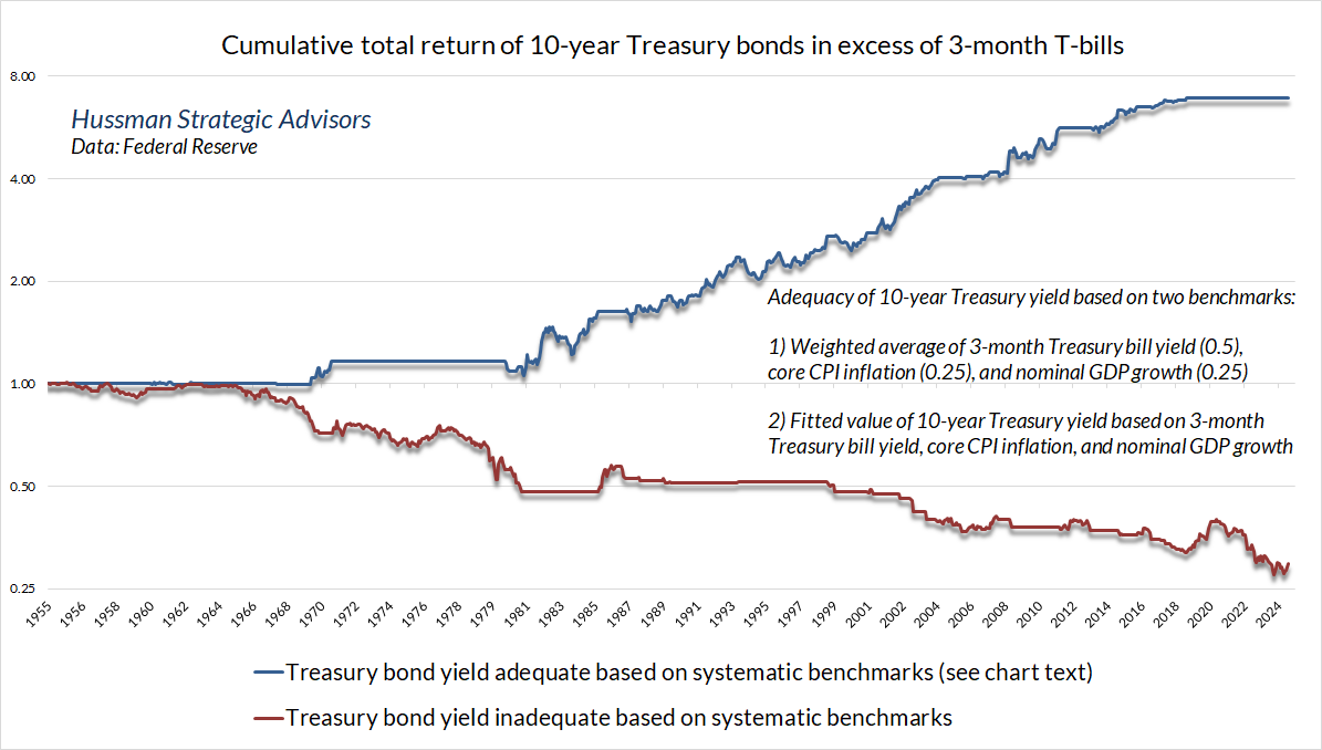
In the fixed income market, we continue to view the yield on 10-year Treasury bonds as acceptable though slightly inadequate, relative to systematic benchmarks that have historically been useful in assessing the likely return/risk profile of bonds. The chart below updates this comparison. The total return of 10-year Treasuries has slightly lagged T-bills year-to-date, but they’ve outperformed T-bills since the pop in yields we observed in October 2023, when I noted that we were “finally inclined to nibble on longer maturity debt.”
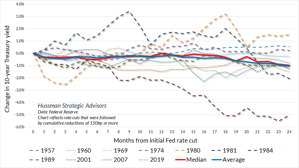
But wait. Doesn’t an expected Fed pivot make long-term bonds much more attractive? Well, we can ask this question: what is the median change in the 10-year Treasury yield in the first 12 months following a Fed pivot, in a rate-cutting cycle that takes the Fed funds rate at least 150 basis points lower? The answer is zero. The largest outliers were the 1984 pivot, the first few months of the 1980 pivot, and the roller coaster that followed the 1981 pivot, which saw Treasury yields spike initially, but eventually decline by over 2% two years later. All three of these outliers started at an initial 10-year Treasury yield of about 12%. For now, with the 10-year bond yield at 3.86%, I do believe “acceptable though slightly inadequate” is the best description I can offer, despite the prospect for lower short-term interest rates.
In our own investment discipline, we generally accept risk in bonds based on the adequacy of the yields that they provide. The chart below shows the importance of yield adequacy in navigating bonds, and reflects the benchmarks shown earlier in this section.
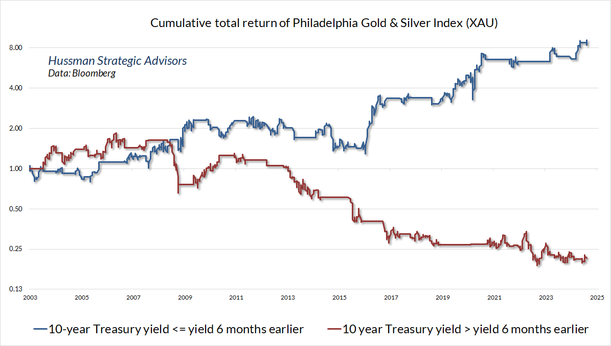
I’ve always believed that investors underestimate the extent to which precious metals can support a diversified approach to the fixed income markets. The reason is that except when inflation is very high and rising (e.g. core consumer price inflation on the order of 6% or more), we find that the main driver of returns in precious metals stocks isn’t inflation but rather the behavior of interest rates. The chart below illustrates this in data since 2003, but the same relationship holds true across history. Generally speaking, we find that the strongest return/risk profile in precious metals shares is associated with periods of falling interest rates, while the weakest outcomes are associated with periods of rising interest rates – again, unless inflation is quite high and rising.
For that reason, we often use moderate positions in precious metals shares as a complement to fixed-income securities in our bond-focused discipline, Strategic Total Return Fund (HSTRX). It doesn’t seem to be common knowledge that HSTRX has outperformed its benchmark, the Bloomberg U.S. Aggregate Index, over the past 1, 3, 5, 7, 10, 15, and 20 years, and since its inception in September 2002. As with all our work, we take value-conscious, historically-informed, full-cycle investment discipline seriously. When one diversifies a portfolio, the combination of full-cycle returns and imperfect correlation can be helpful.
Of course, that’s the intent of all our investment disciplines, including Strategic Growth Fund (HSGFX) and Strategic Allocation Fund (HSAFX). While HSGFX outperformed its benchmark, the S&P 500, with lower volatility and smaller drawdowns from its inception in July 2000 through late-May 2014, we admittedly lost our footing in the face of unprecedented zero interest rate policies. In hindsight, the “ensemble” methods we implemented following our stress-testing work after the global financial crisis encouraged a persistently bearish response to historically-reliable “limits” to speculation. We abandoned that implementation in 2021, shifting substantial focus to our key gauge of market internals, which has remained useful since we introduced it in 1998.
When one diversifies a portfolio, the combination of full-cycle returns and imperfect correlation can be helpful.
The period since January 2022, in my view, has comprised the extended top formation of the third great speculative bubble in U.S. financial history. Persistently extreme valuations and divergent internals have provided little opportunity to demonstrate the impact of our 2021 adaptations. While the enthusiasm surrounding artificial intelligence and a likely Fed pivot has fueled a palpable “fear of missing out,” the fact is that the capitalization-weighted S&P 500 has outperformed Treasury bills by less than 10% since January 2022, with nearly all of that owing to the rally of the past 4 weeks. Meanwhile, the equal-weighted S&P 500 and the Russell 2000 remain even with or behind Treasury bills for this period. I do have a concern that investors may recognize the usefulness of value-conscious, historically-informed, full-cycle investment discipline only after risk has already unfolded, as we saw after 2000-2002 and 2007-2009. With valuations still near record highs, my hope is that we provide an adequate amount of research to have confidence in that discipline, and its potential role in diversification.
Fed pivots and baby aspirin
When my wife was 4 years old, she snuck into the medicine cabinet with her 5-year old brother, and they sat happily under a tree in the backyard polishing off a bottle of orange flavored baby aspirin. Fortunately, there was not enough in the bottle, divided between them, to do any damage, and child-safety caps were introduced shortly thereafter.
The enthusiasm of investors about a likely Federal Reserve “pivot” to interest rate cuts seems a lot like that baby aspirin adventure. It’s tempting to treat the stuff as if it’s candy, but a Fed pivot is usually a signal that all is not well, and even then, the effect of the stuff is dose-dependent.
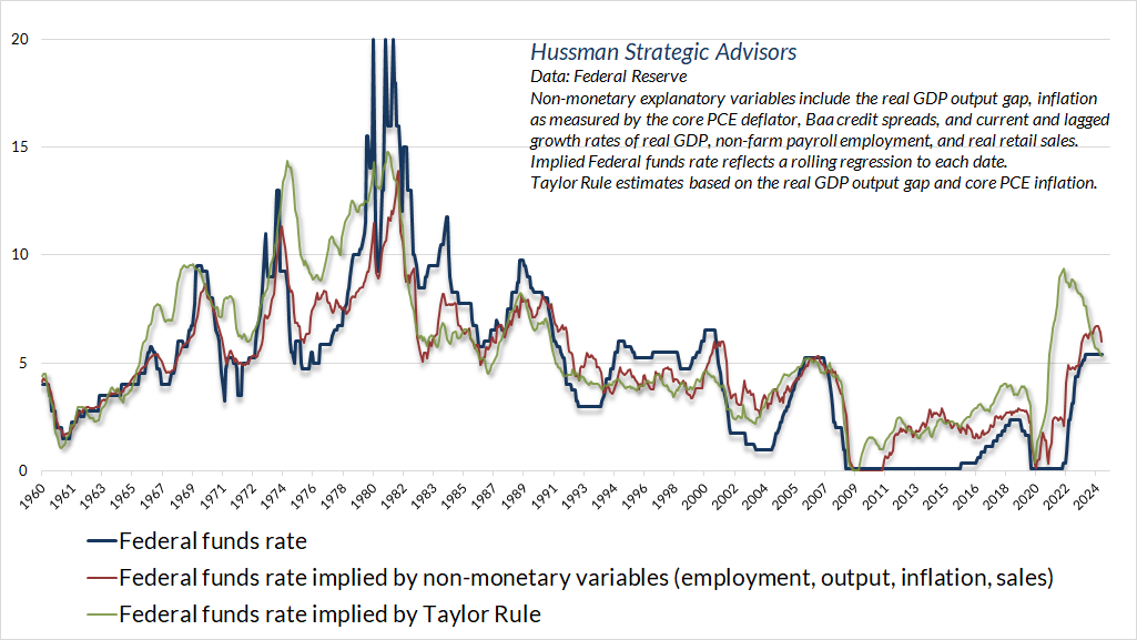
Presently, there seems to be a common perception that the Federal funds rate is sky-high and extremely tight. But that perception is actually built on anchoring bias following more than a decade of deranged zero interest rate policies. Relative to systematic benchmarks that reflect prevailing inflation, unemployment, consumer demand, the GDP output gap, and other factors, the current level of the Fed funds rate is right in line with historically run-of-the-mill levels that have described appropriate Fed policy.
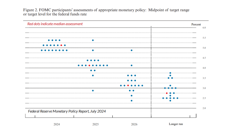
Still, given the downward trend of inflation and the modest upward trend in the rate of unemployment, it makes sense that the Fed is contemplating reductions in the Fed funds rate from the current target range of 5.25%-5.5%. Based on the latest summary of economic projections (“dot plot”) from members of the Federal Open Market Committee, the median end-of-year projections for the Federal funds rate in the coming years are 5.125% by the end of 2024, 4.125% in 2025, 3.125% in 2026, and a longer run rate of 2.75%.
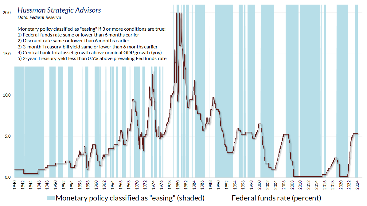
Based on prevailing trends in Treasury yields, inflation, and other factors, our view is that the current monetary policy environment is consistent with expectations of reductions in the Federal funds rate in the coming quarters. The chart below shows a simple but useful approach we use to classify easing versus tightening policy environments.
As I detailed in You’re Soaking In It, it’s tempting to imagine that Fed easing is always bullish for stocks. But the actual response of the market depends on a critical question: are investors inclined toward speculation or risk-aversion? See, when investors are inclined toward speculation (which we gauge based on uniformly favorable market internals), they treat low-interest liquidity as an inferior asset. In that environment, more liquidity, or lower interest rates on that liquidity, encourages them to try to get rid of the stuff by buying stocks and riskier assets. To say that investors are inclined to speculate essentially says that they’ve largely ruled out losses, so they tend to view risk as superior to low-interest safety.
In contrast, when investors are inclined toward risk aversion, as they were throughout 2000-2002 and 2007-2009, even persistent and aggressive Fed easing does nothing to support stocks, because safe, low-interest liquidity is viewed as a desirable asset.
As a result, we actually find that unfavorable market internals dominate monetary policy regardless of whether the Fed is easing or tightening, while favorable market internals amplify the speculative impact of easy money and disable the unfavorable impact of tight policy. The chart below shows the cumulative total return of the S&P 500 based on the status of monetary policy (based on the classification above) and market internals.
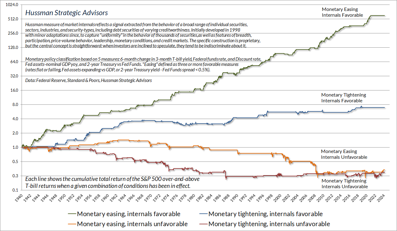
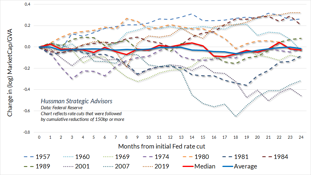
The key takeaway is that attending directly to market internals is actually more effective than attending to monetary easing or tightening. Still, given that we can expect a pivot toward lower rates in the near future, how much do valuations tend to increase, on average, in the 3, 6, 12, and 24 months following a Fed pivot?
The answer is simple. They don’t. See, Fed tightening tends to occur when the economy is running hot and the financial markets are doing quite well. The pivot tends to happen in response to increasing risk of economic weakness. As it turns out, both the median and average response of stock valuations is a decline over subsequent quarters, particularly if valuations have been elevated, as they were in 2001 and 2007. In fact, with the exception of the August 2019 pivot, where much of the subsequent advance was driven by trillions of dollars of pandemic subsidies over the following year, the only instances when valuations rose following a Fed pivot (1957, 1980, 1981, 1984) were periods when valuations started at or below historically run-of-the-mill norms.
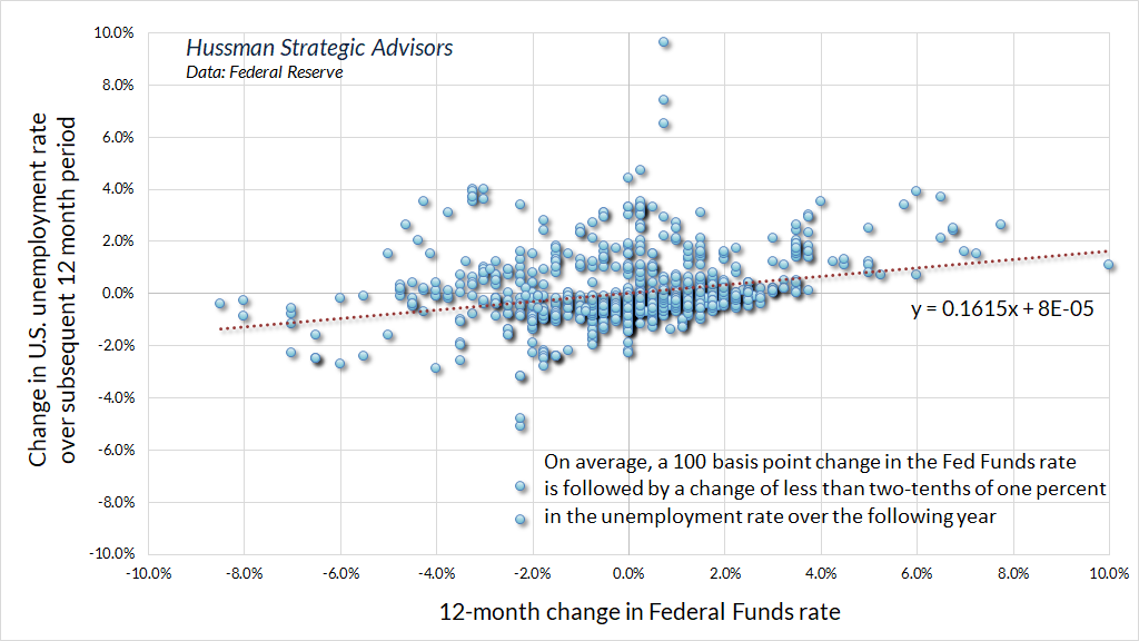
The other thing to consider about Fed rate cuts is that they’re very much like baby aspirin in the sense that their effect size on the real economy is far smaller than investors seem to imagine. Indeed, a 100 basis point cut in the Fed funds rate has historically been associated with a decline in the unemployment rate of less than two-tenths of one percent over the following year.
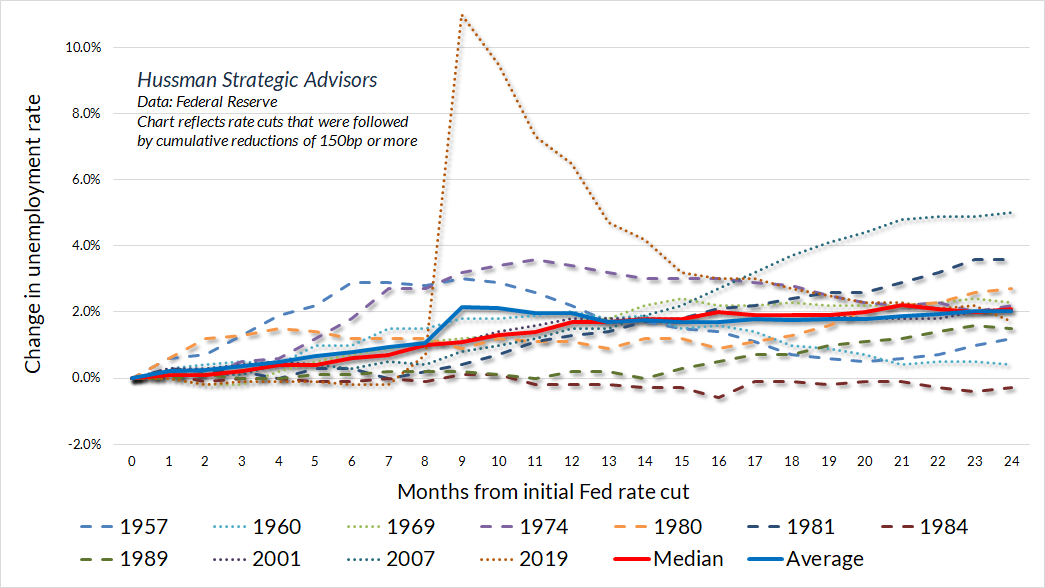
Indeed, while the Fed is accumulating its initial rate cuts, the rate of unemployment typically doesn’t decline at all. Instead, the median increase in the unemployment rate in the 12-month period following a Fed pivot is about 2%. Indeed, the only time the unemployment rate did not increase following a material Fed pivot (the initial cut of a series comprising at least 150 basis points) was the 1984 pivot, when the employment rate at the time was 7.3%, coming down from a high of 10.8%. Even in that instance, the unemployment rate remained virtually unchanged two years after the initial pivot.
Simply put, we agree that economic conditions have eased enough to make gradual reductions in the Federal funds rate reasonable. The current rate is already consistent with systematic benchmarks, but we do continue to see economic conditions hovering at the threshold of recession. We would need more evidence to expect a recession with confidence, but provided that the Fed continues to support monetary confidence by gradually shrinking its balance sheet, I don’t see much risk in modestly cutting interest rates at the same time (particularly since rate cuts would presently be accomplished simply by the Fed paying a lower interest rate to banks on their reserve balances).
The key takeaway is that attending directly to market internals is actually more effective than attending to monetary easing or tightening. Still, given that we can expect a pivot toward lower rates in the near future, how much do valuations tend to increase, on average, in the 3, 6, 12, and 24 months following a Fed pivot? The answer is simple. They don’t.
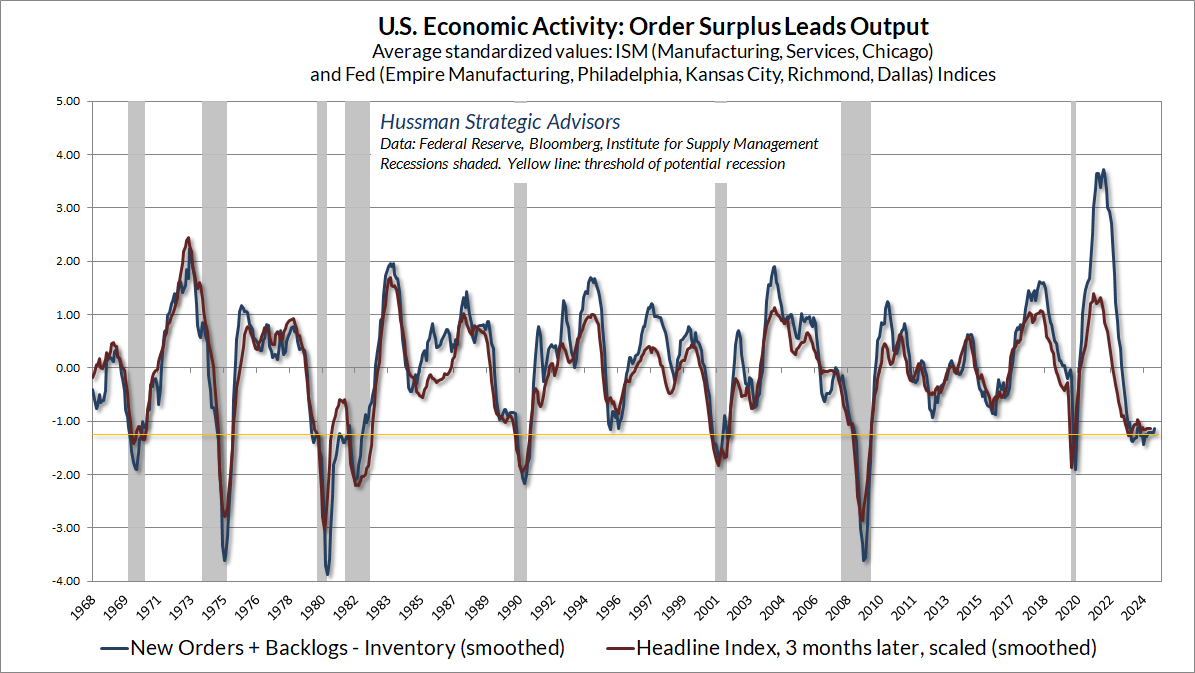
As an example of the borderline recession conditions we presently observe, the chart below shows our Order Surplus composite, which is comprised of data on new orders, order backlogs, and inventories across regional and national Fed and purchasing mangers surveys.
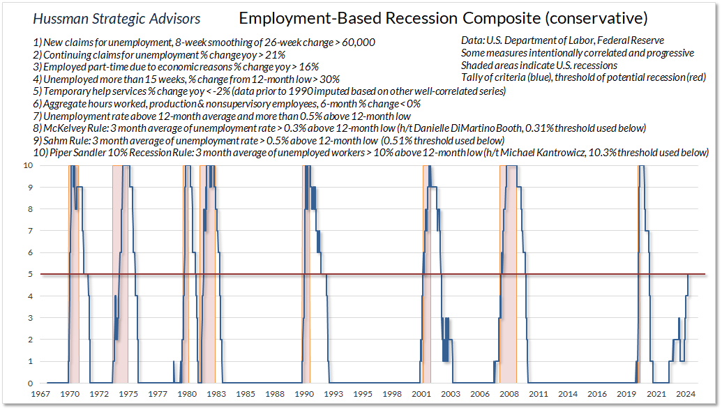
The chart below shows the conservative version of our Employment Based Recession Composite. Like other leading measures, including the Conference Board U.S. Leading Index, the data remain at thresholds that have typically defined the borderline between expansion and recession. That in itself isn’t a “recession call” – again we’d need more evidence to expect a recession with confidence, but we’re not inclined to ignore the growling underneath the surface of the economy. Fed easing would undoubtedly be an important consideration, particularly if we observe a favorable shift in market internals. In contrast, there’s little evidence to expect that a Fed pivot – amid extreme valuations, economic risk, and unfavorable internals, would be the magical pixie dust that many observers seem to imagine.
There are no sidelines
One of the persistent themes we hear is that as interest rates decline, trillions of dollars of “cash on the sidelines” will start “looking for a home” and can be expected to “pour into the stock market.”
Sweetheart, could you pass that bottle of baby aspirin?
Let’s do this again very quickly. When the Fed buys Treasury securities, it pays for them by creating its own liabilities – primarily currency (read the top line of any dollar bill), and bank reserves. Once those liabilities are created, someone has to hold them, at every moment in time, until the Fed retires those liabilities. Over the past couple of years, the Fed has reduced its balance sheet by allowing Treasury securities it holds to mature, without buying new ones. Essentially, the Treasury pays off the securities owned by the Fed with cash it receives from taxes or the sale of new Treasury securities to the public. The Fed now holds fewer Treasury securities (assets) and it gets back the base money (currency and reserves) that it created previously. The Fed now has fewer assets, and it also has fewer liabilities. That’s what’s meant by “quantitative tapering” or “shrinking the balance sheet.”
Historically, the base money created by the Fed has earned zero interest. Since people don’t want to hold stuff that bears zero interest, except for immediate liquidity like checking account balances and so forth, too much zero interest cash gets them looking for somewhere else to invest it. Their first stop is Treasury bills. Of course, when they buy a Treasury bill, the cash just goes to the seller. It doesn’t go away. Instead, the interest rate on Treasury bills will fall until investors – in aggregate – are indifferent between holding the existing supply of zero interest cash and the existing supply of Treasury bills. The larger the amount of zero interest cash as a fraction of GDP, the lower they’ll tend to drive short term interest rates.
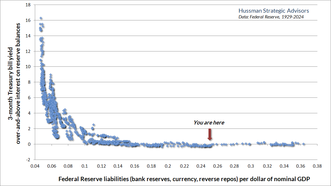
Once the amount of zero interest cash gets past about 14% of GDP, one can expect short-term interest rates to hit zero UNLESS the Fed explicitly pays interest on that cash. The interest the Fed explicitly pays to banks on the reserves it has created is, in fact, the only reason that interest rates are not zero at present, because the Fed’s balance sheet remains at a still-deranged 25% of GDP.
The chart below provides a visual, in data since 1928, on how all of this works. Notice that the vertical axis is labeled “3 month Treasury yield over-and-above interest on reserves.” Prior to quantitative easing (QE), interest on reserves didn’t exist, but again, once Fed liabilities hit about 14% of GDP, the only way to get interest rates above zero, as we’ve seen in recent years, is for the Fed to explicitly pay interest on them.
In my view, one of the contributors to the recent bout of inflation, as well as the ongoing cryptocurrency ruse (yeah), and other forms of speculation in untethered instruments, was the loss of confidence among investors that the Fed would have the discipline to control its issuance of monetary liabilities. As a fairly adamant critic of QE and zero interest rate policies, I’ve actually been impressed by the Fed’s systematic discipline over the past two years. I hope it will continue, but we’ve adapted our discipline to allow for endless bouts of deranged monetary policy if the Fed veers that direction again.
Meanwhile, keep in mind that every security that’s issued, including cash, has to be held by someone at every moment in time until it’s retired. Changing the interest rate on cash can certainly make the holder more or less eager to exchange that cash for “something” else, and that can certainly affect the price of that “something.” But the same moment a buyer puts cash “into” that something, a seller takes that cash right back “out.” The cash just changes hands.
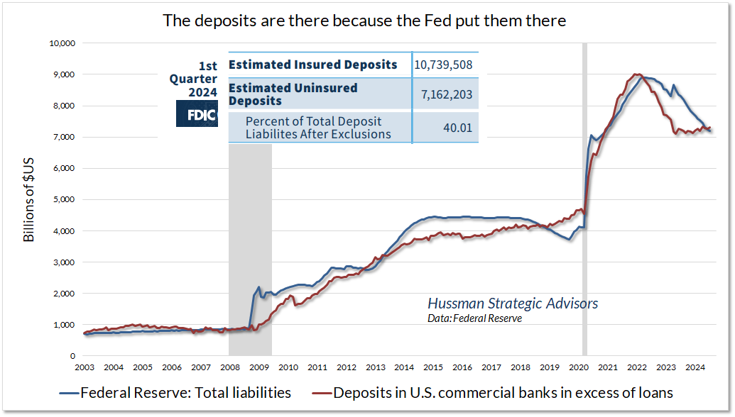
The simple fact is that the cash is there because the Fed put it there. QE means that the Fed buys bonds and pays for them with liabilities we call “base money.” It transfers that base money to the bank account of the seller, in the form of electronic credits called “reserves.” The people sitting on those bank accounts can spend the money, which then gets transferred to another bank, but the reserves stay in the banking system unless they’re withdrawn as physical currency. Most of the stuff the Fed created is still held in the banking system, mostly as uninsured deposits. They’re uninsured because the Fed created so much of the stuff that it blew past the FDIC’s limits, but someone still has to hold it. It’s going to stay there until the Fed absorbs it back by shrinking its balance sheet.
In short, there’s no such thing as cash “on the sidelines” because there are no sidelines at all. In equilibrium, every security that’s been issued must be held by someone. Period. That includes Fed liabilities like cash. The act of buying something with cash does not transform it into something other than cash. It just changes hands. Likewise, there’s no such thing as investors “rotating into” this and “out of” that. There’s no such thing as investors, as a group, “getting out of” this or “getting into” that. The dollars that come “in” are equal to the dollars that come “out.” The eagerness of investors can certainly affect the price of this or that, but in the end, every security still has to be held until it’s retired.
When a speculative bubble collapses – and I suspect this one will end like others before it – it isn’t because people take money “out” of the market. Every dollar a seller takes out is the same dollar a buyer just brought in. Prices collapse because the sellers are more eager to get out than the buyers are to get in, and a price decline is needed in order for stocks and cash to exchange hands (that’s why it’s called a stock exchange). The hypervalued market capitalization people call “wealth” simply vanishes because market capitalization is just price times shares, and the only way to get sellers and buyers to trade with each other is for the trade to happen at a lower price. With market valuations just shy of their recent record extreme, it may be helpful to seriously consider your exposure to risk, and the full-cycle losses that have resolved speculative episodes across history.
Keep Me Informed
Please enter your email address to be notified of new content, including market commentary and special updates.
Thank you for your interest in the Hussman Funds.
100% Spam-free. No list sharing. No solicitations. Opt-out anytime with one click.
By submitting this form, you consent to receive news and commentary, at no cost, from Hussman Strategic Advisors, News & Commentary, Cincinnati OH, 45246. https://www.hussmanfunds.com. You can revoke your consent to receive emails at any time by clicking the unsubscribe link at the bottom of every email. Emails are serviced by Constant Contact.
The foregoing comments represent the general investment analysis and economic views of the Advisor, and are provided solely for the purpose of information, instruction and discourse.
Prospectuses for the Hussman Strategic Growth Fund, the Hussman Strategic Total Return Fund, and the Hussman Strategic Allocation Fund, as well as Fund reports and other information, are available by clicking Prospectus & Reports under “The Funds” menu button on any page of this website.
The S&P 500 Index is a commonly recognized, capitalization-weighted index of 500 widely-held equity securities, designed to measure broad U.S. equity performance. The Bloomberg U.S. Aggregate Bond Index is made up of the Bloomberg U.S. Government/Corporate Bond Index, Mortgage-Backed Securities Index, and Asset-Backed Securities Index, including securities that are of investment grade quality or better, have at least one year to maturity, and have an outstanding par value of at least $100 million. The Bloomberg US EQ:FI 60:40 Index is designed to measure cross-asset market performance in the U.S. The index rebalances monthly to 60% equities and 40% fixed income. The equity and fixed income allocation is represented by Bloomberg U.S. Large Cap Index and Bloomberg U.S. Aggregate Index. You cannot invest directly in an index.
Estimates of prospective return and risk for equities, bonds, and other financial markets are forward-looking statements based the analysis and reasonable beliefs of Hussman Strategic Advisors. They are not a guarantee of future performance, and are not indicative of the prospective returns of any of the Hussman Funds. Actual returns may differ substantially from the estimates provided. Estimates of prospective long-term returns for the S&P 500 reflect our standard valuation methodology, focusing on the relationship between current market prices and earnings, dividends and other fundamentals, adjusted for variability over the economic cycle. Further details relating to MarketCap/GVA (the ratio of nonfinancial market capitalization to gross-value added, including estimated foreign revenues) and our Margin-Adjusted P/E (MAPE) can be found in the Market Comment Archive under the Knowledge Center tab of this website. MarketCap/GVA: Hussman 05/18/15. MAPE: Hussman 05/05/14, Hussman 09/04/17.