
Slimming Down a Top-Heavy Market

William Hester, CFA
Senior Research Analyst
Hussman Strategic Advisors
January 2025
The strong performance of large-cap stocks over the past decade has left the market exceptionally top-heavy. By some measures, stock market capitalization has never been more concentrated among a handful of large stocks as today. The closest parallel to this level of concentration in modern market data is the late-1990’s technology bubble, reaching its peak in 2000. The current extreme is now comparable to that bubble peak, both in terms of the performance gap between the largest stocks in the S&P 500 index relative to the rest of the index, and in the lopsidedness of their market concentration.
One way to measure the persistence of outperformance by the largest stocks is to compare a market-value-weighted index of large stocks to its equal-weighted counterpart over a 10-year period. By 1999, a market-value-weighted index comprising the largest 30% of stocks (which is highly correlated to the actual S&P 500 Index) had outperformed its equal-weighted version by 2.6% annually over the prior decade. Such outperformance is unusual. In fact, capitalization-weighted portfolios have historically lagged equal-weighted portfolios by an average of 0.5% annually over 10-year periods. That 2.6% annual excess return marked a record for large-stock outperformance at the time. But in June of 2024 that record fell. The market-value version of this large-stock portfolio had outperformed its equal-weighted counterpart by 2.9% a year since 2014.
The second characteristic is the lopsidedness of the final push to the peak of market concentration. This can be measured by the percentage of stocks outperforming the index itself. The smaller the number of stocks outperforming the index in a given year, the more pronounced the outperformance of the largest stocks tends to be. Since 1990, an average of 52% of stocks in the S&P 500 have lagged the index in a typical year. In 1998, as market concentration approached its peak, 72% of stocks lagged the overall index. By 1999, the final full calendar year of the bull market, 68% of stocks in the index lagged behind the overall index.
These consecutive years of more than two-thirds of stocks lagging the index marked the end of the late 1990’s era of market concentration. In the years since, the percentage of stocks lagging the index has averaged just 48%, and has not exceeded 63%—until now. In 2023, 71% of stocks lagged the index, and last year, 72% did the same. This marks the only other instance in data since 1990 when more than two-thirds of stocks lagged the index for two consecutive calendar years.
Reaching levels of both persistence and lopsidedness of large-stock outperformance similar to those seen at the end of the last major peak in market concentration doesn’t guarantee an imminent end to the current dominance of large stocks. But it does suggest that the relative performance has become unusually overextended.
A major shift in relative performance could bring both opportunities and risks. The potential opportunity, often highlighted, is that an index of smaller stocks may achieve higher relative returns in the decade that follows. The risks typically associated with the unwinding of concentrated markets are less frequently discussed. Considering both the opportunities and the risks may be useful prior to an eventual unwinding of the current record market concentration.
In the discussion below, I’ve divided stock performance measures into two groups. The first includes the largest 10 percent of stocks that trade on the NYSE, AMEX, or Nasdaq. This portfolio currently contains the 180 stocks with the largest market values. At this portfolio size, the returns aren’t overly influenced by just a handful of stocks, but the portfolios do represent the performance of the largest stocks relative to the remaining actively traded universe. Currently, this group’s cutoff is approximately $60 billion in market capitalization and above, with an average market cap of $240 billion. The second group includes the next 50 percent of stocks by market value. This portfolio currently contains about 1,000 stocks, and has average market cap of $11.5 billion. The smallest 40 percent of stocks by market value – currently about 2,500 stocks – have been left out of the analysis. With these cutoffs and groups I’m hoping to frame the discussion not as big companies versus small ones. But rather mega-cap companies versus non-mega-cap companies. I’ll refer to these portfolios as the Mega Cap portfolio and Non-Mega Cap portfolio.
To put the current level of market concentration into perspective, the blue line in the chart below shows the size of the Mega Cap portfolio as a percent of all stocks (the data for the portfolio metrics in the research below are generously provided on professor Ken French’s website).
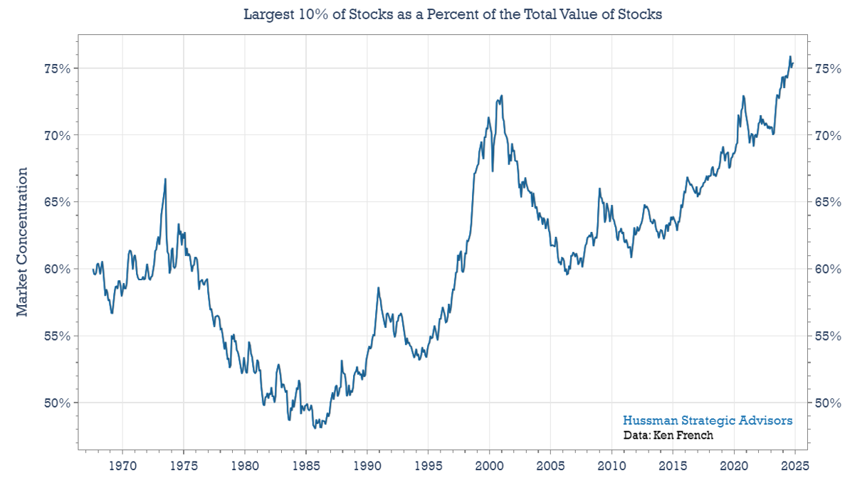
Over the past five and a half decades, there have been two previous peaks in market concentration: one in 1973 and another in 2000. Today, market concentration has reached an all-time high – and while not shown here, is even higher than levels seen in the early 1930’s. Given these extremes, here are five ideas to consider regarding the opportunities and risks that tend to follow periods of extreme market concentration.
Non-Mega Cap Stocks Will Likely Outperform Mega Cap Stocks Over the Next Decade
In the chart above, a rising blue line indicates that the largest stocks are outperforming the rest of the market. You’ll notice long cycles where Mega Cap stocks outperform Non-Mega Cap stocks, followed by periods when this trend reverses. This cyclical pattern is common when categorizing stocks by various characteristics. For example, there are multi-year periods when value stocks outperform growth stocks or when international stocks outperform domestic ones—until these trends eventually reverse. The current trend of large U.S. growth stocks outperforming has persisted for over a decade.
Reversals in performance can be surprising in their intensity. In the graph below, the horizontal axis represents the initial level of market concentration, while the vertical axis shows the subsequent 10-year excess return of the Non-Mega Cap portfolio versus the Mega Cap portfolio. Each marker shows the spread between the annualized 10-year returns of the two portfolios. Markers above the zero line indicate 10-year periods where Non-Mega Cap stocks outperformed Mega Cap stocks. Markers below the zero line represent periods – such as the last decade – when Mega-Cap stocks outperformed Non-Mega Cap stocks.
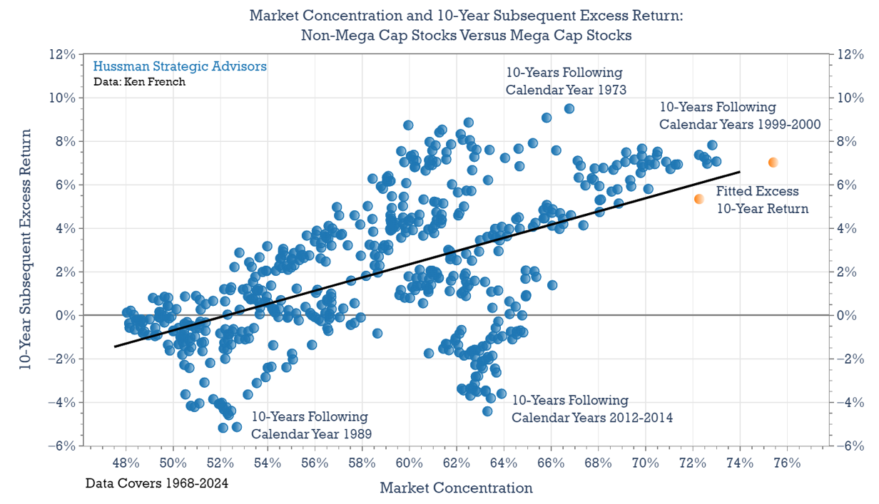
There are a few interesting features to highlight in this graph. First, it’s far more common for Non-Mega Cap portfolios to outperform Mega Cap portfolios. Since 1968, Mega Cap stocks have outperformed Non-Mega Cap stocks in only 25% of 10-year periods. This outperformance primarily occurred in the 10-year periods ending in 1990, 1999, and recent years. In all other periods, Non-Mega Cap portfolios were the top performers over 10-year spans. If Non-Mega Cap stocks were to outperform over the next decade, it wouldn’t be unusual. Rather, it would signal a return to a more typical pattern of relative performance.
I’ve added annotations to several sections of the chart to help better describe the data. In the upper right section, you’ll find periods following market peaks in 1999-2000 and in 1973. In these cases, Non-Mega Cap stocks outperformed Mega Cap stocks by wide margins. In the lower left area, I’ve highlighted markers representing the strong outperformance of Mega Cap stocks from 1989 through the peak of the bubble in 1999. Finally, near the bottom center of the chart, the markers show the net returns ending in the past few years. From this perspective, recent returns stand out as outliers given the somewhat elevated levels of market concentration that already existed at the beginning of these periods.
Another feature to highlight in this chart is the extent that Non-Mega Cap stocks could significantly outperform Mega Cap stocks, given current levels of market concentration. The fitted trendline suggests that, based on typical historical outcomes, Non-Mega Cap stocks could reasonably outperform Mega Cap stocks by about 7 percentage points annually over the next decade. To put that figure into perspective, that would roughly double the outperformance that Mega Cap stocks have enjoyed relative to Non-Mega Cap stock during the last ten years.
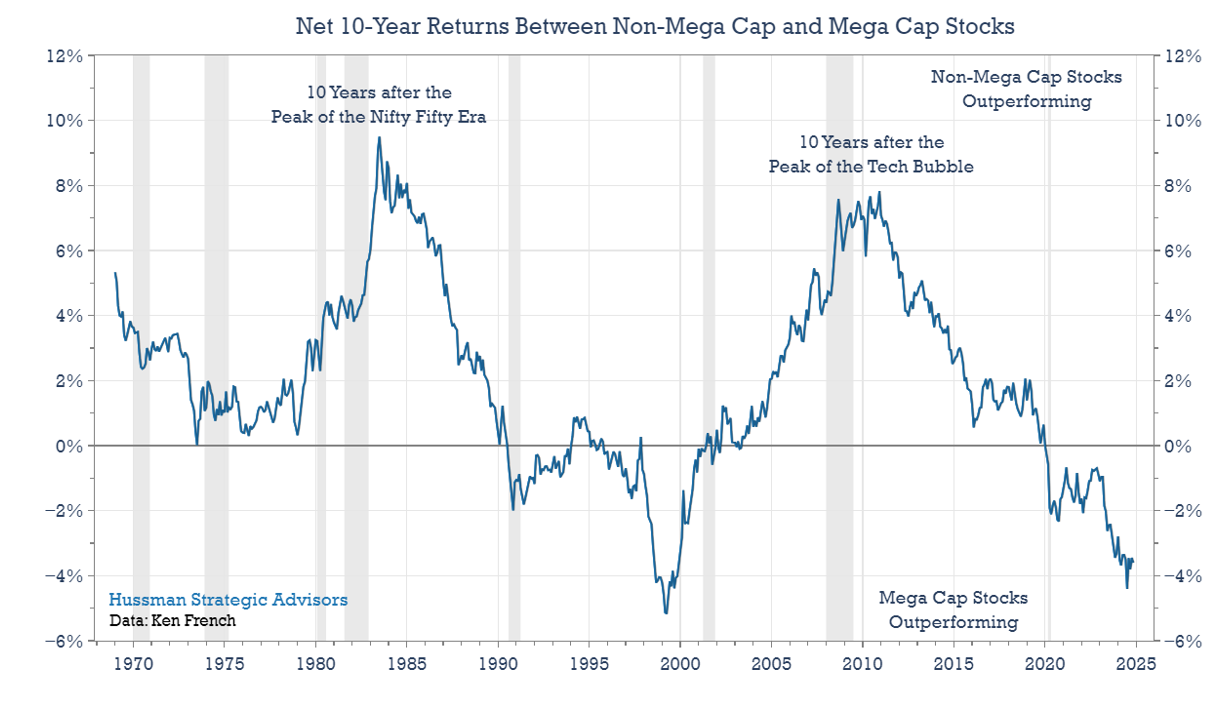
A 7% performance gap in favor of Non-Mega Cap stocks may seem high, but it is not unprecedented. The chart below shows this 10-year performance gap over time. Following the peak of the “Nifty Fifty” stocks in 1973 and technology stocks in 1999, 10-year excess returns in favor of Non-Mega Cap stocks reached approximately 8%. Similarly, peak levels of market concentration in the early 1930s and 1954 were followed by excess returns of about 6%. An annualized excess return of 7% over the next decade would align closely with the historical returns observed during periods starting from high market concentration levels.
Non-Mega Cap Stock Outperformance May Not be as Inviting as it Sounds
Keep in mind that the two previous charts show relative performance – the 10-year total returns of Non-Mega Cap stocks over-and-above the total returns of Mega Cap stocks. But relative returns can be positive even if absolute returns are weak or negative. This is an important caveat to the suggestion that Non-Mega Cap stocks will outperform Mega Cap stocks over the next decade. Following periods of high market concentration both Mega Cap and Non-Mega Cap stocks have historically tended to have either very low returns, or losses, over the next decade. The broader market often struggles to perform well when the largest stocks begin those periods at steep valuation extremes—which is a common consequence of a highly concentrated market.
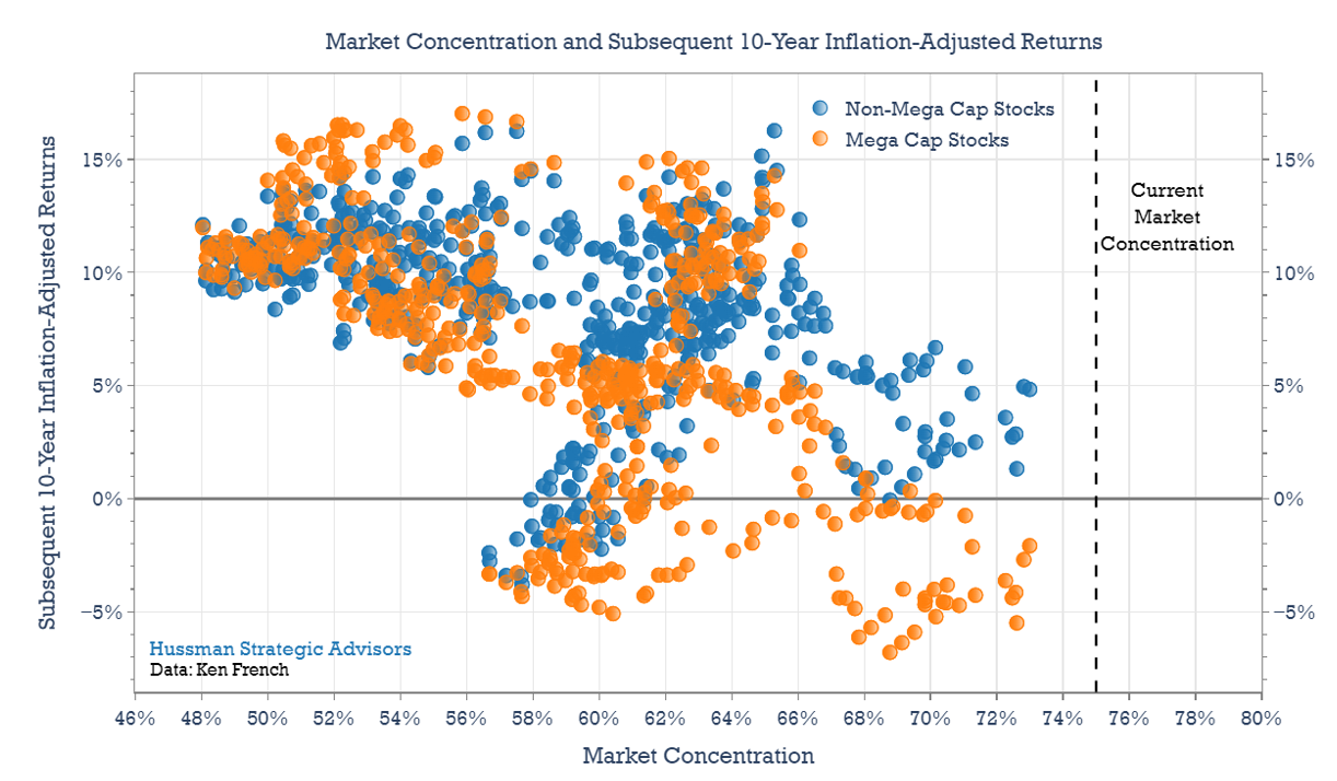
The graph below offers a look at actual returns instead of relative returns. Specifically, the horizontal axis shows the initial level of Mega-Cap concentration. The orange markers show subsequent 10-year real (inflation-adjusted) returns for Mega Cap stocks, and highlight the fact that periods of high market concentration tend to be followed by lower returns among large companies, particularly on an inflation-adjusted basis. (Inflation-adjusted returns are used here because the 1973 market peak was followed by high inflation while the 2000 peak was followed by more moderate inflation).
The blue markers show the 10-year real returns of the Non-Mega Cap portfolios following various levels of market concentration. The right side of the chart shows the returns following periods of high levels of market concentration. It’s clear that Non-Mega Cap stocks (blue) consistently outperform Mega Cap stocks (orange) following periods of extreme concentration. Unfortunately, they do so by compounding at low single digit annual returns, while Mega Cap stocks typically lose value over the same period. This tendency suggests a potentially mixed outlook ahead for Non-Mega Cap stocks. While they appear likely to outperform Mega Cap stocks over the next decade, this outperformance may be achieved through only modest annual returns.
We might expect the outlook to be different if current levels of valuations were materially different from the 2000 market peak. But they aren’t. In fact, by some measures that are well-correlated with subsequent market returns across history, valuations today are worse. To illustrate this, the chart below compares the price-to-sales ratios of the large-cap S&P 500, mid-cap S&P 400, and small-cap S&P 600 Indexes. These indexes track the top 1500 stocks by size. The dashed lines show where the price-to-sales ratio peaked for each index in 2000. Today, valuations have surpassed those peak levels across all three indexes, with the gap between the S&P 500 and the mid-cap and small-cap indexes noticeably wider than in 2000.
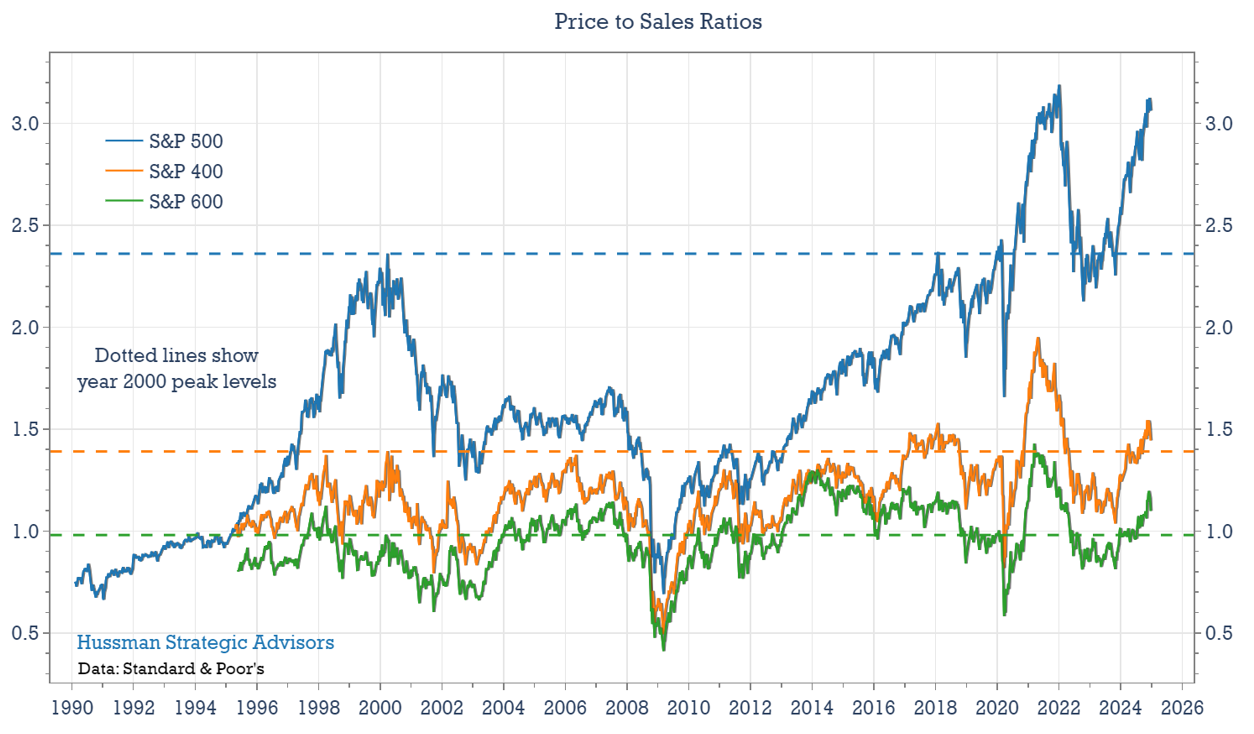
Non-Mega Cap stocks may enjoy higher relative returns than their Mega-Cap counterparts over the coming decade, but their absolute returns could be far less compelling.
Market Concentration Maps to Overall Stock Market Valuation, Which Maps to Subsequent Drawdowns
Following periods of high market concentration, stock market returns are not only low over the subsequent decade, on average, they also tend to be highly volatile. These outcomes – lower long-term returns and deeper drawdowns – are closely linked to elevated levels of market valuations, which often accompany high levels of market concentration. By the time that a small group of stocks dominates the market’s total value, those dominant stocks are also typically overvalued relative to the rest of the market. The graph below illustrates this relationship by plotting market concentration against the average of the standardized values of the CAPE Ratio and the Market Cap to GDP ratio.
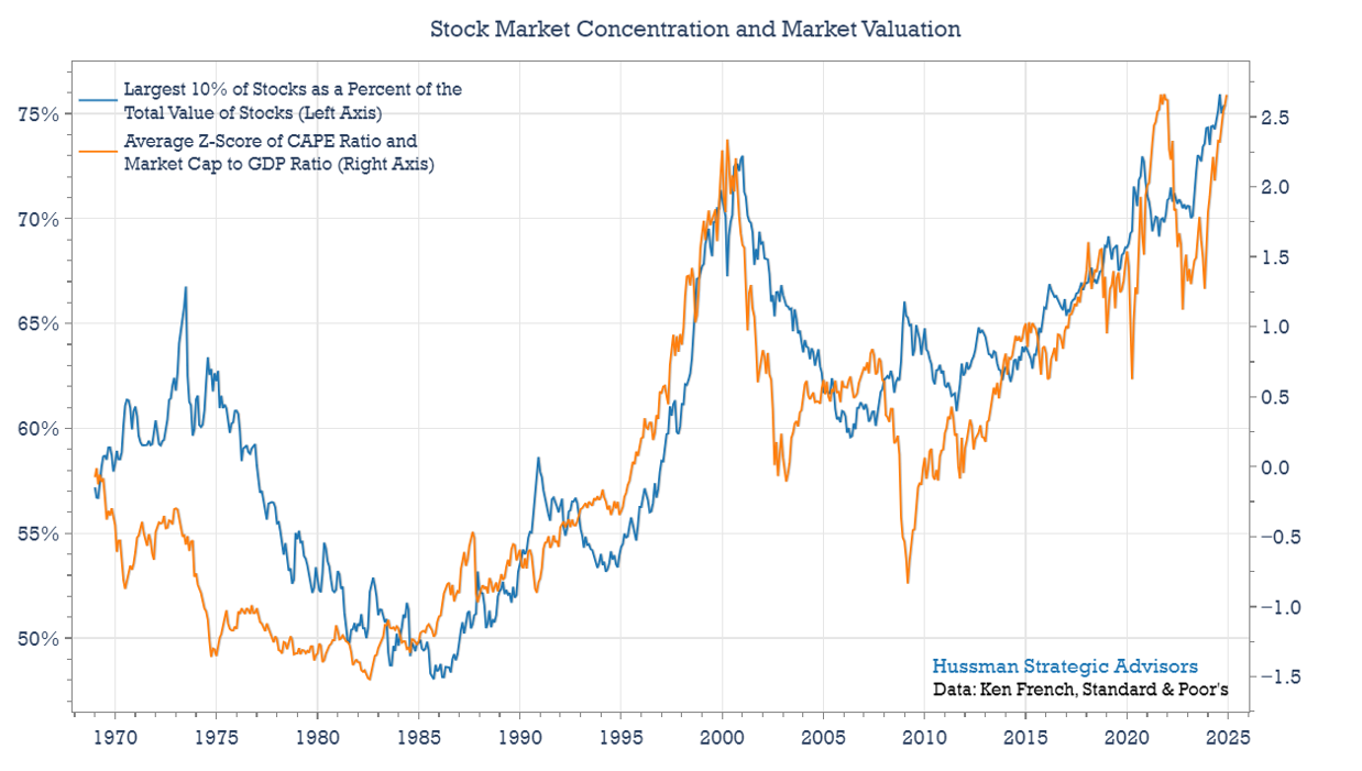
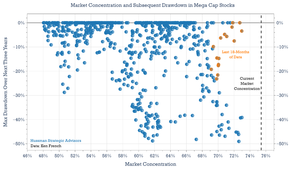
Because of this correlation between valuations and market concentration, we can expect both high valuations and high market concentration to have similar consequences. For example, the graph below shows the relationship between high levels of market concentration and subsequent drawdowns. The horizontal axis shows market concentration and the vertical axis shows their deepest drawdown over the subsequent three years. Not surprisingly, higher levels of market concentration generally correlate with deeper subsequent losses. I’ve highlighted the three-year periods that have ended within the past year and a half. As Mega-Cap stocks have advanced to their current extreme concentrations, the drawdowns during this recent period have been less severe compared to those observed when similar levels of market concentration were reached in the past. Of course, this may just be unfinished business.
Could Non-Mega Cap stocks fare better than Mega Cap stocks during periods of market decline over the next decade, given that they are not as overvalued? It’s possible. Non-Mega Cap stocks demonstrated greater resilience during the 2000–2002 bear market, with a maximum drawdown of just under 40%, compared to a 51% loss for Mega Cap stocks – not to mention a drawdown of more than 82% in the technology-heavy Nasdaq 100 Index. However, the broader historical record suggests Non-Mega Cap stocks can also be riskier than Mega Cap stocks in the midst of a panic. In most major drawdowns, Non-Mega Cap stocks declined by at least as much as Mega Cap stocks and often times more (an average of 8 percentage points more in severe bear markets, outside of the 2000-2002 time period).
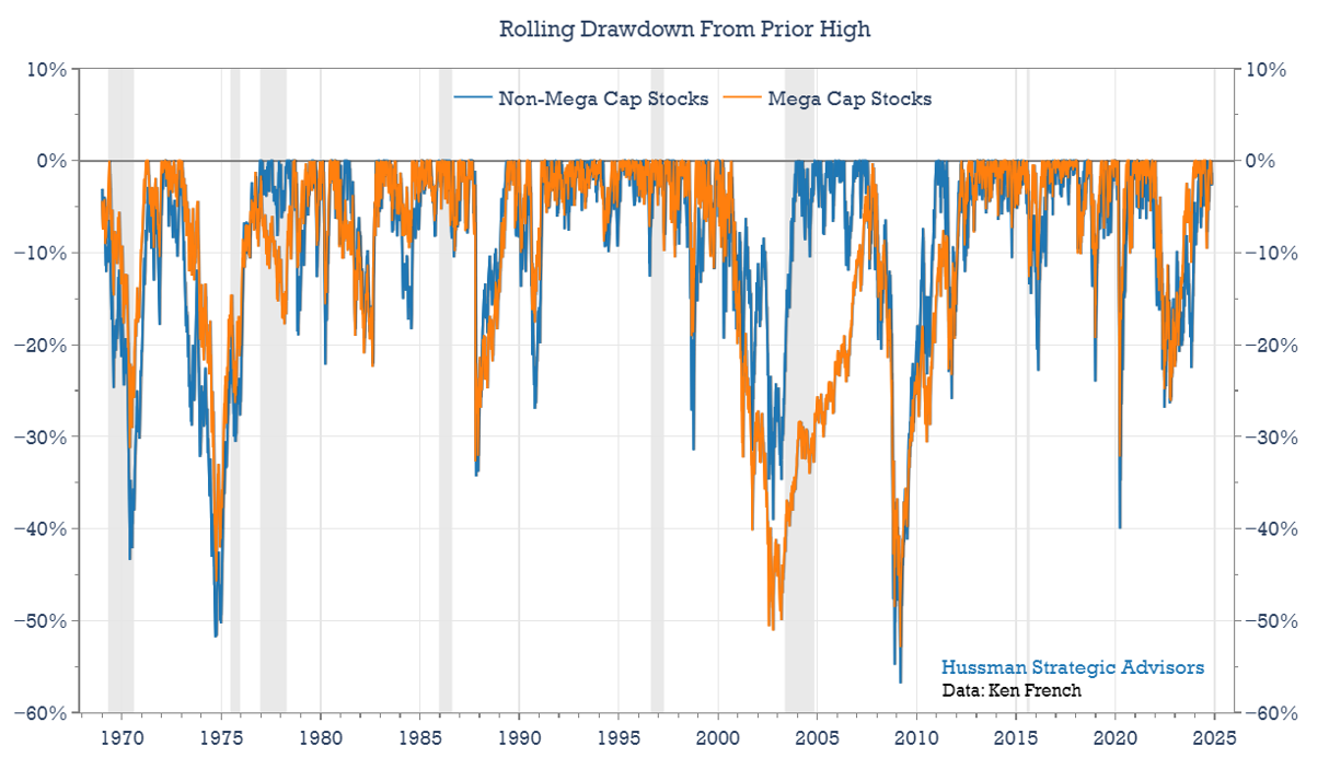
Because market concentration tends to move hand-in-hand with the overall level of stock market valuations, periods of high concentration are typically followed by both higher volatility and significant drawdowns for both Mega Cap and Non-Mega Cap stocks.
As John Hussman has often observed, stocks don’t lose their “beta” just because they are less overvalued than the general market. In fact, investors often become indiscriminate during a panic. For unhedged investment portfolios, the benefit of diversification – even into value stocks or international stocks – tends to be smallest at exactly the point where investors need it most.
What Rising Concentration Gives, Falling Concentration Takes Away
Investing in an index fund during a period of increasing market concentration is a double-edged sword. As the largest stocks advance and gain higher market concentration, they make an increasing contribution to subsequent gains in the index. That’s been pretty clear watching the disproportionate contributions the “Magnificent 7” (Alphabet, Amazon, Apple, Microsoft, Meta, NVIDIA, and Tesla) have made to overall S&P 500 Index returns the last few years. But it’s important to remember that this effect works in reverse when the market turns lower. Bear markets tend to decline more sharply than bull markets rise, and because the largest stocks start from a substantial share of the index at market peaks, their negative impact during a downturn is typically amplified.
During the 2022 market selloff, the Technology, Communication Services, and Consumer Discretionary sectors, although they made up just half of the market, contributed about two-thirds of the percentage decline in the S&P 500 Index. During the 2000-2002 bear market, those sectors also contributed about two-thirds of the stock markets 50% decline. The graph below offers another perspective of the negative impacts that large, overpriced sectors can play in bear markets. The blue line shows the total return performance of the S&P 500, from March 2000 when the technology sector made up 35% of the index (only slightly higher than today’s 33%) through October 2006, when the S&P 500 finally recovered its interim losses. At its deepest loss, the S&P 500 was down 47%. The orange line – which is the S&P 500 ex-Technology Index – fell just 29% during this time period. The Technology Index fell 82%.
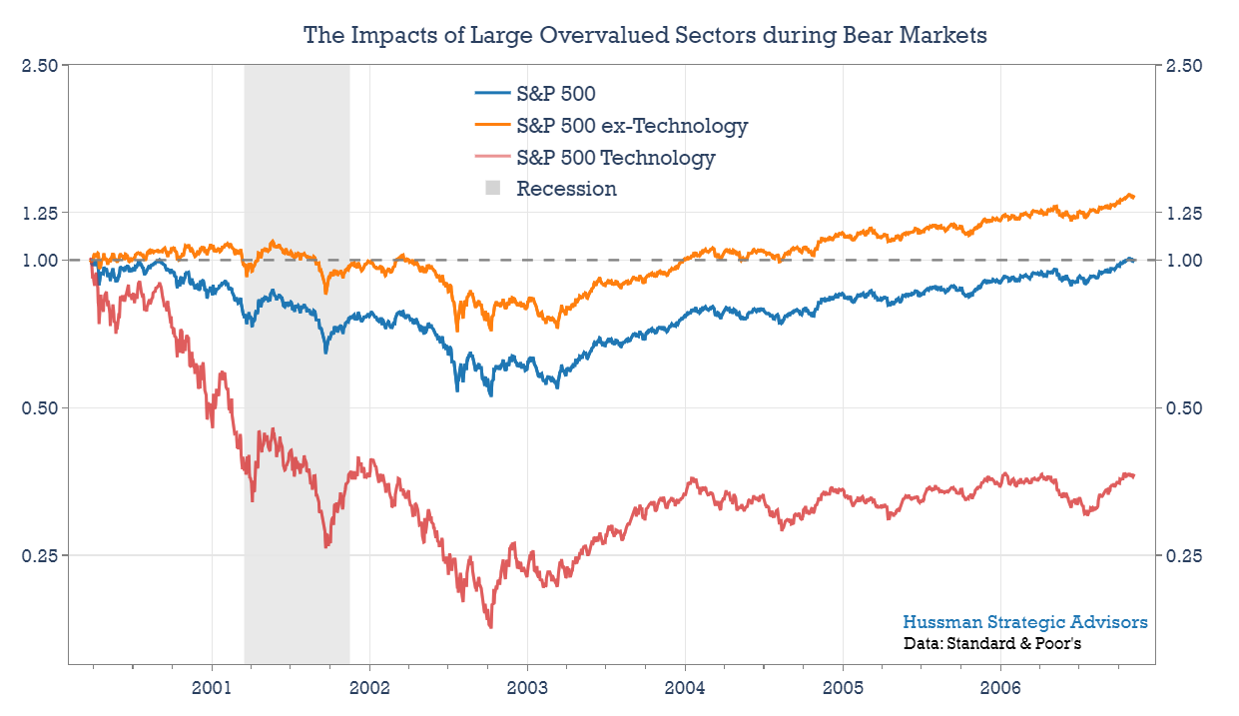
How long did it take for the total return of the S&P 500 Index – dominated by top performing technology stocks over the last decade – to surpass the S&P 500 ex-Technology Index since the peak of the market in 2000? It hasn’t. It’s close, and the overall S&P 500 index inched ahead of the ex-Technology index in July, but has since fallen back behind.
Even 25 years after the technology bubble, the S&P 500 has not been able to overcome the detrimental effects of an overvalued sector making up more than a third of the index. The Technology sector has clearly provided excellent opportunities in the interim, particularly following their 82% loss between 2000 and 2002. But at current concentrations, investors may be at risk of making a mistake similar to that of 2000.
It might seem almost heretical to suggest that these technology stocks could decline by 50 percent during the height of an Artificial Intelligence boom. But that outcome shouldn’t be ruled out, even if investors remain optimistic about the technology sector’s future growth. The graph below shows the price-to-sales ratio for the S&P 500 Technology Index. A key argument for higher price-to-sales ratios is that companies are becoming more profitable. Companies with higher trailing and expected profit margins should trade at higher price-to-sales multiples. This is a topic that we’ve discussed in depth in other commentary. John Hussman has written a detailed analysis of trailing profit margins here. And I’ve written about the optimism built into projected profit margins here. Together, the analysis suggests that further improvements in profit margins will be more challenging without a return to record-low interest rates and that expected profit margins don’t properly consider the drivers that have raised them to what we view as impermanent extremes.
A common argument today is that technology stocks have become permanently more valuable to investors, and should trade at higher price multiples. If so, then where should the price-to-sales multiple be reset? If we believed that current profit margins were permanent, we could bump up the price-to-sales estimate that way.
[Geek’s Note – JPH: The calculation for the overall S&P 500 index would be this: Over the past decade, the S&P 500 profit margin on actual GAAP earnings has averaged 9.5%, compared with a long-term historical norm of 6%. The historical norm for the S&P 500 price-to-sales ratio is less than 1.0. It recently hit a record extreme of more than 3.1. Ignoring the fact that both real and nominal GDP and corporate revenues have grown slower, not faster, than historical norms over the past 10-20 years, assuming that profit margins remain permanently elevated, we could “reset” the norm of the S&P 500 price-to-sales ratio no higher than 1.0*(0.095/0.06) = 1.58. Even these heroic assumptions leave current index valuations at nearly twice the adjusted norm].The price-to-sales ratio of the Technology sector averaged about 1.0 prior to 1996, and averaged 2.5 in the period from the 2000 bubble peak through 2013. The price-to-sales ratio for the sector recently hit 9.9 at the end of 2024. The Consumer Discretionary sector, which includes some of the Magnificent 7 stocks, shows similar extremes relative to historical valuation norms.
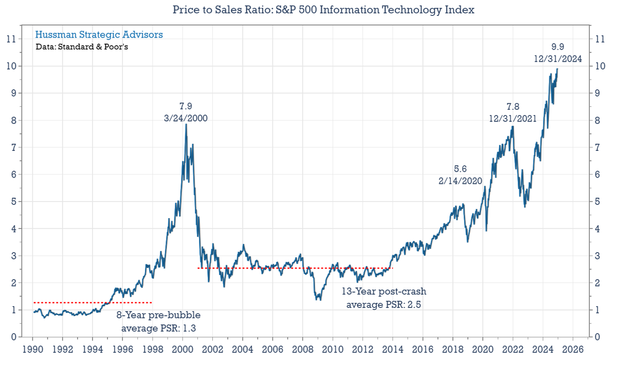
The unwinding of the current high levels of market concentration appears likely to follow a similar pattern to the periods that followed extremes in 1973 and 2000, during which the most overvalued stocks underperformed the broader index, driven in part by contracting valuation multiples.
An Overlooked Benefit to Overvalued Mega-Cap Stocks
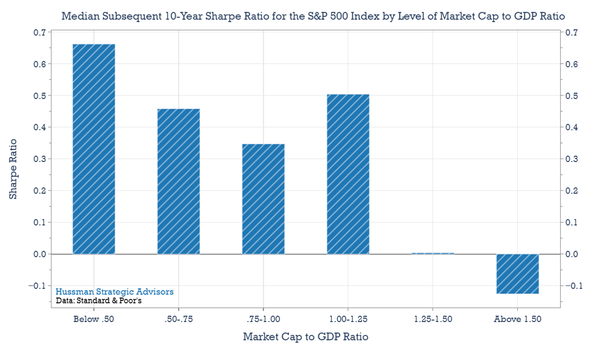
There are two key ways that market valuations can provide valuable insights into what the next decade might hold. First, high valuation levels are typically associated with lower investment returns over the subsequent decade. Second, elevated valuations often coincide with higher volatility, leading to lower Sharpe Ratios (returns per unit of risk).
The chart below illustrates the median 10-year Sharpe Ratio for the S&P 500 Index following various levels of the Market Cap to GDP ratio. Lower valuation levels have generally resulted in higher Sharpe Ratios, while higher valuation levels have produced lower Sharpe Ratios. The slightly elevated median Sharpe Ratio for the 1.00-1.25 range of Market Cap-to-GDP reflects, in part, the strong returns of recent years, fueled by record-high price multiples. Even so, the data clearly demonstrate that varying levels of market valuation—especially at the extremes— provide information about returns and risks that are likely to follow.
In addition to providing information about overall return/risk prospects for the S&P 500, overvalued Mega-Cap stocks provide useful guidance to long-term investors about sector-weighting.
We’ve identified two key characteristics that tend to follow peaks in market concentration:
- Non-Mega Cap stocks typically outperform Mega Cap stocks.
- Both Mega Cap and Non-Mega Cap stocks experience heightened levels of volatility and drawdown.
These characteristics are a consequence of the fact that lopsided levels of Mega-Cap market concentration tend to align with peak market valuations. These extremes are usually followed by lower subsequent returns and higher levels of volatility.
Taken together, these characteristics – losses for Mega-Cap stocks, strong relative returns but low absolute returns for Non Mega-Cap stocks, and lots of market volatility – offer a potentially overlooked benefit for long-term investors choosing how to structure their portfolios. Specifically, the long-term risk-adjusted performance of a hedged portfolio – hedging Non-Mega Cap stocks with Mega Cap stocks – has been higher than an unhedged portfolio of Non-Mega Cap stocks alone. Since this kind of pointed long-short strategy can have significant short-term swings, it shouldn’t be considered as a stand-alone investment approach. But the analysis below suggests that the general principle shouldn’t be overlooked as investors structure their portfolios.
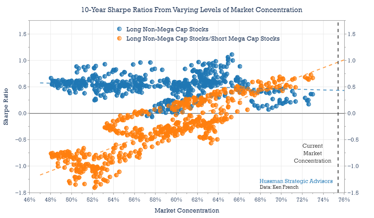
In the graph below, the vertical axis shows Sharpe Ratios over rolling 10-year periods. The horizontal axis shows the starting level of market concentration. Each marker shows the subsequent 10-year Sharpe Ratio (investment returns per unit of volatility) that followed different levels of market concentration.
The blue markers show the Sharpe Ratios for the Non-Mega Cap stock portfolios. On average the Sharpe Ratio is 0.47 for this group. These Non-Mega Cap portfolios historically have had a slightly higher average Sharpe Ratio than Mega-Cap portfolios. This isn’t too surprising, because we’ve already seen that Non-Mega Cap portfolios typically have enjoyed average higher 10-year returns with similar levels of volatility.
One interesting feature of this chart is that the Sharpe Ratios of the Non-Mega Cap portfolios (blue) are noticeably lower following periods of high market concentration. High, lopsided concentration of Mega-Cap stocks does nothing to protect Non-Mega Cap stocks from lower returns or higher volatility. It’s difficult for an unhedged stock portfolio to avoid the consequences that typically follow over-valued markets, no matter where investors try to hide.
The orange markers in the chart below show the annualized 10-year Sharpe Ratios that result by simply subtracting the monthly return of Mega Cap stocks from Non-Mega Cap stocks, and taking the cumulative performance of those net returns. The key point here is that once market concentration reaches extreme levels, Sharpe Ratios are actually boosted by hedging the market risk of Non-Mega Cap stocks with a short position in Mega Cap stocks, even over periods as long as a decade. Again, because of the potential volatility involved, this analysis is not meant to suggest a stand-alone investment approach.
In sum, we know that stock market valuations hold important information about likely investment returns over the following 10-12 year horizon. The analysis above shows that investors can draw additional useful information from the level of Mega-Cap concentration. Highly concentrated markets suggest the need to carefully adjust sector weightings, favoring equity investments beyond the universe of Mega-Cap stocks, and even capitalizing on the volatility and lower expected returns of the largest stocks. Following extremes in market concentration, these strategies can help enhance the return/risk profiles of investment portfolios for very long periods of time.
Keep Me Informed
Please enter your email address to be notified of new content, including market commentary and special updates.
Thank you for your interest in the Hussman Funds.
100% Spam-free. No list sharing. No solicitations. Opt-out anytime with one click.
By submitting this form, you consent to receive news and commentary, at no cost, from Hussman Strategic Advisors, News & Commentary, Cincinnati OH, 45246. https://www.hussmanfunds.com. You can revoke your consent to receive emails at any time by clicking the unsubscribe link at the bottom of every email. Emails are serviced by Constant Contact.
The foregoing comments represent the general investment analysis and economic views of the Advisor, and are provided solely for the purpose of information, instruction and discourse.
Prospectuses for the Hussman Strategic Market Cycle Fund, the Hussman Strategic Total Return Fund, and the Hussman Strategic Allocation Fund, as well as Fund reports and other information, are available by clicking Prospectus & Reports under “The Funds” menu button on any page of this website.
The S&P 500 Index is a commonly recognized, capitalization-weighted index of 500 widely-held equity securities, designed to measure broad U.S. equity performance. The Bloomberg U.S. Aggregate Bond Index is made up of the Bloomberg U.S. Government/Corporate Bond Index, Mortgage-Backed Securities Index, and Asset-Backed Securities Index, including securities that are of investment grade quality or better, have at least one year to maturity, and have an outstanding par value of at least $100 million. The Bloomberg US EQ:FI 60:40 Index is designed to measure cross-asset market performance in the U.S. The index rebalances monthly to 60% equities and 40% fixed income. The equity and fixed income allocation is represented by Bloomberg U.S. Large Cap Index and Bloomberg U.S. Aggregate Index. You cannot invest directly in an index.
Estimates of prospective return and risk for equities, bonds, and other financial markets are forward-looking statements based the analysis and reasonable beliefs of Hussman Strategic Advisors. They are not a guarantee of future performance, and are not indicative of the prospective returns of any of the Hussman Funds. Actual returns may differ substantially from the estimates provided. Estimates of prospective long-term returns for the S&P 500 reflect our standard valuation methodology, focusing on the relationship between current market prices and earnings, dividends and other fundamentals, adjusted for variability over the economic cycle. Further details relating to MarketCap/GVA (the ratio of nonfinancial market capitalization to gross-value added, including estimated foreign revenues) and our Margin-Adjusted P/E (MAPE) can be found in the Market Comment Archive under the Knowledge Center tab of this website. MarketCap/GVA: Hussman 05/18/15. MAPE: Hussman 05/05/14, Hussman 09/04/17.

