

You’re Soaking in It


John P. Hussman, Ph.D.
President, Hussman Investment Trust
July 2024
Are we the only sane people on the planet? Let’s not be shy: regardless of short-term action, we ultimately expect the S&P 500 to fall by more than half, and the Nasdaq by two-thirds. Shorter term, we have another story. We can say without hesitation that this market looks similar in nearly every respect to the 1929, 1968 and 1972 tops, but the finer interpretation becomes less clear. Is the current market like October 1929, or is it more like, April? If it’s like April, then we’ve got a few months of advances ahead of us. Is the current market like the November 1968 top? If so, the ‘new era’ stocks didn’t start crashing until about June of 1969. Once again, it makes a difference in the short term.
Frankly, we can’t say that this market is characterized only by the exact peaks of 1929, 1968 and 1972. In all three cases, there was a long and pronounced divergence between the broad market and the popular averages for months. The 1929 and 1972 instances were primarily blue-chip frenzies, while the late 1960’s instance was a performance stock frenzy. This time we have both, so we’ll probably see tops on two dates – one in the S&P and one in the Nasdaq. The difficult part of all this is the short term. I have no answer for that, except that in each prior instance, every scrap of short-term gain was wiped out in the eventual downturn.
A final note, I don’t write like this because I want to go ‘on the record’ before a plunge. I write like this because I know the terrible financial difficulty and utter shock that investors felt following declines which originated in similar conditions. Some of my more seasoned subscribers also lived through the 1969-70 and 1973-74 plunges, and have related the pain of buying respectable stocks on a 20-30% dip, only to watch their portfolio cut in half from there. When people watch the Nasdaq, there is a real pressure to chase performance. It can really seem like defensiveness is an enemy, and speculation is a friend. And again, the same was true in the late 1960’s, when McGeorge Bundy of the Ford Foundation directed the managers of university endowments to become more aggressive: ‘We have the preliminary impression that over the long run, caution has cost our colleges and universities much more than imprudence or excessive risk-taking’. In the plunge that followed, that preliminary impression turned out to be horribly incorrect.”
– John P. Hussman, Ph.D., February 9, 2000
The bubble peak a few weeks later was followed by a 50% loss in the S&P 500 Index, a 78% loss in the Nasdaq Composite Index, and an 83% loss in the tech-heavy Nasdaq 100 Index.
On Tuesday, July 16, our most reliable gauge of U.S. stock market valuations hit the steepest extreme in U.S. financial history. We cannot, and do not, assert that this places a “limit” on speculation – even the previous January 2022 peak slightly exceeded the high of 1929. In our investment discipline, valuations are not enough. The uniformity or divergence of market internals is critically important (particularly following our 2021 adaptations), and we also attend to syndromes of extremely overextended market conditions. Our discipline does not rely on forecasts, scenarios, or projections of market action. Instead, we try to align our investment stance with observable, measurable market conditions as they change over the market cycle. Still, there’s a very rare set of market conditions extreme enough to deserve a “warning.” As Madge said in the old Palmolive dish soap commercials, “you’re soaking in it.”
I generally try to avoid near term forecasts of market direction. The predictable amount of market return over a one-week period is overwhelmed by short-term volatility, and forecasts based on longer time horizons implicitly assume that the Market Climate we identify will not change over the forecast period. Given my general avoidance of forecasts, there are very few situations when I would state my views about the market as a ‘warning.’ Unfortunately, in contrast to more general Market Climates that we observe from week to week, the current set of conditions provides no historical examples when stocks have followed with decent returns. Every single instance has been a disaster. We can’t rule out the possibility that investors will adopt a fresh willingness to speculate (which we would observe through an improvement in market internals). Such speculation might prolong the current advance modestly, but even this would not substantially alter the risks that have ultimately been associated with overvalued, overbought, overbullish conditions.
– John P. Hussman, Ph.D., Warning – Examine All Risk Exposures, October 15, 2007
Please Note: As our long-term followers are aware, having admirably navigated decades of market cycles since the early-1980’s, including repeated bubbles and collapses, we encountered unusual difficulty amid unprecedented monetary and fiscal recklessness during the recent bubble. A detailed narrative of that difficulty, the “ensemble methods” that were central to it, our resulting adaptations, and exactly what we abandoned in 2021, can be found the second section of the June comment You Can Ring My Bell. As I noted last month, my hope is that this discussion will offer some confidence, at a point where confidence in our work may serve you and your clients particularly well.
Valuation review
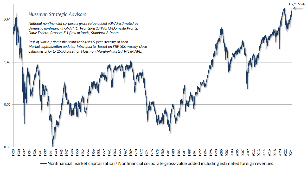
The chart below shows our most reliable valuation measure, based on its correlation with actual subsequent S&P 500 total returns in market cycles across history, in data since 1928. The blue line shows the market capitalization of U.S. nonfinancial equities as a ratio to their gross value-added, including our estimate of foreign revenues. MarketCap/GVA now stands above both the 1929 and 2022 extremes, and is also easily above the 2000 and 2007 peaks.
The chart below shows the relationship between MarketCap/GVA and actual subsequent 12-year S&P 500 average annual nominal total returns, in data since 1928. Notice that there is a “cloud” of outliers above the more general scatter. As I’ve noted before, those outliers are invariably points where valuations at the end of the 12-year period stood at bubble extremes. For example, 12-year total returns in the period from 1988 to 2000 were higher than one would have expected based on 1988 valuations, because 2000 represented a bubble peak. Likewise, total returns in the period from 2009-2021 were even higher than one would have expected based on 2009 valuations, because 2021 valuations were so extreme. Needless to say, if a horizon begins at bubble valuations, it is only possible to generate such an outlier if valuations at the end of the 12-year horizon are similarly extreme.
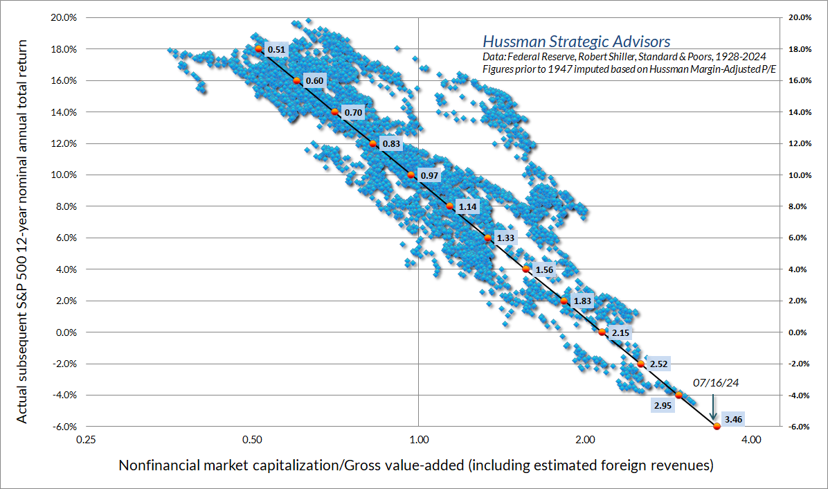
There is no question that investors increasingly disregard valuations during speculative episodes, to the point where valuations are typically dismissed altogether by the peak of a bubble, in preference for passive, price-insensitive speculation (one dare not call it “investing.”) The unfortunate consequence is that market participants come to completely forget the arithmetic that links valuations, cash flows, and actual subsequent returns.
See, a good valuation measure isn’t just some arbitrary ratio of price to “something.” A good valuation measure is shorthand for a proper discounted cash flow analysis. As I detailed in The Structural Drivers of Investment Returns, by far the most important property of your denominator is to be both “smooth” and “representative of long-term cash flows.” Those are the features that make our most reliable valuation measures both well-behaved and meaningful.
The chart below emphasizes the link between a good valuation measure and a proper discounted cash flow analysis. The red line in the chart below is our Margin-Adjusted P/E ratio (MAPE). The blue line reflects the history of actual per-share dividends thrown off by the S&P 500 index since 1900. At each point, the red line shows the ratio of the S&P 500 Index to the present discounted value of actual subsequent dividends, using a fixed 10% annual discount rate.
A few notes will be helpful here. In the analysis below, dividends beyond 2024 are estimated using a 4.5% growth rate, consistent with the actual growth of S&P 500 revenues and nominal GDP over the past 10, 20, and 30 years. The further you go back in history, the impact of that specific growth assumption becomes vanishingly small. The 10% discount rate is arbitrary, and we could use other figures just as easily, but 10% is roughly the historical average, and consistent with what investors often view as a “typical” long-term return for stocks.
The reason we use a fixed discount rate in this chart, rather than varying it over time, is that the resulting valuation measure has a very straightforward interpretation. When the ratio of the S&P 500 to the present value of discounted dividends is 1.0 (shown by the horizontal line in teal), it means that the S&P 500 at that point was priced at a level where subsequent cash flows were, by definition, adequate to produce 10% long-term total returns. Valuations above 1.0, by definition, are associated with likely long-term returns averaging less than 10% annually, while valuations below 1.0, by definition, are associated with likely long-term returns averaging more than 10% annually.
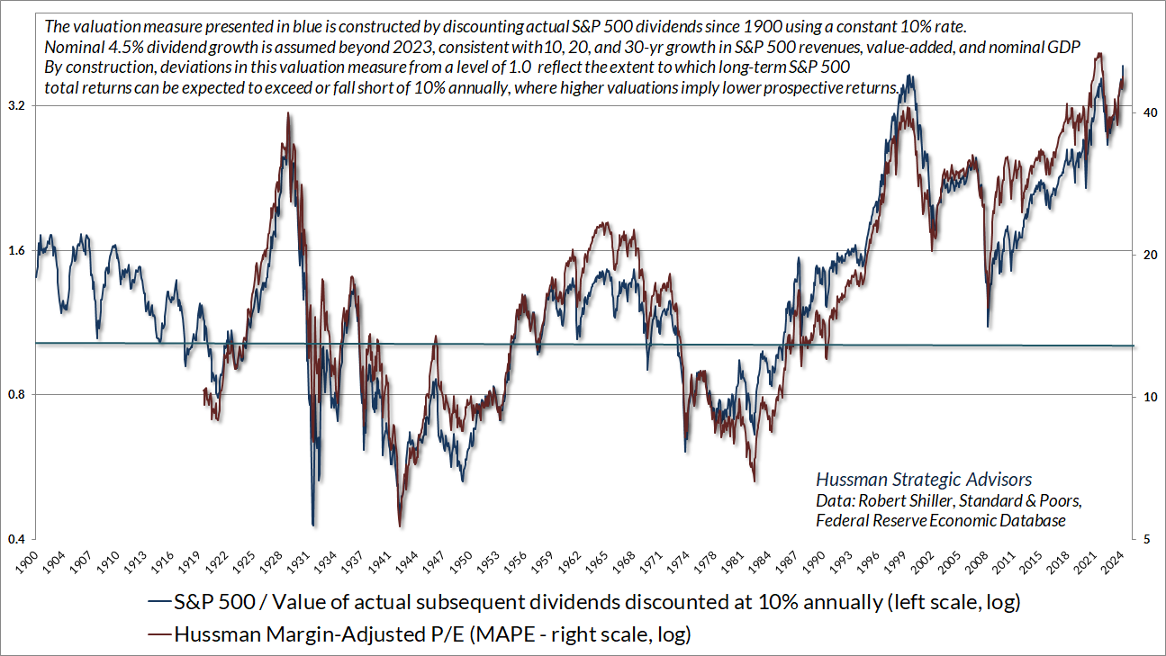
I can’t emphasize enough that stocks are not claims to next year’s earnings. They are claims to a very, very long-term stream of future cash flows that must be delivered to investors over time. A good valuation multiple is nothing but shorthand for a proper discounted cash flow analysis. That’s why good valuation multiples produce these beautiful log-linear scatters when they are plotted against actual subsequent market returns, particularly on horizons of about 10-12 years.
It’s easy to show that if the ratio of price-to-fundamentals remains fixed forever, investors can expect total returns equal to the long-term average growth rate of fundamentals, plus the dividend yield. In the chart above, given the current S&P 500 dividend yield of 1.3%, and assuming nominal growth of 4.5% annually, current prices would imply long-term nominal S&P 500 total returns on the order of 5.8% annually – provided valuations never retreat from current extremes.
The problem is that even valuations at the 2020 low, while still far above historical norms, were just 54% of current levels. If the S&P 500 was simply to touch that same level of valuations a decade from today, average annual total returns would be reduced by the annualized retreat in valuations. So the estimated average nominal total return over the coming 10 years would be (1.045)*(0.54)^(1/10)-1+0.013 = -0.4% annually.
One might think the whole chart above is preposterous, because both of those valuation measures have been above the teal line since 1990. Then again, the total return of the S&P 500 since December 31, 1990 has averaged 10.9%, and even that return has relied on achieving the highest valuations in history. The S&P 500 would have to lose a quarter of its value to bring that figure down to 10%, and of course, our most reliable measures suggest far deeper potential losses. As I’ve often emphasized, elevated valuations don’t mean that stocks have to lose value. They only mean that long-term returns are likely to be lower than run-of-the-mill historical norms. The more extreme the valuations, the greater the likely shortfall.
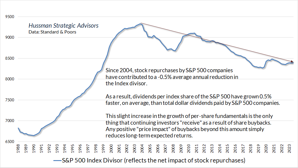
A quick note on stock buybacks. Share repurchases by corporations are often treated as an addition to dividends, as if the buybacks have directly returned capital to shareholders. That’s not quite how buybacks work. Think about it. When a company buys back its shares, do you as an investor get some sort of cash payment? No – only if you’re the shareholder who sells. Assuming the company executes a net buyback (buybacks over and above new issuance, share-based compensation, and new debt), what shareholders actually “get” is a reduction in shares outstanding, which increases the amount of per-share fundamentals that they will enjoy in the future. Given any amount of total revenues, earnings or dividends, a net buyback produces a little bit of “growth” in the per-share fundamentals that continuing investors enjoy.
Notably, the divisor of the S&P 500 index is adjusted to reflect the impact of buybacks. So we can directly examine how much impact buybacks have had on per-share growth in S&P 500 fundamentals over the past two decades. The answer is that, since 2004, buybacks have contributed to a contraction in the S&P 500 divisor amounting to about 0.5% annually, which in turn has resulted in additional growth of about 0.5% annually in per-share fundamentals. For purposes of the discounted cash flow analysis above, we’ve used actual index dividends, which include the impact of buybacks.
While our MarketCap/GVA and MAPE remain our most reliable valuation measures, they’re certainly not alone in their assessment of current extremes. Even if one takes record profit margins at face-value, and assumes that Wall Street’s rather aggressive estimates for year-ahead (forward) operating earnings are correct, the S&P 500 price-to-forward operating earnings multiple is at levels only previously observed surrounding the 2000 bubble peak and the more recent 2022 peak.
Though “forward operating earnings” estimates only became popular on Wall Street in the 1990’s, and weren’t even available prior to the 1980’s, the S&P 500 forward operating P/E has a reasonably high correlation with the Shiller cyclically-adjusted P/E (CAPE). The two valuation measures scale differently, but we can still use this relationship to get a rough estimate of what the forward operating P/E would likely have been across history. The horizontal green line shows the current level.
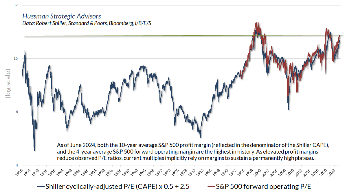
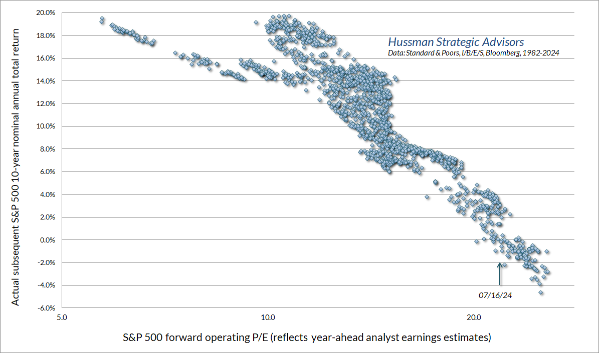
While we don’t have a century of history for the forward operating P/E, as we do for other reliable measures, the chart below shows the relationship between the forward P/E and actual subsequent 10-year S&P 500 nominal total returns, in data since 1980. Even taking margins and Wall Street estimates at face value, the associated 10-year return estimate is close to zero, and at best in the low single-digits.
All of this contributes to a rather severe prospect for potential market losses over the completion of this cycle. There’s no assurance that valuations will ever touch their run-of-the-mill historical norms again, but it’s worth considering that they’ve typically done just that.
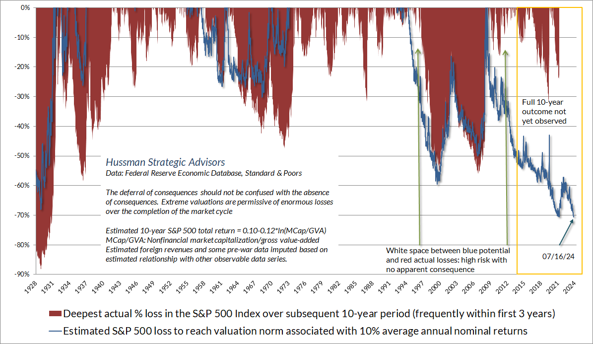
The chart below is a variant of one we’ve shown in the past. The blue line shows the amount by which the S&P 500 would have to decline, at each point in history, to reach the valuation norms that we associate with 10% nominal annual expected S&P 500 total returns. The red shading shows the deepest drawdown loss in the S&P 500 over the following 10-year period. These losses often occurred within the first 3 years. The yellow rectangle is shown because we don’t yet actually know the maximum drawdown loss for points less than 10-years ago.
As of July 16, 2024, the S&P 500 would have to fall by just over 70% to reach what have historically been run-of-the-mill valuation norms. As a reminder of how the arithmetic works, a 70% loss amounts to a 50% market loss, followed by an additional loss of 40% of what remains. Nothing in our investment discipline contemplates a loss of either magnitude, but suffice it to say that history advises against ruling it out.
Amid the drumbeat of “new era” assertions about transformative technology, unlimited market advances, expanding profit margins, and the irrelevance of valuations – all themes that are uncomfortably familiar to anyone who has studied the history of speculative bubbles and collapses – it’s worth pointing out a few wrinkles in the story.
As I noted last month, the argument is not to dismiss the idea that technological change can produce a “new era” in economic activity, but rather, that the whole history of U.S. economic growth is made of no other substance than the constant introduction of “new eras.” The most dynamic layer of the economy is constantly regenerating in new forms. Again and again, the early profitability and growth of the most glamourous companies is subsequently eroded by the “creative destruction” of market expansion, competition, and even newer innovations. As Joseph Schumpeter wrote a century ago, this process is the “essential fact” of an entrepreneurial economy.
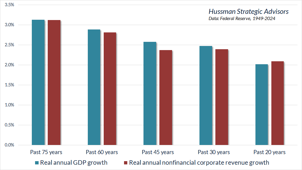
Yet despite the rise and dominance of the internet, smartphones, advanced semiconductors, social media, and process efficiencies driven by technology, real U.S. GDP growth and real U.S. corporate revenues have grown slower, not faster, over the past 20 years than during the past 30, 45, 60, and 75 years.
It’s also worth noting that real “structural” GDP growth (growth driven by U.S. labor force growth and trend productivity, excluding “cyclical” fluctuations due to changes in unemployment) stands at only about 2% annually, well below real growth before 1970, declining over time, and up only slightly from pandemic lows.
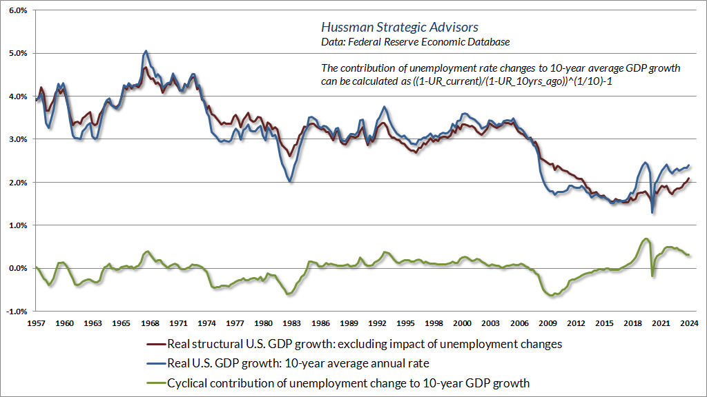
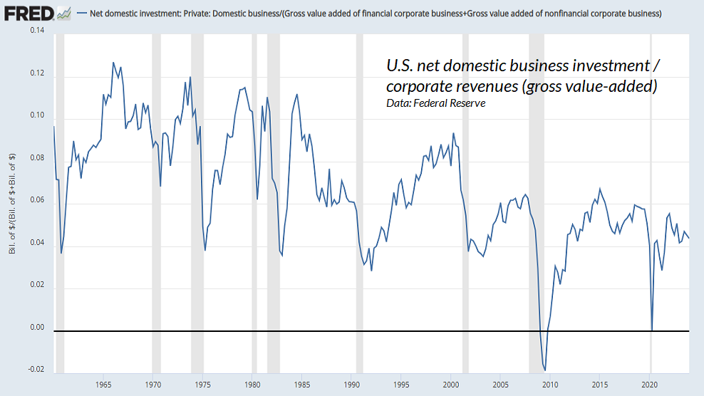
Structural growth has slowed progressively in recent decades both because U.S. demographic labor force growth has slowed, and because cycle after cycle of speculative malinvestment – encouraged by cheap money – has left us with an economy that generates progressively less net domestic investment in each cycle, as a share of corporate revenues and GDP. Despite all the fanciful noise about technological innovation unleashing untold growth, an economy that prioritizes financial speculation over productive investment ultimately cannot produce the long-term cash flows that justify that speculation.
As for corporate profitability, it bears repeating that nonfinancial U.S. corporate profits – before interest and taxes – have maintained a steady relationship with revenues for decades. Profit margins before interest and taxes haven’t changed materially in 75 years. All of the expansion in profit margins is attributable to lower taxes and interest expenses as a share of revenues.
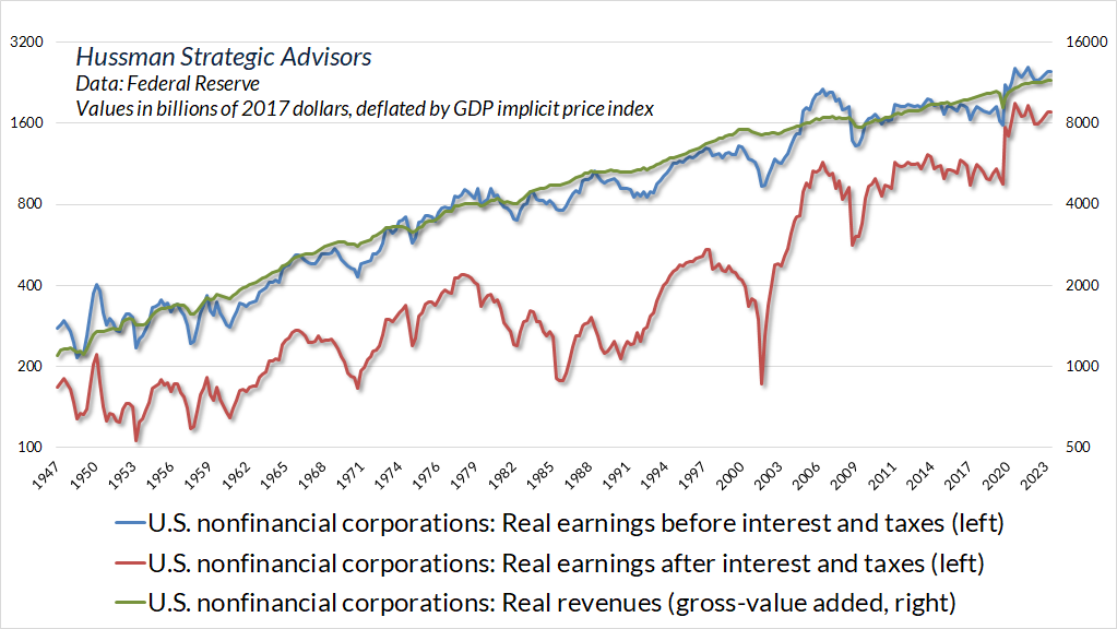
On the tax front, most of the benefit of corporate tax reductions on after-tax margins was already in place by 1981. Since then, marginal tax rates may have declined, but effective taxes – particularly the amount of taxes paid as a share of corporate revenues – have been trendless.
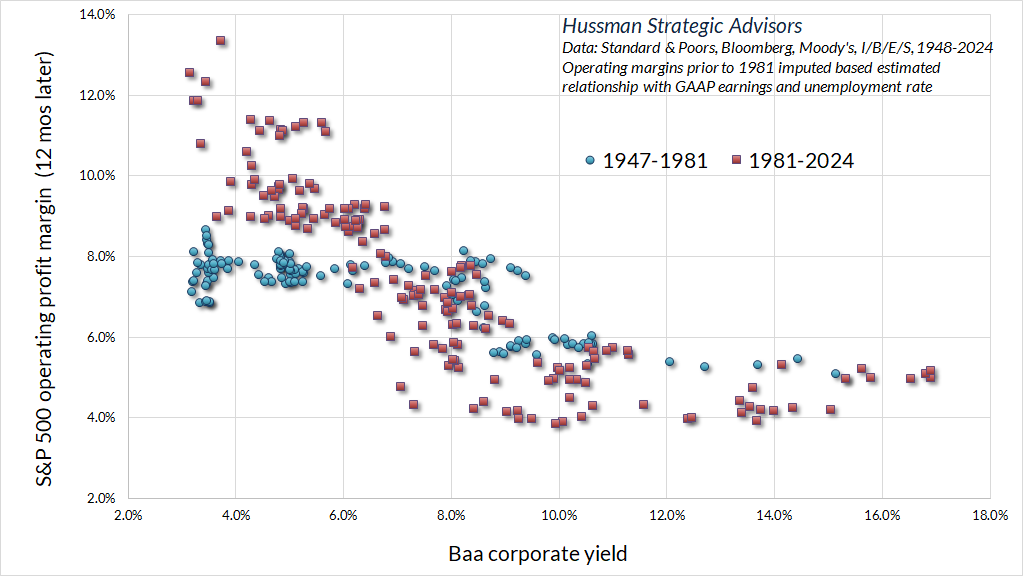
This leaves the long period of falling inflation and interest rates since the 1980’s as the primary driver of expansion in corporate profit margins. Following a massive wave of corporate refinancing in 2020 and 2021, my impression is that current profit margins do not yet broadly reflect the increase in the level of interest rates since the lows of the pandemic. The chart below shows the relationship between Baa corporate yields and S&P 500 operating profit margins over time. The red scatter (data since 1981) is steeper largely because debt levels have been higher in this period.
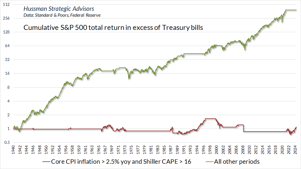
With regard to inflation, it’s often assumed that persistent inflation would naturally and directly be accompanied by higher stock prices over time. On that front, investors should remember that the CPI tripled from 1968-1982. Over the same period, the S&P 500 index fell from 108 to 102. Valuations are far more extreme today than in 1968. While there’s little question that hyperinflation would result in rising nominal earnings and stock prices, the historical fact is that the impact of high inflation on nominal fundamentals typically finds its way into rising stock prices only after valuations have collapsed to historically normal or depressed levels. At present, investors would need a several-fold increase in the CPI for the positive impact of inflation on nominal fundamentals to dominate extreme valuations.
Indeed, the S&P 500 has made no historical progress at all, relative to Treasury bills, in periods where inflation was higher than even 2.5% annually and the Shiller cyclically-adjusted P/E (CAPE) was above a run-of-the-mill multiple of 16 (it’s currently near 35). Whatever reputation stocks have as an “inflation hedge” has been earned during periods of below-average valuations, modest inflation, or both.
One can certainly assume that average future inflation will be above 2% annually, which added to 2% real structural GDP growth could produce nominal growth beyond 4% annually, but that assumption would likely be attended by higher interest rates and less extreme valuation multiples. Given current extremes, it’s difficult to create plausible scenarios that would allow investors to have their cake and eat it too. In any event, our attention to market internals allows us to be relatively untethered to any particular scenario or forecast.
With regard to market internals, what investors seem to have interpreted as a “broadening out” of the recent stock market rally might be better described as an easing of corporate bankruptcy fears, based on a higher unemployment rate, rising jobless claims, and hopes of Fed easing ahead. The small-cap advance was concentrated among highly-indebted and unprofitable speculative companies, along with regional banks that carry a large proportion of uninsured deposits and classify a large amount of securities as “held to maturity.” According to Bloomberg, 38% of Russell 2000 companies are currently unprofitable, close to the pandemic peak of 40.9% and higher than the peak of 32.4% during the global financial crisis. While we do own certain regional banks, as well as certain emerging and still unprofitable companies, we try not to focus our stock selection in these areas. That tends to be beneficial, but it does periodically have disadvantages. Our limited exposure to default-prone stocks was admittedly uncomfortable for our hedged-equity discipline when these stocks briefly became the singular focus of a speculative fear-of-missing-out. In any event, the sudden speculation in this group of stocks wasn’t nearly enough to shift our measures of market internals to a favorable condition.
Market internals, trend-following, and monetary easing
The current level of market valuation, in itself, places no constraint on further speculation. If elevated valuations were enough to drive stock prices lower, it would have been impossible to reach current levels in the first place. Spectacular extremes like 1929, 2000, 2022, and today can only be achieved if speculators have thoroughly ignored every lesser extreme.
So in addition to valuations, we gauge the inclination of investors toward speculation or risk-aversion based on the uniformity or divergence of market action across thousands of individual stocks, industries, sectors, and security-types, including debt securities of varying creditworthiness (when investors are inclined to speculate, they tend to be indiscriminate about it).
The chart below presents the cumulative total return of the S&P 500 in periods where our main gauge of market internals has been favorable, accruing Treasury bill interest otherwise. The chart is historical, does not represent any investment portfolio, does not reflect valuations or other features of our investment approach, and is not an assurance of future outcomes.
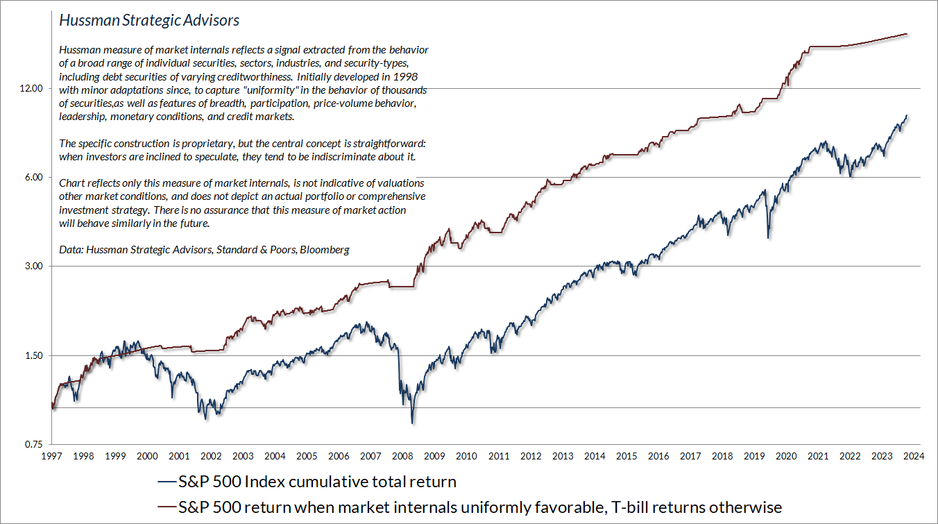
It’s important to recognize that our gauge of market internals is not simply a composite of trend-following measures. We are more concerned with uniformity and divergence across thousands of securities, sectors, industries and security types than we are about raw trend (for example, whether the S&P 500 is above or below certain moving averages) or simple measures of breadth. For that reason, our classification of market internals may not align with seemingly “obvious” trend-following measures.
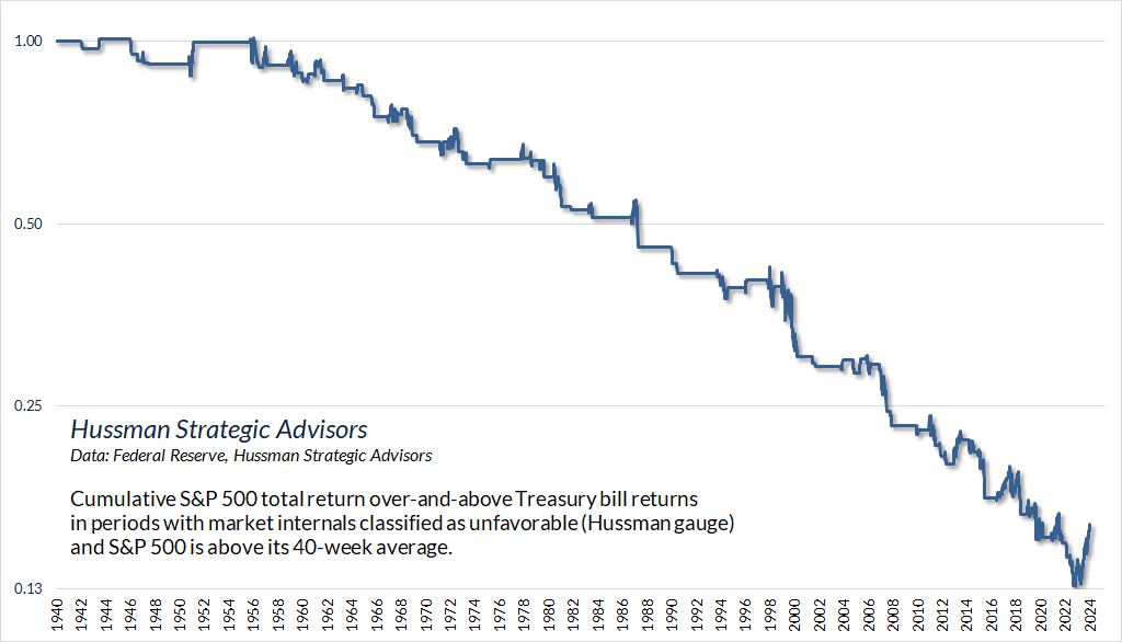
This naturally begs the question, what happens if trend following measures are favorable and internals are unfavorable? Are we missing something? Ignoring something? Could internals do better by allowing trend-following measures to override uniformity? This is a question that we ask on an ongoing basis across virtually every consideration imaginable – monetary, economic, trend-following, technological, sectoral, fiscal, seasonal, and so forth. The chart below shows what this sort of analysis looks like. The chart below, for example, shows the cumulative total return of the S&P 500, in excess of Treasury bill returns, when our gauge of market internals was classified as unfavorable, but the S&P 500 was above its 40-week moving average.
Clearly, the average outcome for the S&P 500 has been negative across history when this combination has been present. That’s not always the case, for example, during the run-up to bull market peaks such as 1990, 2000, 2007 and today, and it’s certainly true that recent enthusiasm about artificial intelligence and potential Fed easing has produced a longer period of market strength than we normally see when internals are unfavorable. But there’s nothing systematic about this period, and we certainly don’t have evidence to prioritize this or other trend-following measures in preference to market internals.
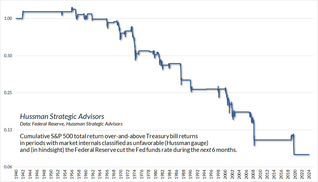
Similarly, suppose market internals were unfavorable, but we knew for certain that the Federal Reserve would cut interest rates over the coming 6-month period. Would that knowledge justify taking a pre-emptive bullish position despite unfavorable internals? The answer, historically speaking, is no. A rate cut is typically worth a one-day pop even when internals are unfavorable, but average market losses were actually worse in these periods.
Unfavorable internals dominate monetary easing, favorable internals amplify it
Last month, Jerome Powell observed that the combination of gradually softening employment conditions and moderating inflation has created a more balanced monetary environment. While the prevailing Federal funds rate remains consistent with systematic benchmarks that consider inflation, unemployment, and other economic variables, we wouldn’t be surprised to see one or more rate cuts in the coming meetings.
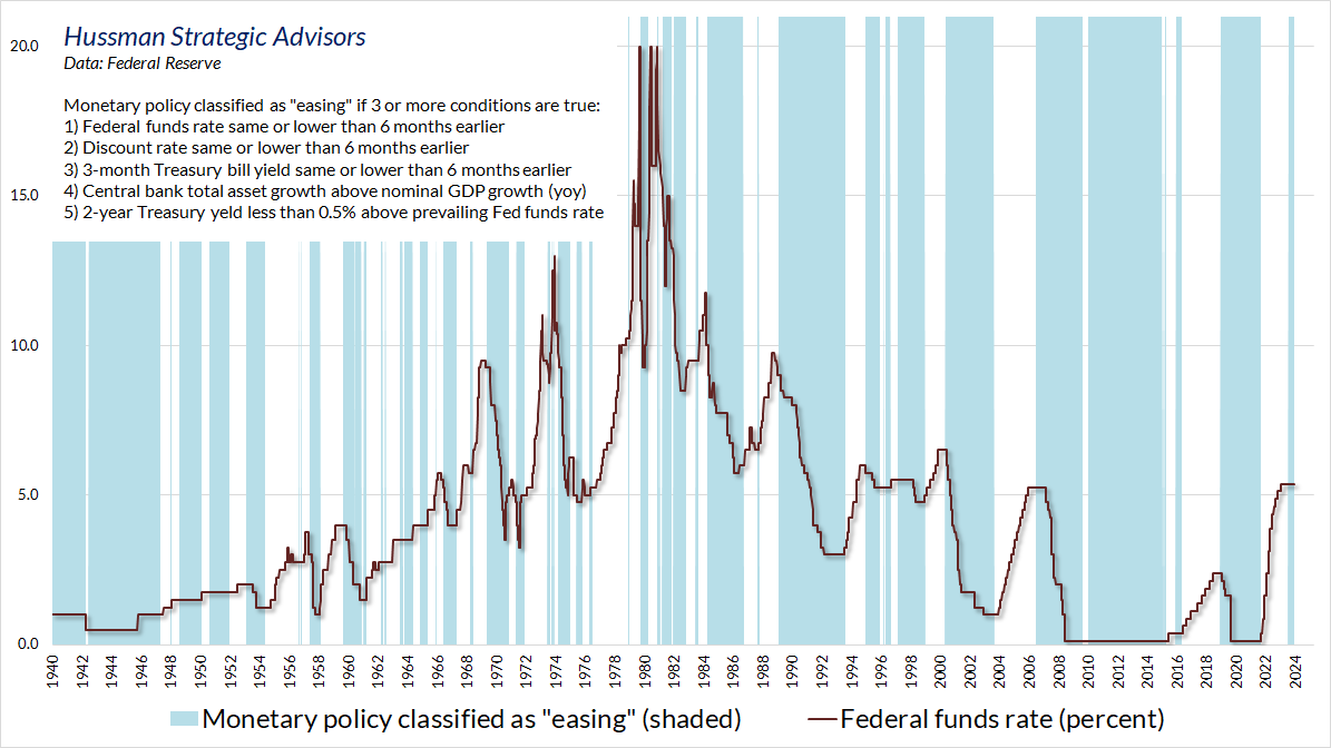
The chart below shows a slightly expanded classification of what we might call “easing” and “tightening” monetary policy environments. In the chart below, monetary policy is classified as “easing” if three or more of the following conditions are true: 1) Fed funds rate the same or lower than 6 months earlier; 2) Discount rate the same or lower than 6 months earlier; 3) 3-month Treasury bill yield the same or lower than 6 months earlier; 4) Central bank total asset growth above nominal GDP growth, year-over-year; 5) 2-year Treasury yield less than 0.5% above the prevailing Federal funds rate.
Periods classified as “easing” (even if the Fed hasn’t actually cut rates yet) are highlighted in blue. The actual Fed funds rate is shown in red. Clearly, this classification rubric does a reasonably good job in distinguishing periods of monetary easing and tightening across history.
This brings us to a crucial question, and our response to the endless drumbeat that Fed easing makes every other investment consideration obsolete.
What factor is more important for the stock market?
1) Monetary easing per se, or;
2) Investor psychology – specifically speculation or risk-aversion among investors, as gauged by the uniformity of market internals?
The chart below shows the cumulative total return of the S&P 500, over-and-above Treasury bill returns, based on various (mutually exclusive) combinations of monetary policy and market internals. This chart should be familiar to longer-term followers – the main difference is that it uses the monetary policy classification described above.
Look at the green line. The strongest combination of conditions emerges when monetary easing is joined by speculative investor psychology. In this situation, investors treat low-interest liquidity as an inferior asset, and try to get rid of it by chasing riskier investments like stocks. Of course, money never goes “into” the market – it passes through the market into the hands of a seller, who is then faced with the same problem of what to do with low interest liquidity that someone has to hold at every moment in time.
If there’s one simple summary of our difficulty amid zero-interest rate policy, it’s reflected in that green line. As I detailed in the second section of You Can Ring My Bell, the problem was not valuations, nor market internals, but our reliance and bearish response to historically-reliable speculative “limits.” The discussion also details how, after decades of admirably navigating complete market cycles, bubbles and collapses, we encountered that difficulty in the first place: the “ensemble methods” we developed in our stress-testing against Depression-era data learned too well that certain extremes were nearly always followed (prior to QE) by collapses, so those syndromes became the first branch of nearly every decision tree distinguishing favorable vs. unfavorable outcomes. It’s worth emphasizing that even if the Federal Reserve embarks on infinite amounts of quantitative easing in the future, we will not face that difficulty again – we abandoned our post-GFC ensemble methods in 2021 and explicitly prioritized the status of market internals. My hope is that investors will learn the right lesson, lest they ignore valuations and internals at a point where they might be of enormous value.
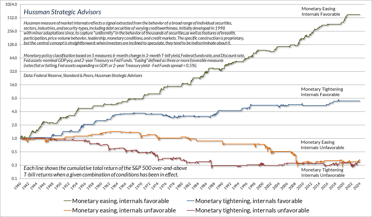
Now look at the other lines. As noted earlier, the steepest market losses typically emerge when investors are inclined toward risk-aversion and the Fed is easing. Recall, for example, that the Fed eased persistently and aggressively throughout the 2000-2002 and 2007-2009 market collapses. Why doesn’t easing help in that situation? Simple. When investors are risk averse, they view low-interest liquidity as a desirable asset, so creating more of the stuff doesn’t provoke speculation. In that situation, it doesn’t help to pre-empt expected rate cuts by shifting to a constructive position too soon. We generally shift when the observable measures in our investment discipline shift.
Stocks also tend to do poorly when market internals are unfavorable and monetary policy is tight, but the annualized loss is actually smaller than when the Fed is easing. Conversely, stocks tend to do well when market internals are favorable even if monetary policy is tight, though the average annualized gain is clearly highest when the Fed is easing amid favorable internals.
This one goes to four
There are certain features of valuation, investor psychology, and price behavior that emerge, to one degree or another, when the fear of missing out becomes particularly extreme and the focus of speculation becomes particularly narrow. We’ve suddenly hit a motherlode of those conditions. Emphatically, this is not a forecast. It’s a statement about current, observable conditions.
– John P. Hussman, Ph.D., Motherlode, November 21, 2021
We know that while valuations are profoundly important in gauging likely long-term investment returns and the extent of potential losses over the complete market cycle, valuations can have very little impact on market outcomes over shorter segments of the market cycle. It’s when rich valuations are joined risk-aversion – as gauged by divergent or deteriorating market internals – that a “trap door” tends to open. The risk of falling through increases when one also observes a preponderance of overextended warning signals, as we’ve increasingly seen in recent months, accelerating to a fever pitch in recent weeks.
These warning signals generally take the form of “syndromes” that combine overextended price action, lopsided sentiment, and increasing turbulence, divergence, or reversal in various measures of breadth, leadership, and participation. Over the past four decades, I’ve developed and collected scores of these syndromes in weekly and daily data. In addition, we use various methods to “cluster” market conditions based on their similarity to other periods across history, such as major peaks and troughs, as well as points that were followed by steeply compressed advances and declines.
Our investment discipline is focused on aligning our investment stance with observable, measurable conditions rather than relying on forecasts or scenarios. Still, certain conditions are extreme enough to say, “Hmm, this may not be a major market peak, but every major market peak has looked something like this, and we generally don’t see this sort of condition except at major market peaks.” I know that’s a subtle distinction, but it’s important to distinguish observations from forecasts. A forecast crosses the line by saying “this is what will happen next.” We prefer not to cross that line.
With that said, let me show you what we’re seeing here.
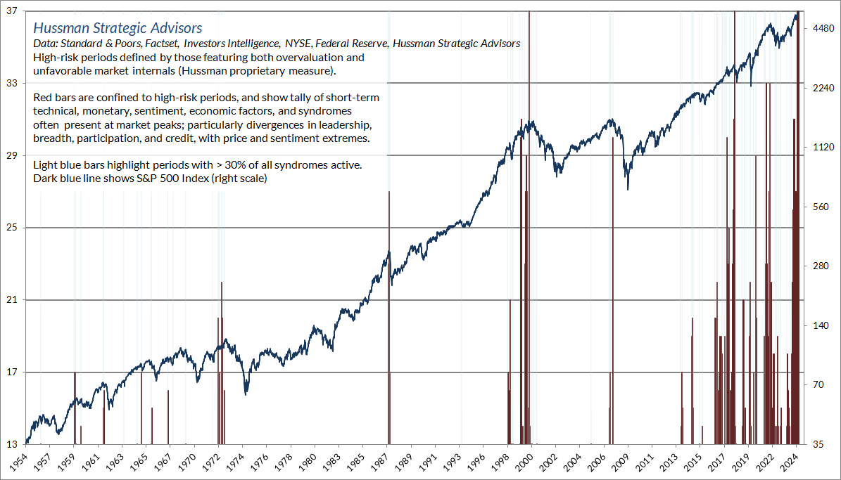
The chart below shows the tally of overextended warning syndromes that we observe in weekly data. The recent set of extremes has persisted somewhat longer than the extremes we observed in 1972, 1987, 2000, 2007, 2018, and 2022, but as I’ve regularly observed over the years, the deferral of consequences should not be confused with the absence of consequences.
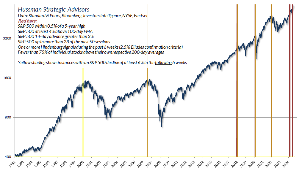
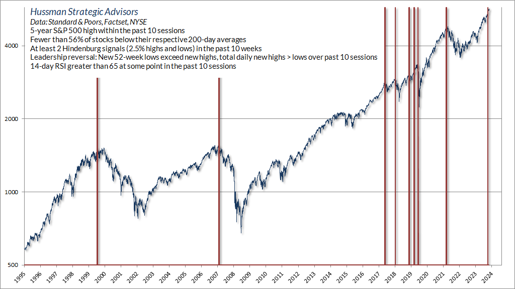
Similarly, we’ve seen a preponderance of warning flags in daily data. The chart below shows one of the overextension syndromes we’ve observed even during the past week. The bars that look yellow/orange are instances that were followed by a decline in the S&P 500 of at least 6% over the following 6 weeks. The recent sets have not (possibly not yet) been followed by material market retreats.
The chart below shows another warning flag that we track in daily data, and captures what I’ve often described as a “phase transition” – an overextended period followed by a quick reversal from a majority of new highs to a majority of new lows shortly after a market peak. Though we saw one of these a few weeks ago, our attention would perk up if we were to see another such reversal in the next week or two.
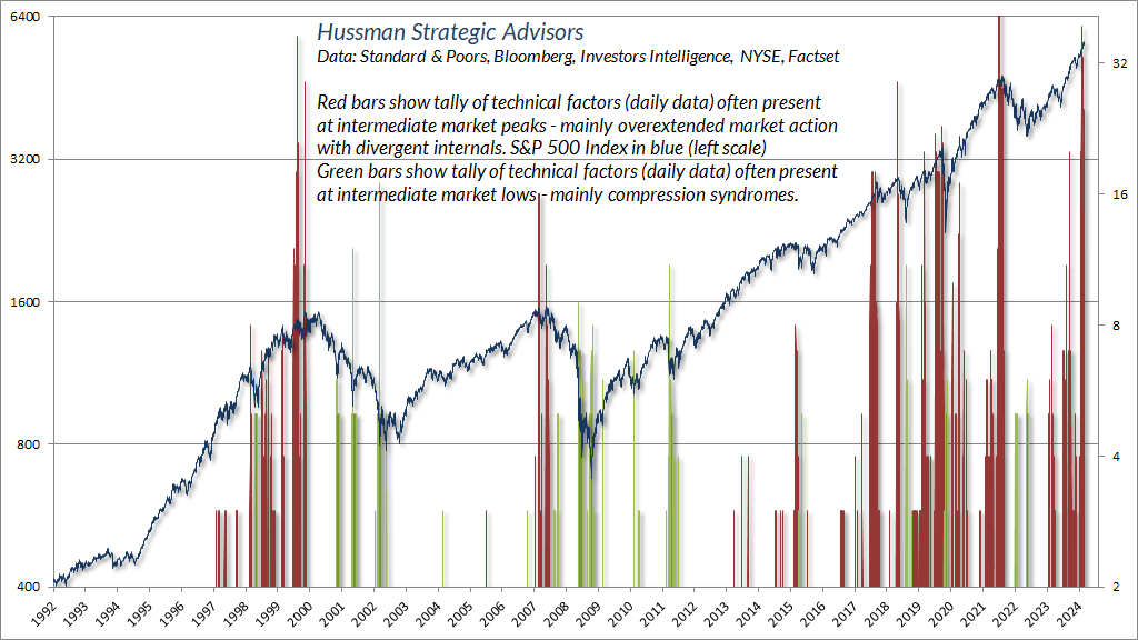
None of these syndromes are investment strategies in themselves, and we take any individual syndrome with a grain of salt. It’s when we see a preponderance of syndromes that we’re more inclined to pay attention to the common signal. The red bars in the chart below show the tally of overextended warning flags we observe in daily data. The green bars reflect “compression” that is often relieved by steep, short-term market advances.
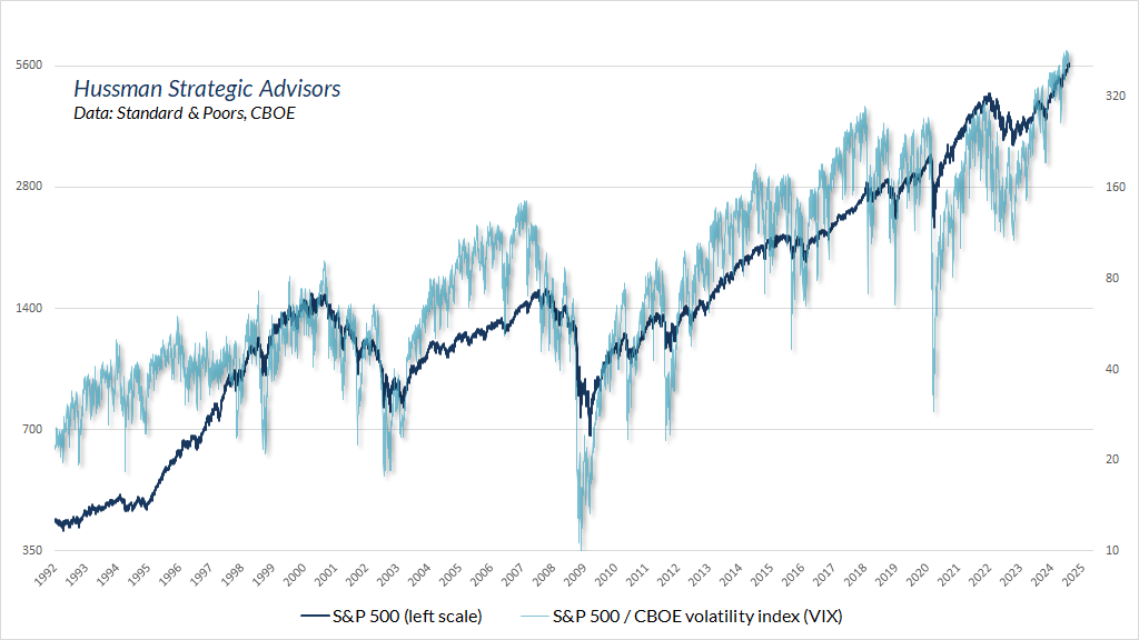
Despite the extremes we’ve increasingly observed in recent weeks, the cost of hedging downside risk has rarely been cheaper. The chart below shows a gauge that we find worth monitoring, to get a sense of points where stocks are overextended amid very little fear, or deeply compressed amid high levels of fear. It’s not a “stationary” indicator in the sense that it trends with the level of the S&P 500 itself over time, but as implied option volatility shifts, the ratio of the S&P 500 to the CBOE volatility index (VIX) often spikes higher and lower, and those spikes can be helpful in identifying points where investors are on “one side of the boat.”
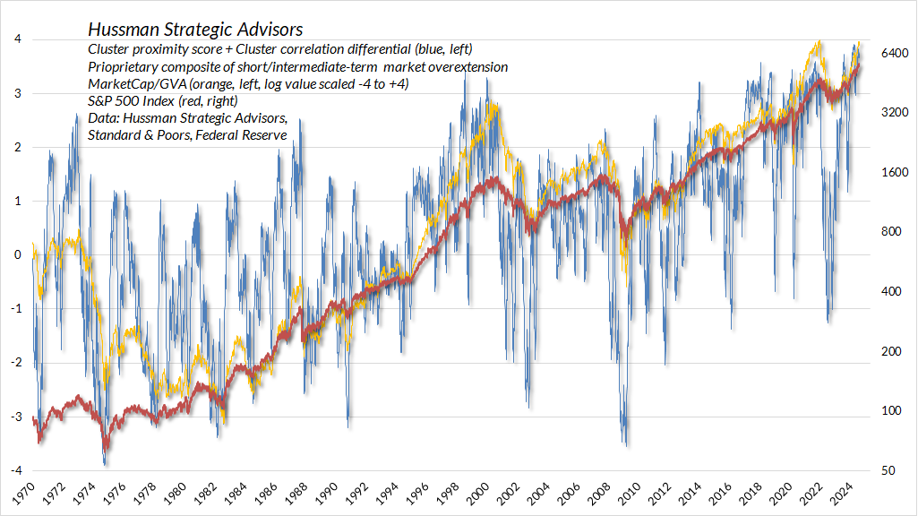
The chart below combines a number of long-term and short-term measures to get a sense of how extreme market conditions are on a variety of horizons. The red line is the S&P 500 (right scale). The yellow line is MarketCap/GVA rescaled on range of -4 to +4, the current level being +4 because it’s the highest extreme in history.
The thin blue line is decidedly short/intermediate term in nature, and shows the sum of two “cluster” scores. The basic idea here is that a perfect correlation with major peaks and pre-collapse extremes across history, coupled with a perfect negative correlation with major troughs and compressed lows would produce a cluster score of +4, and the opposite situation would produce a cluster score as low as -4. There’s a lot of volatility in that blue line because short/intermediate term conditions can change quickly. But you can see where current conditions stand. (“John, why didn’t you rescale this and make everything go to plus or minus one?” “[pause] This one goes to four. It’s three louder.”)
Remember that the first line down following a market peak is typically vertical. The steep initial losses typically make investors feel like fools to sell into the decline, and the clearing rallies that follow convince them that everything is still fine. That process, in repeated sequence, is why investors tend to hold on the whole way down, often eventually capitulating at the lows.
Put simply, based on a preponderance of long-term, intermediate-term, and short-term measures, current market conditions are singularly the most extreme that we have observed in the history of the U.S. financial markets. There is no assurance that the market is, in fact, at a peak. Only that current conditions are more consistent with a major peak than at any other point in history, including 1929, 2000, 2007, and 2022. It is a subtle distinction, but it’s important to distinguish observations from forecasts. My impression is that the U.S. stock market is forming the extended peak of the third great speculative bubble in history, but as usual, we’ll align our investment stance with observable conditions as they change. No forecasts are required.
There’s a very rare set of market conditions extreme enough to deserve a ‘warning.’ As Madge said in the old Palmolive dish soap commercials, ‘you’re soaking in it.’
It’s not a balloon – it’s just a bubble
Finally, amid continued talk of “passive flows” and “cash on the sidelines,” it may be helpful to investors to understand how financial markets and equilibrium work, to defend against a rather persistent flow of incorrect notions.
The key observation that will help is this: Every security that is issued – whether a stock share, a bond certificate, a T-bill, a dollar of bank reserves, or a piece of paper currency – must be held by someone at every moment in time until that security is destroyed. If cash “pours into” the stock market, where does it go? It goes to the seller of the stocks. If the cash was “on the sidelines” before it went “into” the market, it is still “on the sidelines” a moment after the trade is made. It’s just in different hands.
There is emphatically no such thing as a dollar bill or any other security “finding a home” in another security. The dollar bill might find its home in somebody else’s hands, but it will still be a dollar bill until the Federal Reserve retires that dollar bill (by selling a bond on its balance sheet, taking the dollar bill in return, and shrinking its balance sheet). A share of stock may find another home, but it will still be a share of stock until that share of stock is retired – either by the company being acquired, the share being repurchased by the company, or the company going bankrupt.
The stock market is not a balloon that gets bigger when money “flows into” it. It doesn’t get smaller because money “flows out” of it. Holding the number of shares constant, the stock market gets bigger if investors pay a higher price for those shares. Period. If a dentist in Poughkeepsie pays 10 cents more than the previous trade for a single share of Apple, the market capitalization of Apple will increase by $1.5 billion. If a single share is sold 10 cents lower, that $1.5 billion vanishes into thin air. Market capitalization is simply price times shares.
So where does income come from, where does it go if not “into” the market, and how do securities come into and out of existence? Well, income is always the result of someone producing more than they consume. If the whole economy produces more output than it consumes or exports (on-balance), the unconsumed output is classified as “investment” – either productive investment like housing, factories, and capital goods, or possibly unwanted “inventory” investment.
From the production side, anytime the economy produces something without consuming it, the surplus output is called “investment.” From the income side, anytime someone produces something and sells it instead of consuming it, the surplus income is called “savings.” Not surprisingly, the total amount of savings in the economy is always the same as the total amount of investment. Always. It’s an accounting identity.
Suppose you build someone a deck with wood from your backyard, and they pay you $500. They get your deck, and you get their cash. The deck represents $500 of new, unconsumed, value-added housing investment. You now have $500 of new saving. There’s new saving, and new investment, but the amount of cash in the economy is the same as before. It just changed hands. If instead you baked $500 of apple pies, and someone bought and ate them, the economy has no new investment, and it also has no new savings, because your $500 saving is offset by $500 of “dissaving” that is now in somebody’s tummy. Either way, no new securities have been created.
In contrast, suppose someone takes their saving and lends it to someone, or invests in a company in return for newly issued stock shares from the company, or their bank uses the savings to make a loan, a new “security” is created (a bond certificate, a stock share, or an IOU to the bank). That security memorializes the fact that savings were intermediated from one party in the economy to another. When you intermediate your savings to the government in return for a Treasury bond, that bond memorializes the fact that your savings were transferred to the government so it could make some sort of expenditure.
Regardless of what securities are created when savings are intermediated from one person in the economy to another, the newly created security will have to be held by someone until it is retired. It’s an asset to the holder of the security, and it’s a liability to the issuer of the security. Add up the assets and liabilities in the economy, and it turns out that the securities in the economy have a net value of zero. Instead, when you add up all the assets and liabilities of the economy, you’ll find that the true basis of national wealth is the stock of productive investment that it has accumulated (physical capital, housing, infrastructure, job skills, education, inventions, institutions), and its endowment of resources (land, environment, clean air and water, energy) that it hasn’t squandered.
Depending on how spending is financed, and how the output is used, it can result in saving, investment, the creation of new securities, all of these, or none of these. If the government runs massive deficits so someone can consume more than they produce, someone else has to produce more than they consume. They are only willing to do that because they get something in return: newly created government liabilities.
The reason there’s so much money on the so-called “sidelines” is that the government has run massive deficits to subsidize spending and subsidies to businesses and households. Those deficits were funded largely by creating dollar bills and issuing short-term Treasury debt. Somebody has to hold those government liabilities, in exactly the form they were created in, until they’re retired. The “cash on the sidelines” is not going away until the government runs surpluses. The cash can’t “go” anywhere or “find a home” as something other than cash. It’s already home. Putting it “into” stocks doesn’t turn it into something else. The seller gets it. It stays in the form of money (government liabilities). It just changes hands.
The idea of “passive flows” has a kernel of truth in the sense that when the stock purchases of investors focus on the same set of stocks, without regard to price, eager buyers may have to pay more to wrestle those shares away from other holders who are also price-insensitive. But in the end, the shares are still held by someone, and the cash is still held by someone. The number of shares sold must equal the number of shares purchased. The number of dollars received must equal the number of dollars paid.
It’s not “money flow” that matters. It’s speculation versus risk-aversion. It’s the eagerness of buyers versus the eagerness of sellers. Even if it’s for just one share of Apple. The thing that can collapse the market, without huge “money flows” or shifts in spending or income, is simply the desire of enough investors to reduce the amount of market capitalization that they hold. In aggregate, every share has to be held by someone. Every dollar of cash has to be held by someone. In aggregate, there’s no such thing as “investors getting out of stocks.” The only thing that can change is the tradeoff between stock shares and cash – in other words, the number of dollars that investors are willing to exchange for each share of stock. Similarly, there’s no such thing as investors “rotating out of X and into Y.” Every share of X and Y must be held by someone. It’s only the tradeoff between the two – the relative prices – that can change.
Put simply, security prices change not because of money flowing “into” or “out of” the market, but because the tradeoff between cash and securities changes. If investors are willing to trade one share of stock for a slightly different amount of cash, the price changes, so the entire market cap changes.
The thing that can collapse the market, without huge ‘money flows’ or shifts in spending or income, is simply the desire of enough investors to reduce the amount of market capitalization that they hold. In aggregate, every share must be held by someone. Every dollar of cash must be held by someone. In aggregate, there’s no such thing as ‘investors getting out of stocks.’ The only thing that can change is the tradeoff between stock shares and cash – in other words, the number of dollars that investors are willing to exchange for each share of stock.
Last week, our most reliable measure of stock market valuations hit the highest extreme in history. It wasn’t because more money was blown into the market like a balloon, or poured into the market like a bathtub with an open spigot. It was because people were willing to exchange record numbers of dollars for the privilege, hope, and excitement of getting shares of stock into their hands. The thing that will reverse that is simply for that tradeoff to become less extreme.
It’s not a balloon – it’s just a bubble.
Keep Me Informed
Please enter your email address to be notified of new content, including market commentary and special updates.
Thank you for your interest in the Hussman Funds.
100% Spam-free. No list sharing. No solicitations. Opt-out anytime with one click.
By submitting this form, you consent to receive news and commentary, at no cost, from Hussman Strategic Advisors, News & Commentary, Cincinnati OH, 45246. https://www.hussmanfunds.com. You can revoke your consent to receive emails at any time by clicking the unsubscribe link at the bottom of every email. Emails are serviced by Constant Contact.
The foregoing comments represent the general investment analysis and economic views of the Advisor, and are provided solely for the purpose of information, instruction and discourse.
Prospectuses for the Hussman Strategic Growth Fund, the Hussman Strategic Total Return Fund, and the Hussman Strategic Allocation Fund, as well as Fund reports and other information, are available by clicking “The Funds” menu button from any page of this website.
Estimates of prospective return and risk for equities, bonds, and other financial markets are forward-looking statements based the analysis and reasonable beliefs of Hussman Strategic Advisors. They are not a guarantee of future performance, and are not indicative of the prospective returns of any of the Hussman Funds. Actual returns may differ substantially from the estimates provided. Estimates of prospective long-term returns for the S&P 500 reflect our standard valuation methodology, focusing on the relationship between current market prices and earnings, dividends and other fundamentals, adjusted for variability over the economic cycle. Further details relating to MarketCap/GVA (the ratio of nonfinancial market capitalization to gross-value added, including estimated foreign revenues) and our Margin-Adjusted P/E (MAPE) can be found in the Market Comment Archive under the Knowledge Center tab of this website. MarketCap/GVA: Hussman 05/18/15. MAPE: Hussman 05/05/14, Hussman 09/04/17.