
The Turtle and the Pendulum

John P. Hussman, Ph.D.
President, Hussman Investment Trust
November 2024
The market is a pendulum that forever swings between unsustainable optimism, which makes stocks too expensive, and unjustified pessimism, which makes them too cheap. The intelligent investor is a realist who sells to optimists and buys from pessimists.
– Benjamin Graham
Imagine a turtle walking along the shoreline. On its shell is a pendulum, swinging backward and forward, also aligned with the shoreline. When the pendulum swings forward, the bob at the end of the string swings ahead even faster than the turtle does. When the pendulum swings backward, the bob loses ground even as the turtle plods forward. At any point in time, the movement of the bob is driven not only by the average speed of the turtle, but the gradual emergence and elimination of accumulated extremes, along with random gusts of wind as the pendulum swings back and forth.
Change is the sum of fundamental trends, the gradual elimination of accumulated extremes, and the random arrival of new shocks. This is true for nearly every process, including, for example, economic growth and stock market returns.
Before discussing valuations, it’s critical to emphasize that valuations are not a timing tool. Valuations are enormously informative about the prospects for long-term investment returns, and potential downside risk over the complete market cycle. But investment returns over shorter segments of the market cycle are driven by investor psychology, including the frequent attachment of that psychology to day-to-day developments that have very little bearing on long-term cash flows.
Our most reliable gauge of speculative versus risk-averse psychology is the uniformity or divergence of market action across thousands of individual stocks, industries, sectors, and security types, because when investors are inclined to speculation, they tend to be indiscriminate about it. We also attend to overextended extremes in prices, sentiment, valuations, and other considerations that comprise the core of our investment discipline.
In addition to that core discipline, I’ve found it hard to suppress my enthusiasm about a forceful and – as a former options mathematician – analytically elegant hedging adaptation we introduced in September. I expect it to increase our investment flexibility in nearly every investment environment, even amid what I continue to view as the extended top-formation of the third great speculative bubble in U.S. history.
For now, suffice it to say that it was the wrong question to ask how we might cleverly dart between a defensive outlook and a bullish one amid historically ominous market conditions. The better question was how to vary the intensity of a valid defensive outlook, in a way that can be expected to benefit even in a further advance, provided only that the market fluctuates along the way. More on the solution to that question later in this comment.
The turtle and the pendulum – how valuations drive long-term returns
When we examine market valuations, we can choose any fundamental to be our “turtle,” but keep in mind that a share of stock is nothing but a claim on some very long-term stream of cash flows that investors expect to be delivered into their hands over time. As I discussed in Making Friends with Bears Through Math, three considerations are essential: first, the fundamental you use should be essentially proportional – in a long-term sense – to the very long-term stream of cash flows that stocks will deliver over time; second, the fundamental you use shouldn’t fluctuate a great deal over the economic cycle, as earnings unfortunately do; and third, always look for the proof in the pudding – the valuation ratio you use (technically its logarithm) should be tightly correlated with actual subsequent market returns, particularly over a horizon of 10-12 years. It’s also preferable for the numerator and the denominator to be apples-to-apples. So S&P 500 index to S&P 500 revenues, or nonfinancial market cap to nonfinancial gross value-added, are somewhat more reliable than say, nonfinancial market cap to nominal GDP.
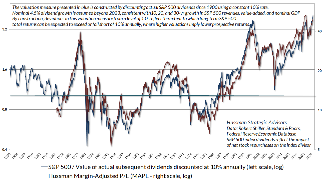
As I’ve often noted, a reliable valuation measure is just shorthand for a proper discounted cash flow analysis. The chart below shows our Margin-Adjusted P/E, which considers cyclical variations in profit margins and their impact on the price/earnings ratio, along with the ratio of the S&P 500 to the present value of actual subsequent S&P 500 dividends since 1900, discounted at a constant rate of 10% annually. The ratio therefore estimates the extent to which likely long-term S&P 500 total returns are likely to depart from a 10% average return. The higher the valuation, the larger the expected shortfall from historically run-of-the-mill expected returns of 10%.
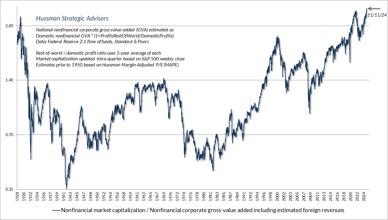
In the discussion below, I’ve chosen nonfinancial corporate value-added as our fundamental “turtle” (essentially the revenues of U.S. nonfinancial corporations, excluding double counting, and including our estimate of foreign revenues). The chart below shows the ratio of nonfinancial market capitalization to gross value-added – what I call MarketCap/GVA – in data since 1928. It remains our most reliable valuation measure, based on correlation with actual subsequent 10-12-year S&P 500 total returns across history. Last week’s record high featured the most extreme level of valuation in U.S. history.
If we write the growth rate of fundamentals as g, and the ratio of nonfinancial market capitalization to gross value-added as McGVA, we can estimate the average annual total return of U.S. stocks over any horizon of T years as:
Average annual total return = (1+g) x (McGVA_future/McGVA_today)^(1/T) – 1 + average dividend yield
The growth rate g is the average speed of our turtle. The pendulum is the swing in valuations, which we “amortize” over T years. The average dividend yield completes our total return.
Let’s do some simple arithmetic. While the market capitalization of U.S. nonfinancial companies doesn’t precisely match that of the S&P 500, the correlation of their annual changes is above 0.95. The arithmetic that follows applies equally to other measures such as price/revenue and price/earnings multiples. Whatever fundamental one chooses, as noted above, it’s preferable choose one that is proportional to and representative of very long-term expected cash flows.
From the 1990 market low to the 2000 bubble peak, MarketCap/GVA more than tripled, from roughly 0.7 to 2.4. During that year period, U.S. corporate gross value-added grew at an average rate of about 5% annually, and the dividend yield of the S&P 500 averaged 2.4% annually. Remarkably, the nominal total return of the S&P 500 over that 10-year period averaged over 21% annually. Why? Do the arithmetic:
Average annual total return = (1.05) x (2.4/0.7)^(1/10) – 1 + 0.024 = 21.2%
In contrast, from March 2000 to March 2009, MarketCap/GVA dropped by about two-thirds, from 2.4 to roughly 0.8, below the long-term historical norm of 1.0 for this measure. During that 9-year period, nonfinancial gross value added grew by about 4% annually, while dividends contributed an average yield of about 1.7%. Yet for the full 9-year period, the nominal total return of the S&P 500 averaged a loss of more than -6% annually. Why? Do the arithmetic:
Average annual total return = (1.04) x (0.8/2.4)^(1/9) – 1 + 0.017 = -6.3%
From the 2000 bubble peak nearly 25 years ago to the current extreme, MarketCap/GVA has increased from 2.4 to an unprecedented extreme of nearly 3.5. During the intervening years, nonfinancial gross value added has grown by about 4% annually, while dividends have contributed an average yield of about 2%. The total return of the S&P 500 over that nearly 25-year period has averaged about 7.6% annually. Why? Do the arithmetic:
Average annual total return = (1.04)*(3.5/2.4)^(1/25) – 1 + 0.02 = 7.6%.
Change is the sum of fundamental trends, the gradual elimination of accumulated extremes, and the random arrival of new shocks. Having arrived at the most speculative valuation extreme in U.S. history, investors now rely on the absence of any future retreat from these extremes, and the assurance that all future shocks will be favorable.
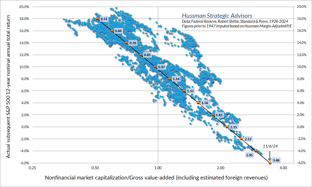
Now consider the coming decade. The only way to prevent the pendulum from swinging backward is for valuations to sustain a permanent extreme. In that case, we would expect average annual growth of about 4.5% from the turtle (U.S. corporate revenues), coupled with a contribution of about 1.3% from dividends. The only time the S&P 500 dividend yield was lower was in the months surrounding the 2000 bubble peak. Assuming that valuations never retreat, these assumptions would imply estimated average nominal S&P 500 total returns on the order of 5.8% annually.
Allowing MarketCap/GVA to retreat over the coming decade to the level of 2.3 seen as recently as October 2022, estimated 10-year S&P 500 average annual nominal total returns fall to just 1.5%.
Allowing MarketCap/GVA to retreat to the level of 1.8 seen as recently as March 2020, estimated 10-year S&P 500 average annual total returns fall to -1%.
Allowing MarketCap/GVA simply to touch its long-term historical norm of 1.0, even ruling out lows like 2009 and 1990, as well as the level of 0.4 observed in 1982, estimated 10-year S&P 500 average annual total returns fall to -6.5%.
All of this simple arithmetic is why, in data since 1928, the historical relationship between MarketCap/GVA and actual subsequent 12-year S&P 500 average annual nominal total returns looks like this.
A quick note on share buybacks. While corporate stock buybacks are often called a “distribution to shareholders,” the only shareholders that receive those dollars are the ones that sell. What buybacks do for other investors is to reduce shares outstanding, thereby increasing fundamentals per share. Notably, per share fundamentals for the S&P 500 such as earnings, revenues, and dividends fully reflect the impact of share buybacks. The buybacks do affect the level and growth rate of these fundamentals, but since per-share fundamentals take that into account, anything beyond that (such as treating buybacks as if they are dividends) is double counting. As it happens, including the full effect of share buybacks since 2000, the growth rate of per-share S&P 500 revenues has been 4.3% annually. Data-free appeals to “buybacks” don’t get investors around the arithmetic that links observable valuations to subsequent long-term returns.
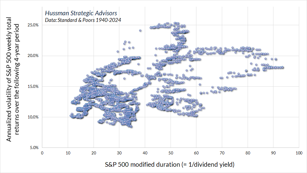
Meanwhile, it’s worth keeping in mind that an S&P 500 dividend yield of 1.3% implies a “duration” of 1/0.013 or about 77 years. Duration is essentially the sensitivity of prices to changes in the returns demanded by investors, and it’s also a measure of how many years it takes for an investment to be “paid off” in present-value terms. 77 years is easily more than double the typical equity duration risk that investors have accepted across history.
Here’s something that might surprise you but shouldn’t. Extremely low S&P 500 dividend yields and high durations tend to be followed by higher volatility of subsequent market returns, and profound full-cycle drawdowns across history. The chart below shows equity duration (the inverse of the S&P 500 dividend yield) along with the annualized volatility of monthly S&P 500 total returns over the subsequent 4-year period.
We also know that extreme valuations are associated with depressed long-term returns and deeper full-cycle drawdowns. In the chart below, the highest point in the upper back right corner is August 1929, which featured the most extreme level of MarketCap/GVA in U.S. history, until the extremes of early 2022 and today. Put simply, extreme valuations dramatically impair the long-term and full-cycle return/risk ratio of the market.
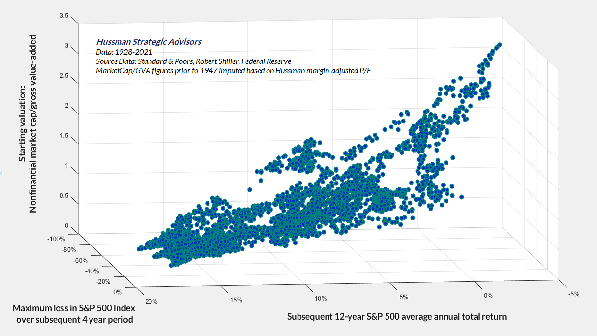
Even if valuations stay within the top 20% of historical extremes, high valuations imply large price fluctuations in response to very small changes in the expected return demanded by investors. As I’ve noted before, a market crash is nothing but risk aversion meeting a market that’s not priced for risk. For our part, particularly with the adapted hedging implementation I’ve described in recent months, it will be enough for us simply for the market to fluctuate – whether in a permanently high range of valuations, or visiting run-of-the-mill norms, or collapsing to depressed levels, or anywhere in-between.
The Martian
At some point, everything is going to go south on you, and you’re going to say ‘this is it – this is how I end.’ And you can either accept that, or you can get to work. That’s all it is. You just begin. You do the math. You solve one problem, and then you solve the next one, and then the next. And if you solve enough problems, you get to come home.
– Matt Damon as astronaut Mark Watney in The Martian
When we encounter difficulties, we get to work, we do the math, we address the largest problems first, and we gradually try to solve enough problems to get home. Introducing market internals to our discipline in the late-1990’s bubble helped us to better navigate speculation that continued to advance beyond every post-war extreme, but that would eventually take technology stocks down by 83%, with the S&P 500 losing half its value, posting a negative total return from its 2000 bubble peak more than a decade later. By the end of the global financial crisis (GFC), we had admirably navigated decades of market cycles, bubbles, and crashes.
In the aftermath of the global financial crisis, I introduced a set of “ensemble methods” as a stress-testing response to incorporate and navigate not only post-war data, but Depression era data as well. The second half of the June 2024 comment, You Can Ring My Bell, details that approach, and the Achilles Heel that emerged in the face of zero interest rate policies. Following a progression of modifications, we finally abandoned the ensemble implementation in 2021, shifting the focus of our investment discipline more directly on the key factors that were responsible for our success across decades of cycles before and through the GFC — valuations and market internals.
The chart below presents the cumulative total return of the S&P 500 in periods where our main gauge of market internals has been favorable, accruing Treasury bill interest otherwise. The chart is historical, does not represent any investment portfolio, does not reflect valuations or other features of our investment approach, and is not an assurance of future outcomes.
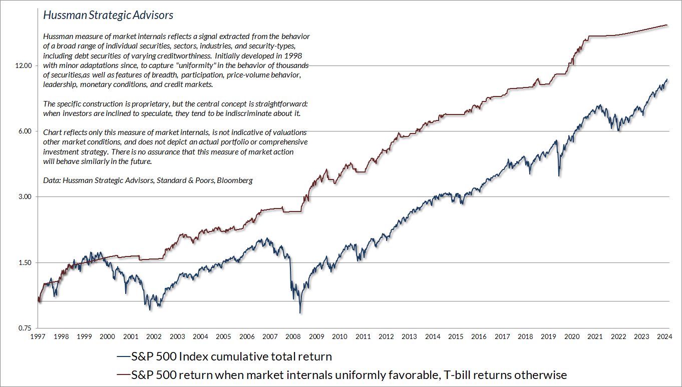
From the January 2022 peak through early-August of this year, the total return of the S&P 500 outperformed Treasury bills by just 2%. Following a nearly unbroken 13-week advance since August, the S&P 500 has outperformed T-bills – I expect temporarily – by about 14% since January 2022. Meanwhile, the equal-weighted S&P 500 is less than 5% ahead of T-bills since early 2022, and the Russell 2000 small-cap index has lagged T-bills.
Despite the persistently negative condition of market internals during the advance in the S&P 500 over the past year, I remain convinced that internals are measuring exactly what they are intended to measure. As I detailed our September comment Asking a Better Question, it’s the wrong question to ask how we might cleverly dart between a valid defensive outlook and a contrived bullish one amid historically ominous market conditions. That would be equivalent to chasing nickels in front of a steamroller. The better question is how we might vary the intensity of our defensive outlook to benefit even in a further advance, provided only that the market fluctuates along the way.
I’m still fairly certain that nobody fully appreciates what we accomplished in September, partly because – with the S&P 500, Nasdaq 100, and Russell 2000 riding along their upper Bollinger bands (two standard deviations above their 20-period averages) at every resolution – daily, weekly, and monthly – there’s only been one week since late-September when we’ve held anything but a tight hedge. So it will help to offer a bit more detail, to better understand the impact of the hedging adaptation we introduced in September.
While this adaptation informs the intensity of our hedge position in all market conditions (including the strike prices we choose for call options in compressed market conditions, and when using leverage, as we commonly did in the early years of the 1990’s tech bubble), the analysis below focuses on bearish hedges.
The blue line in the chart below offers a sense of how the S&P 500 has typically behaved in market conditions that our current discipline (as adapted in 2021) classifies as “bearish” despite the S&P 500 being above its 40-week average – a popular “trend following” measure. The hedging implementation I discussed in September essentially breaks that blue line, representing about 13% of market history, into two subsets: An orange line, representing about 5% of market history – but unfortunately the part of history that we’ve been living in for much of the past year – and a red line, representing about 8% of market history.
The orange line shows periods when our adapted strike-price implementation indicates put option hedges of the inexpensive “tail risk” variety. Notice that the market has indeed historically lagged T-bills even in this environment (which is part of the reason “forcing” internals to be favorable would improve recent results only by damaging historical reliability).
The red line shows periods when our adapted strike-price implementation indicates a preference for a tight hedge. In our present implementation, that sort of hedge would have applied in only about 37% of the year-to-date period (including the past several weeks), and also about 37% of the period since January 2021. Clearly those hard-negative periods have been quite hostile for the S&P 500.
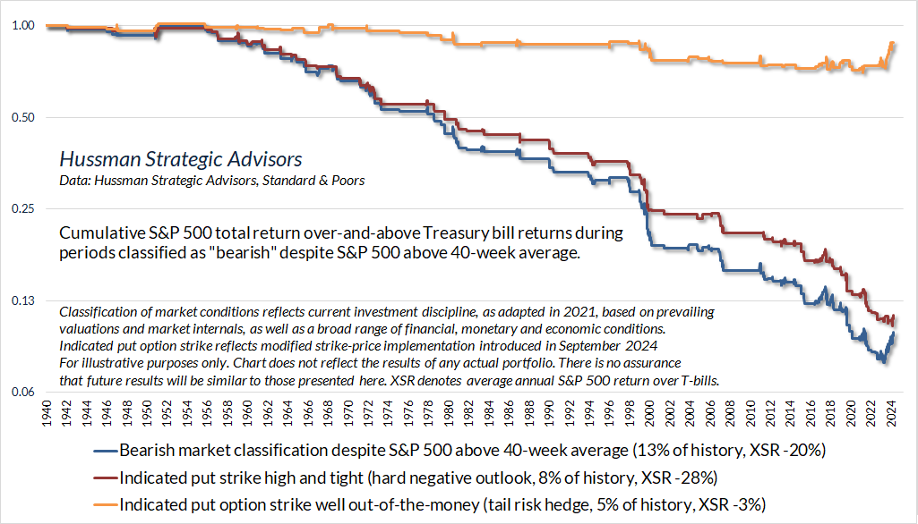
Again, the market has historically lagged T-bills in both the orange and red subsets, but as I noted last month, the hedging adaptation gives us “a better ability to distill bearish periods when the market loses value, on average, but only at a moderate average rate, versus bearish periods when the market also loses value, on average, but at a wicked average rate.”
The chart below shows the impact of this adaptation on a bearish investment stance. The red line shows the cumulative return of a continuous S&P 500 index put option hedge, since January 2022, using at-the-money put option strikes. The figures assume a put option position with a notional amount equal to portfolio value, with the remaining funds invested in Treasury bills. Option values are estimated using the Black-Scholes model with market-based inputs and volatility. In practice, despite extreme valuations and unfavorable internals, we’ve actually had a handful of weeks since 2022 when compressed market conditions encouraged us to adopt a slightly constructive outlook (primarily using call options).
The green line shows the cumulative return of the same continuous bearish investment position, but using the put option strike prices indicated by our September 2024 hedging adaptation. Even assuming a constant bearish position in a market that has advanced, varying the intensity of the hedge is beneficial.
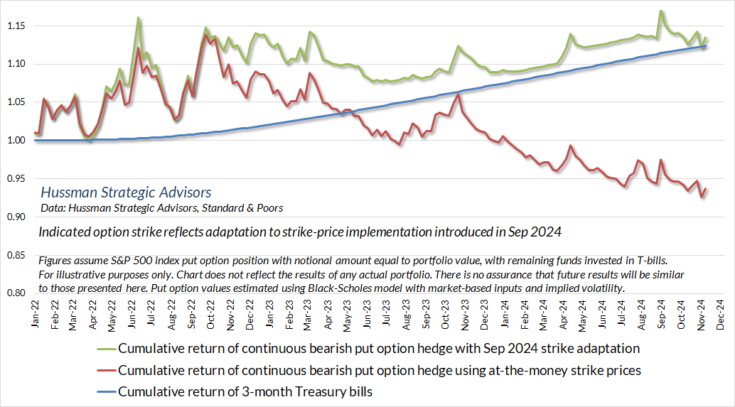
Although there’s no point since the early 2022 market peak when our discipline would have encouraged an unhedged or leveraged investment outlook, this hedging adaptation would have indicated the use of in-the-money call options in a handful of weeks that featured compressed market conditions – particularly in October 2022 – rather than the at-the-money or out-of-the-money call options we used in practice (the impact of constructive positions is not shown above).
As I observed in September, the greatest benefit of the new implementation occurs when a bearish outlook, in hindsight, turns out to be wrong. The “pain trades” – maintaining a tightly bearish market outlook during an uncharacteristic advance, as we’ve experienced in recent months – become far less frequent. Not by “forcing” a constructive outlook despite “trap door” combinations of extreme valuations and unfavorable internals, but by refining the sensitivity of the hedge so we no longer “bleed” time premium.
I expect that our adaptations in recent years will enable us to navigate and welcome any trajectory that valuations may take, provided only that the market fluctuates.
“If you solve enough problems, you get to come home.” Across decades of market cycles, bubbles, and crashes prior to this seemingly interminable half-cycle bubble, our “home” was a discipline that admirably navigated complete market cycles. Investment outcomes are never assured, but my hope is that the analysis above helps to better understand my enthusiasm about the hedging adaptation we introduced in September. We are as comfortable with the prospect of a market collapse as we are with a continued advance, provided only that the market fluctuates along the way. I really do believe that the solution to this problem is the one that gets us home.
On the structural drivers and prospects for U.S. economic growth
One would think that with all the society-changing technological innovations since 2000, GDP growth and S&P 500 revenue growth would have been faster, not slower, than in the past. It has not.
Investors make the repeated mistake of basing valuations and growth expectations on excitement instead of arithmetic. As Arthur C. Clarke wrote more than half a century ago, “Any sufficiently advanced technology is indistinguishable from magic.” Across a century of market cycles – automobiles, oil, telephones, modern appliances, and radio in 1929, the ‘onics/’tronics boom of the late-1960’s, the Nifty Fifty of the 1970’s, the internet in the 1990’s, and big tech today, every speculative bubble believes that it is the first to witness magic, and every one of them relives the same mistakes.
GDP growth has two drivers: output per employed worker (productivity), and the number of employed workers. Productivity is driven by investments in capital goods, education, infrastructure, and research & development. The number of employed workers can be broken into a “structural” component – demographic labor force growth, and a “cyclical” component – fluctuations in the unemployment rate.
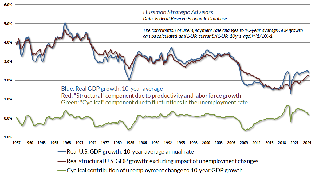
In the chart below, the blue line shows 10-year average annual real GDP growth. The red line is the “structural” component driven by trend productivity and labor force growth (where the share of the population participating in the labor force has snapped back since the pandemic). The green line shows the contribution or reduction in top-line real GDP growth as a result of changes in the unemployment rate. At present, core structural GDP growth is running at just over 2% annually. A profound improvement in labor force growth and productivity would be required to push structural growth back to even 3% annually. Understand that the plausible range of variation in trend productivity and structural GDP growth – and one that would comprise a dramatic economic shift – is only about 1%.
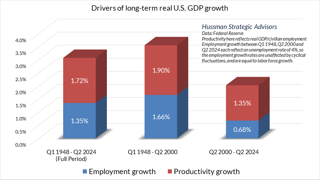
Given that 1948, 2000, and 2024 have all featured an unemployment rate of about 4%, the real GDP growth rates between these periods were driven solely by the two core components: output per worker (productivity), and labor force growth. Notice that the contributions of both components have been markedly lower since 2000. Part of this reflects slowing population growth and an aging workforce, and part reflects a progressive deterioration in net domestic investment as a share of GDP, despite record corporate profits.
It’s not uncommon to hear arguments that technology has created a world where stocks now deserve “premium valuations” that can be sustained indefinitely. We can’t rule out indefinitely rich valuations (though we doubt that outcome). We can, however, say without hesitation that unless higher valuations are accompanied by higher growth rates – and they have not been despite all of the technological progress since 2000 – the higher valuations are mathematically associated with lower long-term returns. Holding the trajectory of cash flows constant, a “premium valuation” is equivalent to a “sub-par return.”
I expect that our adaptations in recent years will enable us to navigate and welcome any trajectory that valuations may take, provided only that the market fluctuates. As noted in the first section, we would estimate long-term nominal S&P 500 total returns on the order of 5.8% annually in the event of permanently elevated valuations, though with materially higher volatility even if valuations never collapse. That would be fine with us. We don’t need a crash. All we need is fluctuation.
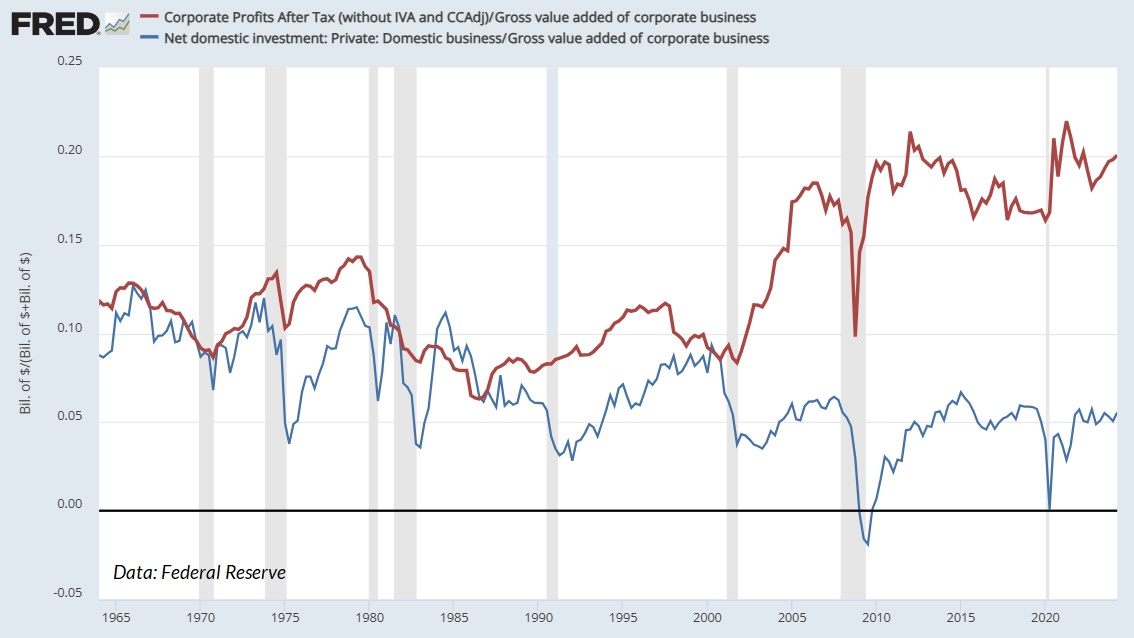
It may seem odd that record profit margins don’t boost corporate investment or economic growth, but they do not – certainly not reliably. We can see this in two ways. The chart below shows net capital formation of U.S. corporations in green (business investment net of depreciation), along with after-tax U.S. corporate profits in blue, both as a share of gross value-added (revenues).
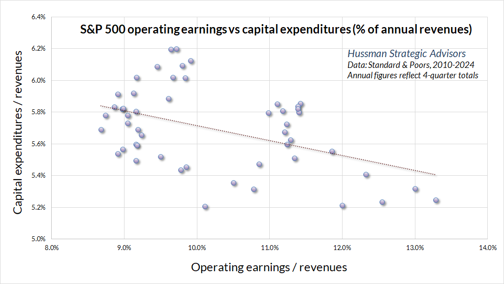
Similarly, there has been no positive relationship between S&P 500 operating margins and capital expenditures of S&P 500 companies as a share of revenues.
In my view, if Congress chooses to use fiscal policy to boost productive investment, growth, and labor productivity, it’s best to do it directly through accelerated depreciation and investment tax credits – particularly during recessions, when greater investment enables the economy to absorb greater saving without promoting a “Keynesian” contraction in national income.
For a deep, data-rich dive into corporate profit margins, including the impact of interest costs, taxes, and unit labor costs, along with an analysis of relative margins of mega-cap stocks relative to other S&P 500 components, see the March comment Universal Capitulation and No Margin of Safety.
Given the structural drivers of U.S. economic growth, the lack of positive correlation between profits and net business investment, the relatively narrow range of productivity improvement that comprises “significant” change, and the position of the U.S. economy relative to its full employment capacity, what are the baseline prospects for U.S. economic growth?
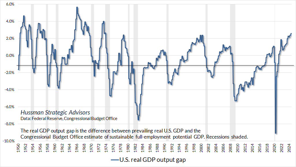
Well, one of the features of the U.S. economy that investors may not entirely appreciate is that U.S. real GDP is still running well above its sustainable full employment potential as estimated by the Congressional Budget Office (CBO). We’ve previously observed that the CBO estimate is closely aligned with our own estimates that simply use productivity and labor force demographics, so while one might find a little bit of wiggle room in the estimates, real potential GDP has generally been a reliable guide to the general position of the U.S. economy within the economic cycle.
Recessions typically emerge after the rate of unemployment has dropped to low levels, and GDP has run beyond its sustainable full-employment potential. In those periods of tight capacity, the Fed will typically be raising short-term interest rates, in an effort to cool demand that has run beyond sustainable supply. In this context, it’s not Fed hikes that cause a recession, but Fed hikes that accompany periods of tight capacity, which in and of themselves are naturally followed by economic retreat. Recessions are typically blamed on Fed tightening, but that’s not really how it works.
Now consider our turtle and pendulum. A useful way to think about prospects for future growth is to consider both the “structural” trends, as well as the gradual elimination of accumulated extremes. The chart below shows this approach, applied to the baseline prospects for real U.S. GDP growth over the coming 4-year period. The blue line in the chart below reflects the estimated 4-year structural GDP growth, minus the current output gap, amortized over 4 years. The red line shows actual subsequent 4-year real annual U.S. GDP growth.
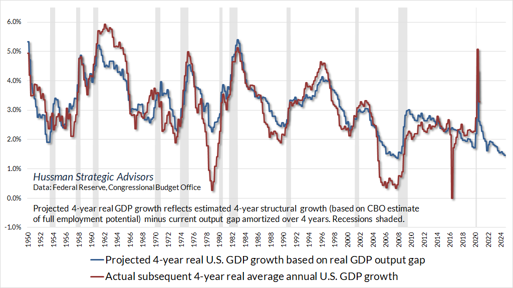
At present, our baseline estimate for real U.S. GDP growth over the coming 4 years is about 1.5% annually, with the caveat that recessions typically induce a striking shortfall from these estimates. I don’t really expect tax policies that will promote either increased labor force participation (which would primarily involve expansion of policies like the earned income tax credit, child and dependent care credits, transportation access, and availability of affordable housing), nor increased net domestic investment (which would primarily involve policies to directly encourage investment, rather than hoping to indirectly influence it by cutting tax rates on profits, high incomes, and financial gains). The problem is that economies don’t enjoy sustained growth without labor force growth or investment-led productivity growth. That’s not politics. It’s just arithmetic.
In contrast, I’ve always observed that recessions are first and foremost periods when a mismatch emerges between what the economy has been producing, and what the economy now demands. Those mismatches can be driven by shifts in consumer preferences, interest-sensitive investment, technology, government spending, credit strains, or crises like the pandemic. Disruptions triggered by these mismatches take time to resolve, absent massive bailouts and deficit spending. My impression is that we may experience more than a bit of mismatch and disruption in the next few years.
Provided complementary policies are in place to encourage labor participation and investment, tariff protection for a period of time can sometimes benefit strategic and infant industries that are critical for self-sufficiency. But policies focused on broader tariffs are among the sources of disruption and mismatch that tend to harm economies, as we should have learned from the Smoot-Hawley tariffs passed in June 1930. The economy and financial markets were already enormously vulnerable after years of speculative malinvestment, and until the FDIC was created in 1933, there was no formal way to take failing banks into receivership, which clearly also contributed to the Depression. The vast majority of financial and economic collapse emerged between mid-1930 and mid-1932. Indeed, while the stock market lost 89% during the Depression, the 1932 market bottom represented an 80% loss from the lowest level reached in late-1929 after the initial October crash.
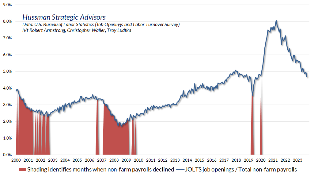
As for present observable conditions and immediate economic prospects, leading employment data remain mixed but have not deteriorated. Job growth and openings are both easing, but new claims for unemployment aren’t rising in a way that suggests imminent risk, and openings as a share of non-farm payroll employment are not yet at levels that tend to permit employment losses. In my view, greater weakness would be needed to expect recession.
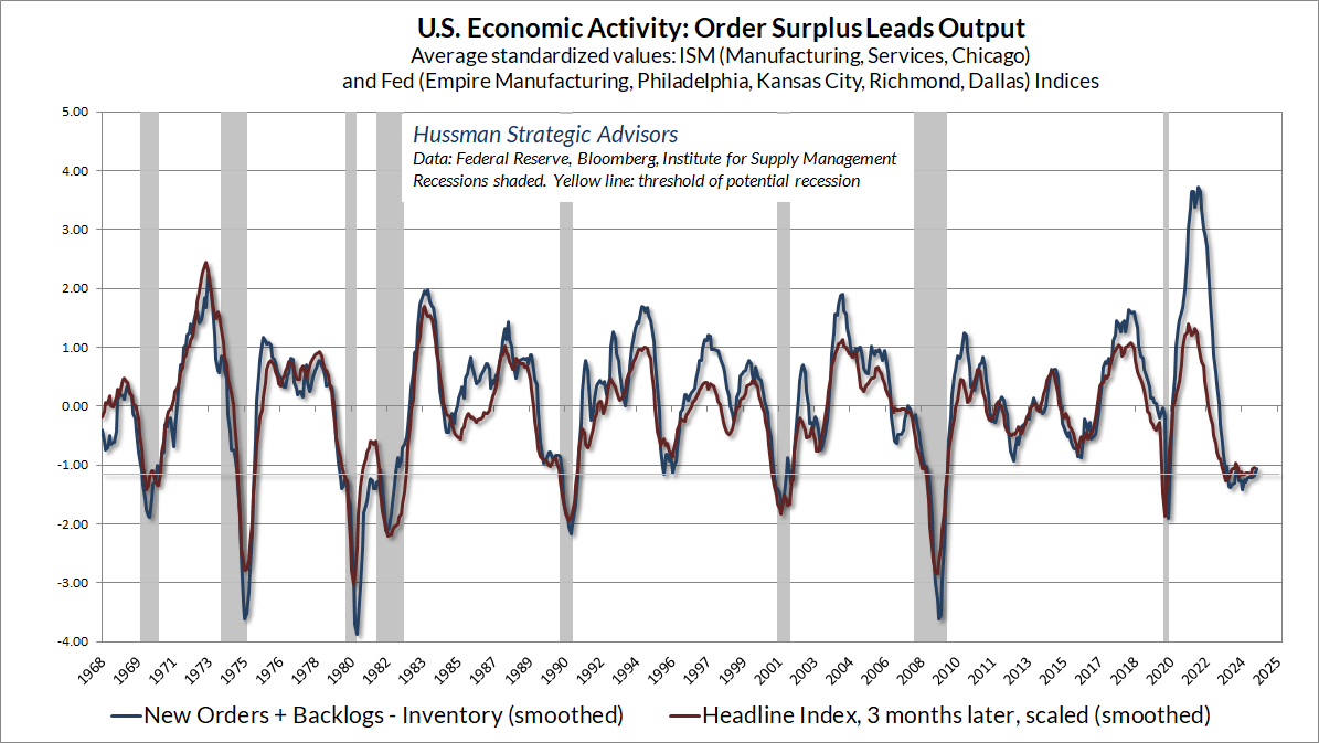
Meanwhile, our order surplus gauge (new orders + backlogs – inventories) based on regional and national ISM and Fed surveys also continues to hover at the threshold that typically separates expansion from recession. Again, greater weakness would be needed to expect recession.
A note on new eras, mega-cap stocks, and “premium” valuations
The ‘new era’ doctrine – that ‘good’ stocks were sound investments regardless of how high the price paid for them – was at bottom only a means of rationalizing under the title of ‘investment’ the well-nigh universal capitulation to the gambling fever. The notion that the desirability of a common stock was entirely independent of its price seems incredibly absurd. Yet the new-era theory led directly to this thesis… An alluring corollary of this principle was that making money in the stock market was now the easiest thing in the world. It was only necessary to buy ‘good’ stocks, regardless of price, and then to let nature take her upward course. The results of such a doctrine could not fail to be tragic.
– Benjamin Graham & David L. Dodd, Security Analysis, 1934
Let’s go back to our turtle and pendulum and examine how the “new era” stocks that emerge with every bubble tend to perform over time. It’s worth remembering that the tech-heavy Nasdaq 100 lost 83% of its value following the 2000 bubble peak. Still, some of the innovators in the tech bubble did go on to do well over the long-term. A bit of arithmetic will help to understand why some did better than others.
Consider the largest three tech stocks at the end of 1999 by market capitalization: Microsoft, Cisco, and Intel. Their total returns, respectively, since 1999 have averaged 10.4%, 1.9%, and 0.3%. The average is 4.2%. Seeing the largest companies in each market cycle go on to lag, as a group, is the norm, not the exception.
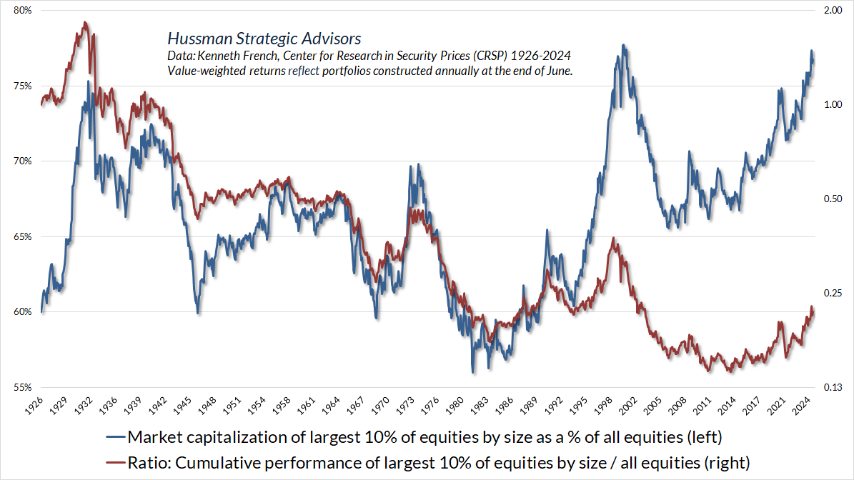
High growth rates and profit margins aren’t fixed numbers. They’re trajectories. When investors value stocks based on extrapolation of the growth phase, they put a pendulum on their turtle and swing it all the way forward. The fact is that except during the speculative blowoffs that drive them to an extreme market share (e.g. 1929, 1972, 2000, today), the largest cap stocks tend to follow by underperforming the average stock over time.
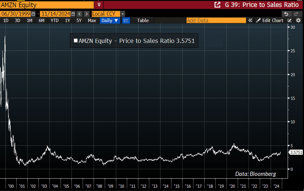
Now consider two companies that have enjoyed phenomenal returns since the tech bubble. Compared with Microsoft’s 1999 market capitalization of $600 billion, Amazon’s was just $26 billion in 1999, with a price/sales multiple above 40 at its high. Yes, Amazon did lose over 93% of its value from December 1999 to October 2001, but it’s also true that revenue growth averaging 30% annually (from that low base) since 1999 has resulted in a 17.5% annual return for Amazon since then.
Why have total returns been substantially lower than the growth rate of Amazon’s revenues? Simple, even though our turtle sprinted ahead, the valuation pendulum on its shell swung backward.
Now consider Apple. Compared with Microsoft’s $600 billion market capitalization, Apple’s was just $16 billion in 1999, with a price/sales multiple of 2.7 at year-end, on a modest base of revenues. Yes, Apple lost over 80% of its value from March 2000 to April 2003, but it’s also true that revenue growth averaging close to 20% annually since 1999 has resulted in an even higher 25.7% annual return for Apple since then.
Why have total returns for Apple been substantially higher than its own growth rate, and how could it have outperformed Amazon, which enjoyed far more rapid revenue growth? Simple, not only did Apple’s turtle sprint ahead, but the valuation pendulum on its shell swung forward as well.
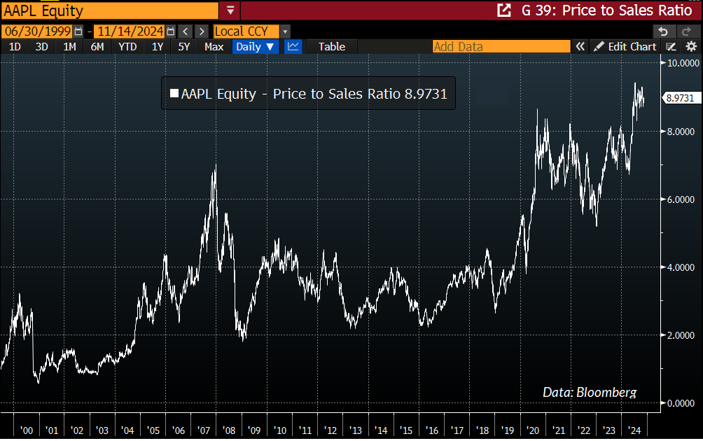
Seeing an enormous and mature company trading at a price/revenue ratio of nearly 9.0 despite a 3-year revenue growth of just 2% annually might help to understand why Warren Buffett no longer owns this particular stock. And seeing MarketCap/GVA at higher levels than at the 1929 and 2000 bubble peaks may help to understand why Berkshire Hathaway holds the largest pile of cash in its history (primarily in Treasury bills comfortably earning about 4.5%). Market conditions and valuations will change. In the meantime, both patience and discipline will matter.
As I’ve noted before, the point of analysis like this isn’t to dismiss the idea that technological change can produce a “new era” in economic activity, but rather, to emphasize that the whole history of U.S. economic growth is made of no other substance than the constant introduction of “new eras.” The most dynamic layer of the economy is constantly regenerating in new forms. Again and again, the early profitability and growth of the most glamourous companies is subsequently eroded by the “creative destruction” of market expansion, competition, and even newer innovations. As Joseph Schumpeter wrote a century ago, this process is the “essential fact” of an entrepreneurial economy.
The problem for investors is that every bubble – every one – is associated with new era thinking. The earliest, seemingly impervious, and most richly valued leaders in a new industry – Visicalc, Sun Micro, Netscape, AOL, Nokia, Blackberry – are often replaced. Even when they aren’t, they often experience profound losses on their way to eventual dominance. In any event, the companies that gain most tend to be those with modest starting valuations on a tangible but relatively moderate revenue base.
Whatever you choose to do with individual stocks or the equity market as a whole, my hope is that the turtle and the pendulum will help in your investment decisions. For our part, extreme valuations, unfavorable market internals, lopsided bullish sentiment, and a motherlode of overextension syndromes hold us to a defensive outlook here. Yet even if valuations remain elevated forever, the intensity of our outlook is likely to change more frequently and usefully than investors may have come to expect, and we’re very much looking forward to that change.
Keep Me Informed
Please enter your email address to be notified of new content, including market commentary and special updates.
Thank you for your interest in the Hussman Funds.
100% Spam-free. No list sharing. No solicitations. Opt-out anytime with one click.
By submitting this form, you consent to receive news and commentary, at no cost, from Hussman Strategic Advisors, News & Commentary, Cincinnati OH, 45246. https://www.hussmanfunds.com. You can revoke your consent to receive emails at any time by clicking the unsubscribe link at the bottom of every email. Emails are serviced by Constant Contact.
The foregoing comments represent the general investment analysis and economic views of the Advisor, and are provided solely for the purpose of information, instruction and discourse.
Prospectuses for the Hussman Strategic Market Cycle Fund, the Hussman Strategic Total Return Fund, and the Hussman Strategic Allocation Fund, as well as Fund reports and other information, are available by clicking Prospectus & Reports under “The Funds” menu button on any page of this website.
The S&P 500 Index is a commonly recognized, capitalization-weighted index of 500 widely-held equity securities, designed to measure broad U.S. equity performance. The Bloomberg U.S. Aggregate Bond Index is made up of the Bloomberg U.S. Government/Corporate Bond Index, Mortgage-Backed Securities Index, and Asset-Backed Securities Index, including securities that are of investment grade quality or better, have at least one year to maturity, and have an outstanding par value of at least $100 million. The Bloomberg US EQ:FI 60:40 Index is designed to measure cross-asset market performance in the U.S. The index rebalances monthly to 60% equities and 40% fixed income. The equity and fixed income allocation is represented by Bloomberg U.S. Large Cap Index and Bloomberg U.S. Aggregate Index. You cannot invest directly in an index.
Estimates of prospective return and risk for equities, bonds, and other financial markets are forward-looking statements based the analysis and reasonable beliefs of Hussman Strategic Advisors. They are not a guarantee of future performance, and are not indicative of the prospective returns of any of the Hussman Funds. Actual returns may differ substantially from the estimates provided. Estimates of prospective long-term returns for the S&P 500 reflect our standard valuation methodology, focusing on the relationship between current market prices and earnings, dividends and other fundamentals, adjusted for variability over the economic cycle. Further details relating to MarketCap/GVA (the ratio of nonfinancial market capitalization to gross-value added, including estimated foreign revenues) and our Margin-Adjusted P/E (MAPE) can be found in the Market Comment Archive under the Knowledge Center tab of this website. MarketCap/GVA: Hussman 05/18/15. MAPE: Hussman 05/05/14, Hussman 09/04/17.

